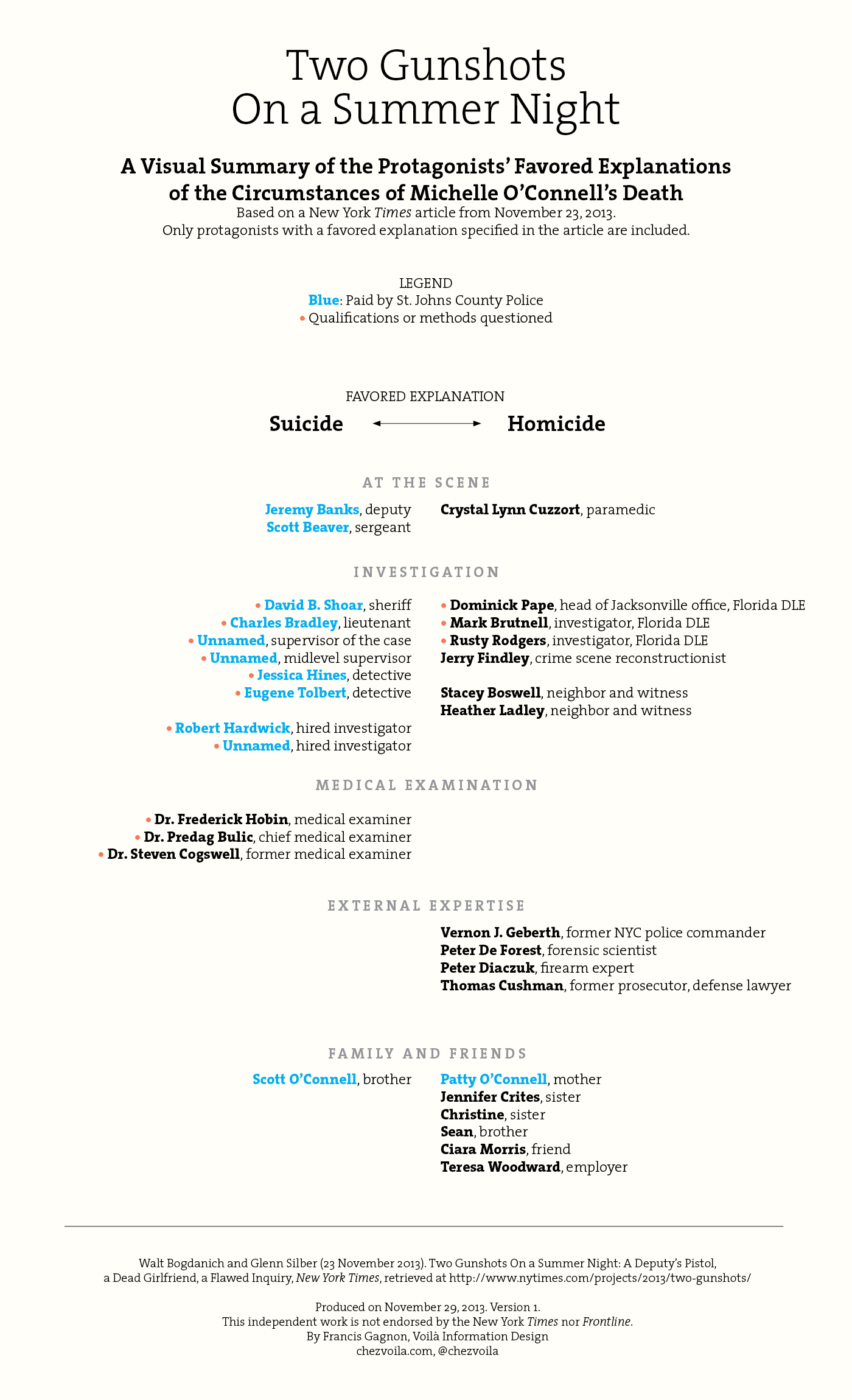
Walt Bogdanich and Glenn Silber have written a gripping article in the New York Times about the suspicious circumstances of Michelle O’Connell’s death, in September 2010. It was published on the front page and, on the web, it’s given special treatment with audio, video and graphics. It remains however a complex article, sometimes hard to follow due to the number of protagonist, their complex relationships and changing positions. I counted 39 people referred to by name, and a host more of people mentioned only by title.
Hours after reading it, the article was still on my mind and I started imagining a visual organization that would clarify who falls on which side, and show two points made in the article: the people who favor the suicide explanation are mostly colleagues of Jeremy Banks, and there have been a lot of questionable methods employed in this case. So I made the following cheat sheets, a companion piece to the article to help the reader make sense of it. It took about six hours.

I draw one main lesson on the limits of the visual medium: it’s hard to be as nuanced as in full text. The structure of my document puts people on either side — suicide or murder — making it difficult to represent nuanced positions about certain aspects of the case. The hardest decision was to exclude the special prosecutor Brad King and his two investigators, Bill Gladson and John Tilley, even though their refusal to prosecute is seen as confirmation of the suicide theory by the St. Johns County Police. As written in the article, “Mr. King never explicitly stated that Ms. O’Connell had killed herself. He simply concluded that there was not sufficient evidence to bring charges.” For the same reason, I excluded the anonymous blogger Cloudwriter because she says “Never did I say Jeremy did it.”
I chose to organize the protagonists because their positions seemed central to the article, but it feels like the timeline and even the arguments, with their strengths and weaknesses could benefit from similar treatment.
The New York Times article deserves to be read widely and not lost in the Thanksgiving celebrations. Hopefully this visual can help more people understand it.
Francis Gagnon is an information designer and the founder of Voilà: (2013), a data visualization agency specialized in sustainable development.

