On Twitter, Matt Notowidigbo, Associate Professor of Economics at Northwestern University, has started a very interesting thread.
I want to start a Twitter thread!(*)
QUESTION: What is one of your favorite figures in economics? Please submit answers below!
(*)Inspired by dinner conversation last week with possible colleagues
— Matt Notowidigdo (@ProfNoto) March 12, 2018
The mere number of responses (55 in less than a day, as of this writing) is a good example of how much people love charts. They remember, think and talk about them, even if it’s not their full-time jobs. Also, none of the charts submitted are visually spectacular and few are even beautiful. Many are in black and white. But their message is what stuck with the audience, Readers are brought in by the insights of the study and the appropriateness of the visualisation method. Here are a few examples.
Let’s start with a submission by Notowidigbo, a convincing case of the impact of a technology on the lives of the poor. The change in amplitude is striking enough, and the fact that there are three regions drives the point home.
Chris Udry’s pick: Jensen 2007 QJE paper showing that cell phones reduce price dispersion in the fisheries sector in Kerala, India https://t.co/So92036rNY (This is a very interesting paper!)
Other nominations? pic.twitter.com/NxEgF3TIJh
— Matt Notowidigdo (@ProfNoto) March 12, 2018
And here’s one that I saw recently on social media and that generated a lot of support in the thread. It’s about the unequal impact of parenthood on men and women’s earnings and it was published in January 2018.
This is a figure that should be widely known. pic.twitter.com/uiTjfJyVLQ
— Arindrajit Dube (@arindube) March 12, 2018
The following example reinforces that a good graph is not necessarily one that is understood in three seconds, but one that rewards exploration and understanding. To help you a little, you’re supposed to be looking at the lag in price changes (the horizontal lines) based on when the news crossed from London to Amsterdam (the vertical lines). I like the creativity of the approach.
I’ve always been partial to Peter Koudijs’ “The boats that did not sail” JoF 2016. Yes, much prettier graphics exist. But Peter clearly spent time thinking how to convey his instrument succinctly to a skeptical audience in a novel way I had never seen before. pic.twitter.com/bEWbEwu54x
— Jonathan Hersh (@DogmaticPrior) March 13, 2018
Here’s a colourful and rich one. It shows the impact of various weather factors on behaviour, economics, etc. It makes you think about the unexpected impacts that climate change may have on society.
This one is easy for me. Carleton and Hsiang 2016 with a review of the social and economic impacts of climate. Amazing! pic.twitter.com/EODRG4AAb6
— Sam Manning (@Glen_Tremendous) March 13, 2018
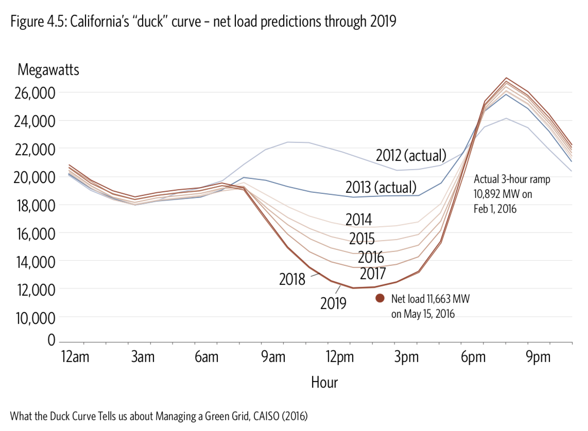
Also, I was surprised to see one that I had the opportunity to edit (not the original) for a report on renewable energy because my client had also found it insightful.
Forever the Duck Curve pic.twitter.com/rXv57PNMbA
— Kevin (@MoralHazardPay) March 12, 2018
I had retained the whole concept, making only minor changes to the design fo clarity. Now looking at it, I wish we could see whether the predictions panned out from 2014 to 2017.

Verifying predictions brings me to my own contribution to the thread.
I often of this McKinsey (2010) chart and how it elegantly shows the optimism bias of equity analysts (human trait? incentives?). https://t.co/spZDsF9fuf pic.twitter.com/GwqJaEOnkr
— Francis Gagnon | Voilà 📊 (@chezVoila) March 13, 2018
What is going on here? Why is it that analysts as a whole exhibit an optimism bias that doesn’t seem to abate over time? Is it part of human nature? Or is it something specific to their incentives to overestimate? In any case, the graph makes a convincing showing with simple line charts.
What makes a good graph is first the insight and second the right visualisation. While good aesthetic appearance is part of proper information design — and several of the graphs above would deserve to be improved — it is nearer the end than the beginning of the process.
Francis Gagnon is an information designer and the founder of Voilà: (2013), a data visualization agency specialized in sustainable development.

