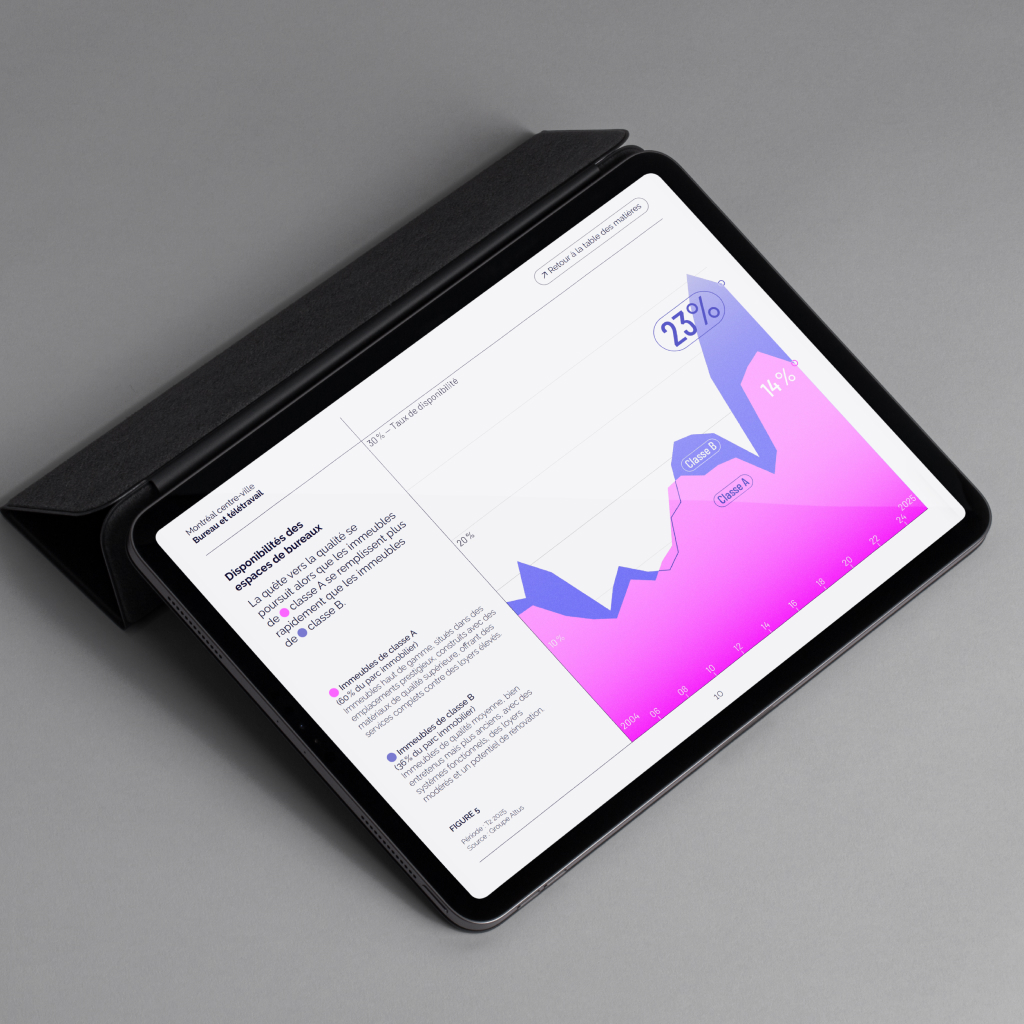
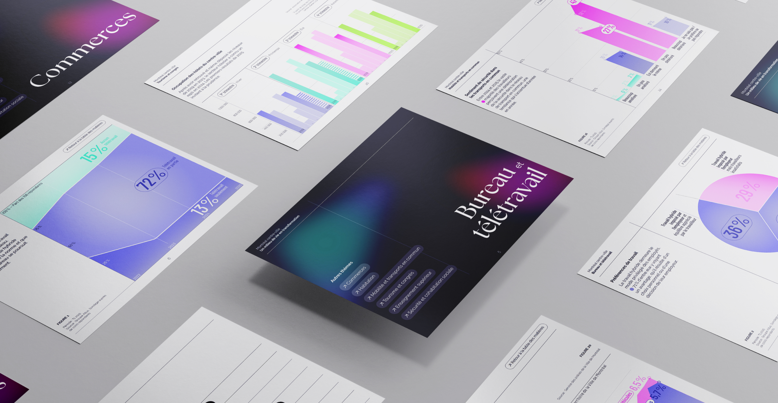
A portrait of downtown Montreal highlighting graphic charts
Montreal centre-ville wanted to rebrand its annual report by offering a creative, visual interpretation of its data, moving away from the traditionally text-heavy format. For the eighth edition, Voilà: redesigned the report around clear, vibrant charts designed for clear interpretation.
Design as a tool for clarity
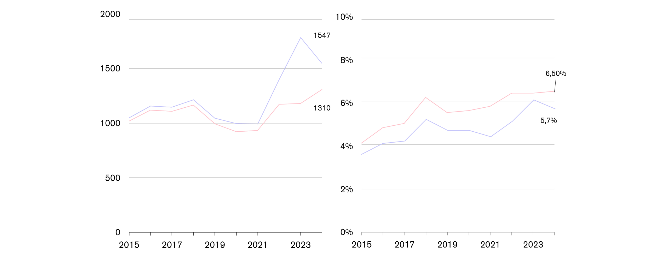
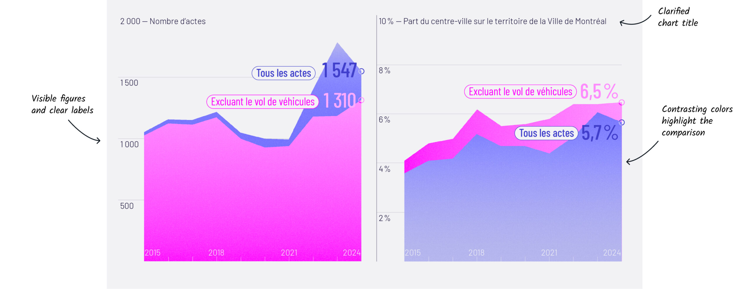
The design of this report began with the selection and reorganization of the client’s data. Now, each page is conceived as a standalone narrative element, clear and visually striking.
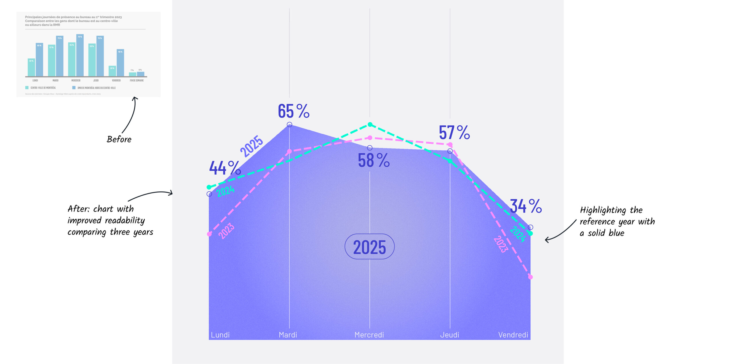
To go beyond a simple presentation of data, the new graphical treatment highlights key findings. By simplifying the representation, it reveals—in this example—that office attendance increased on Mondays but decreased on Wednesdays.
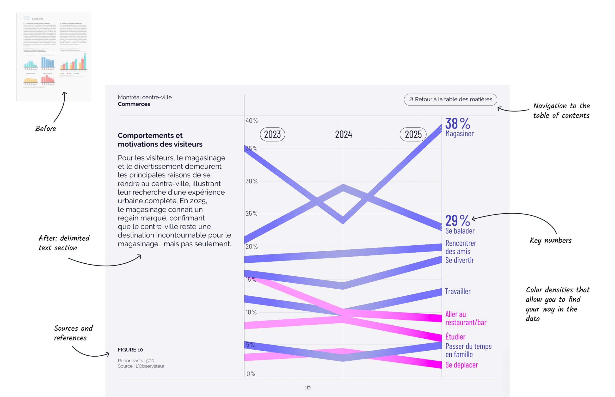
Here, layout is used as a tool for clarity: conveying each message through a single chart that dominates the page, rather than burying it in a long text alongside a standard graph.
Bold graphic elements draw attention to the essentials, reinforced by saturated colors. At the same time, the placement of the text—subtle yet highly legible and well-spaced—structures the overall composition and highlights key messages.
BeforeAfter
Smooth reading designed for digital
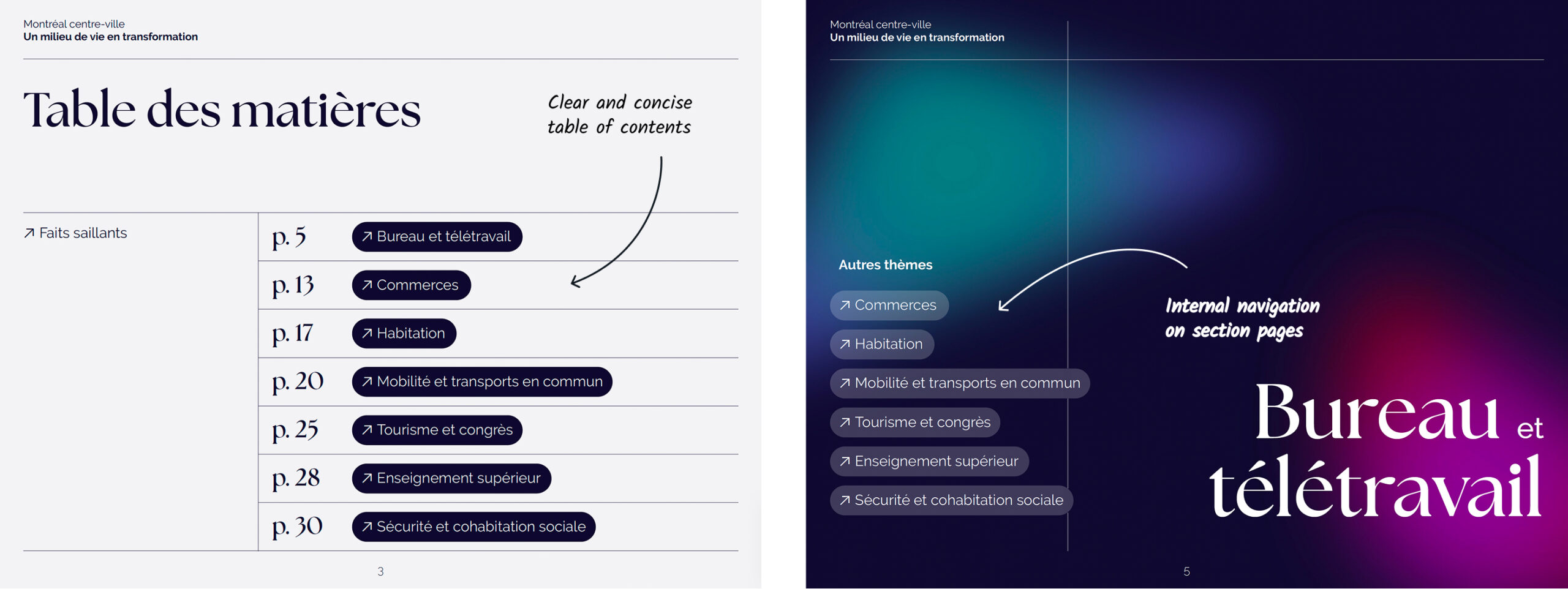
The report is organized into thematic sections supported by on-screen interactive navigation that facilitates moving across the report.
Ready to reveal your data through a creative vision? Let's chat!