The Institute for Research on Public Policy (IRPP) has developed an interactive map in collaboration with The Community Economic Development Network and The Energy Mix about Community Susceptibility in Canada. They were seeking Voila:’s support to produce a static infographic that summarizes the key messages.
Understanding the findings
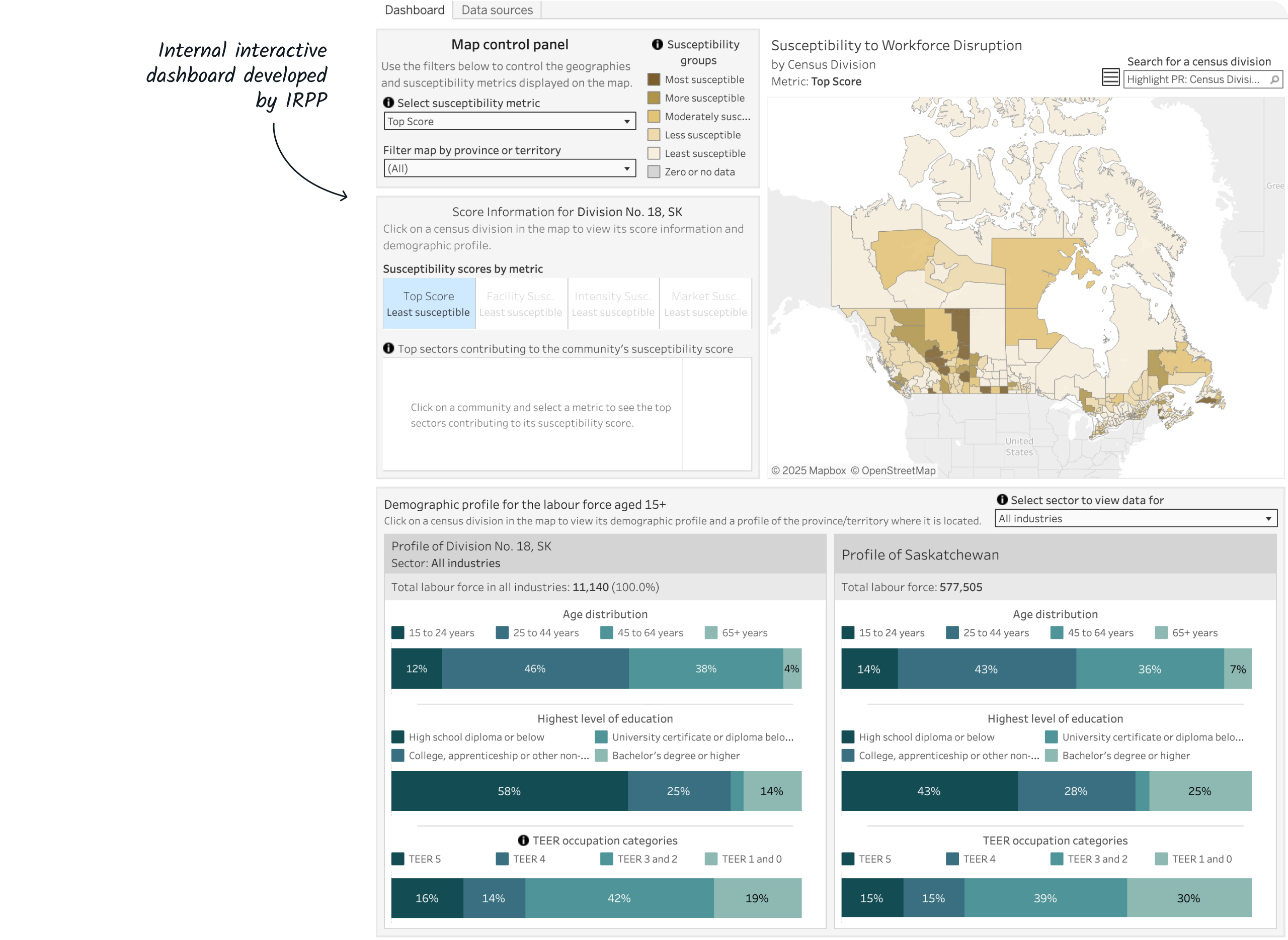
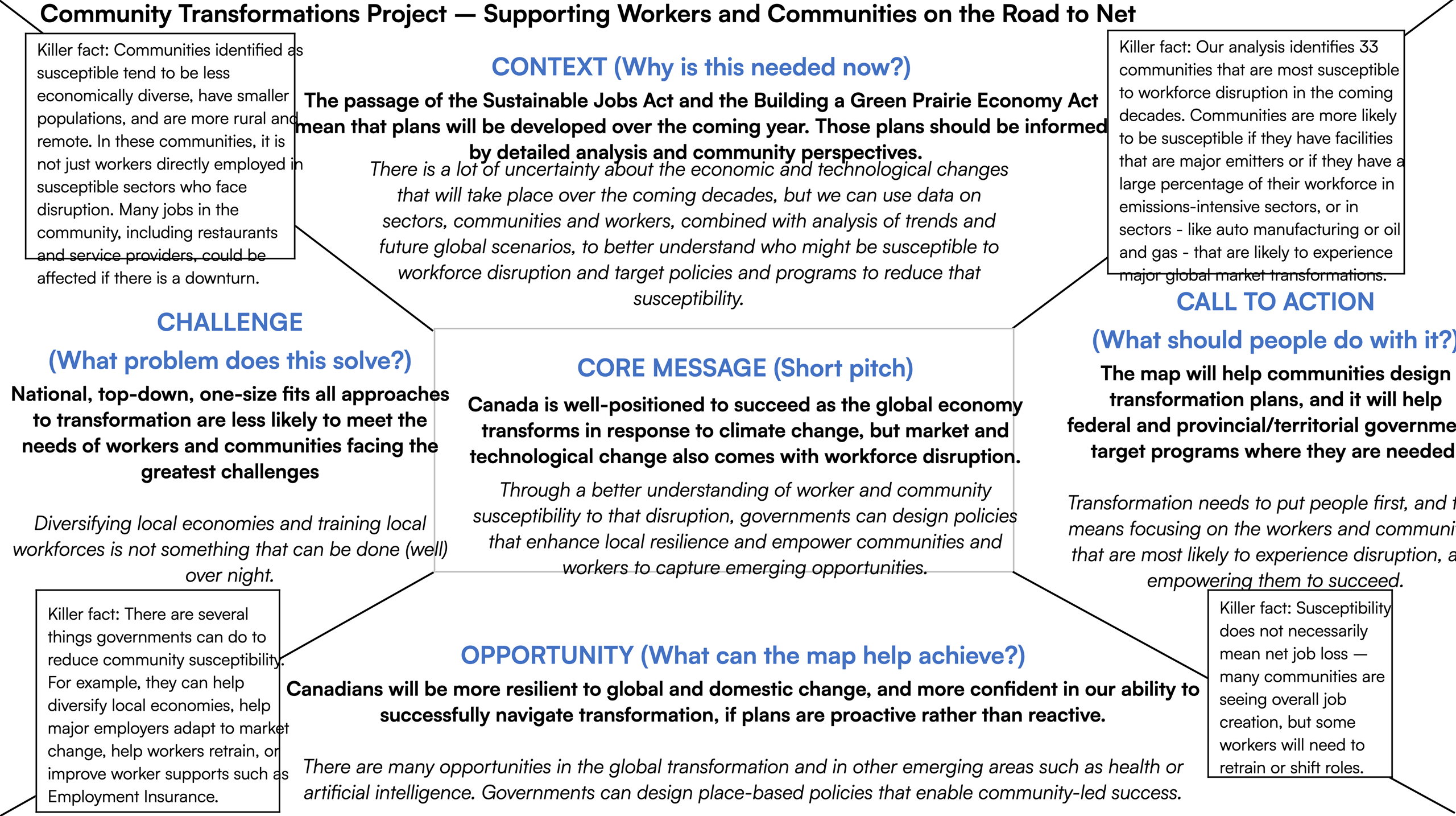
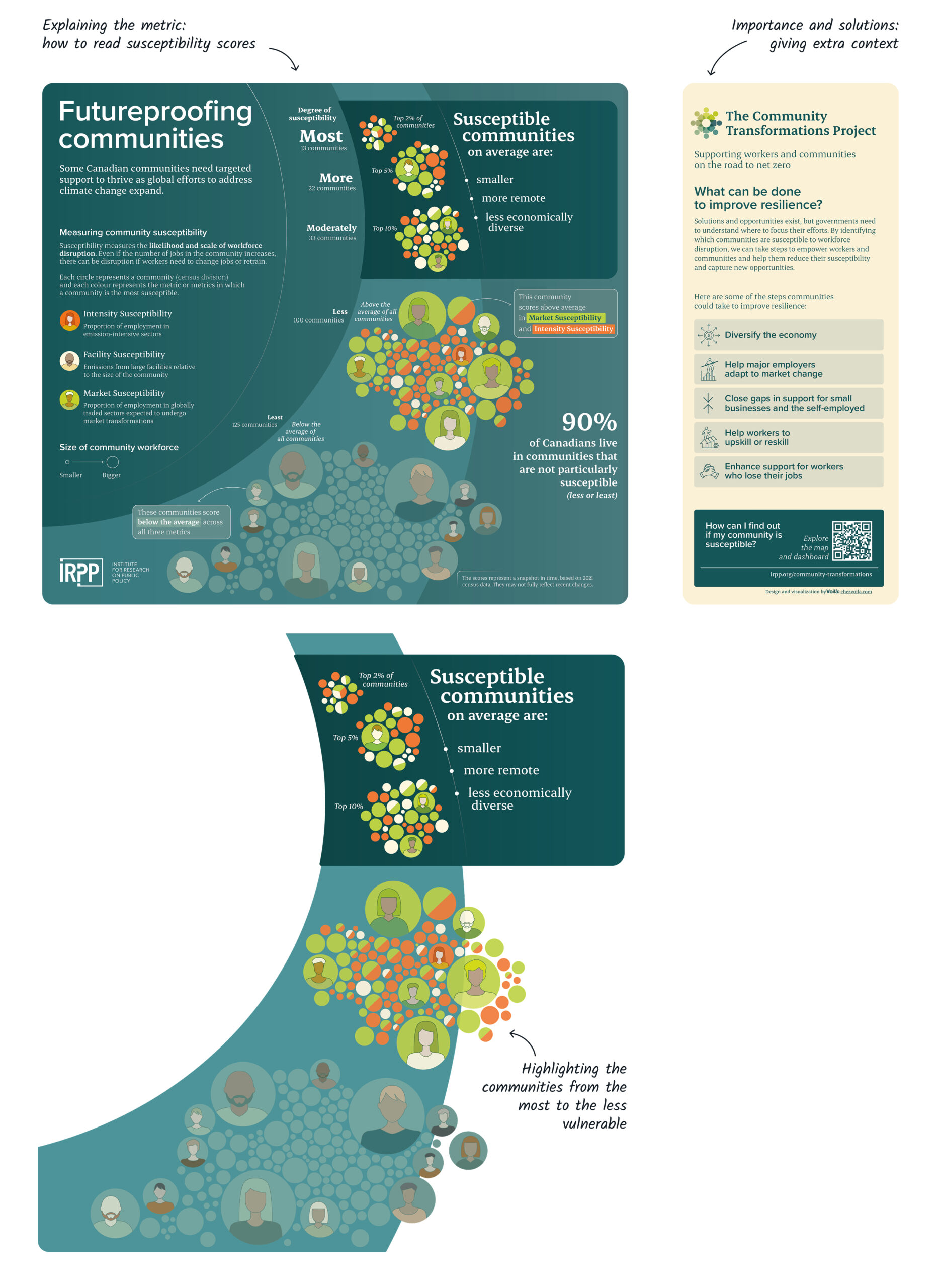
This project analyzes the impact of climate change on the Canadian workforce, focusing on ten community profiles and a series of government measures developed to support it. At the beginning of our mandate, the client had already conducted extensive data collection and analysis. They had developed an internal interactive dashboard to present the research findings. Our role was to explore with them the conclusions drawn from the data and the key messages they wanted to convey to their audience.
From map to infographic
While the client’s dashboard was relying on a map, it became clear that it would not be the right design to convey the message on a static infographic. Indeed, the characteristics of the findings were not based on geography, but on the economic diversification of communities and their size. In this context, we began our information design research by exploring other avenues based on the client’s brief.
Before
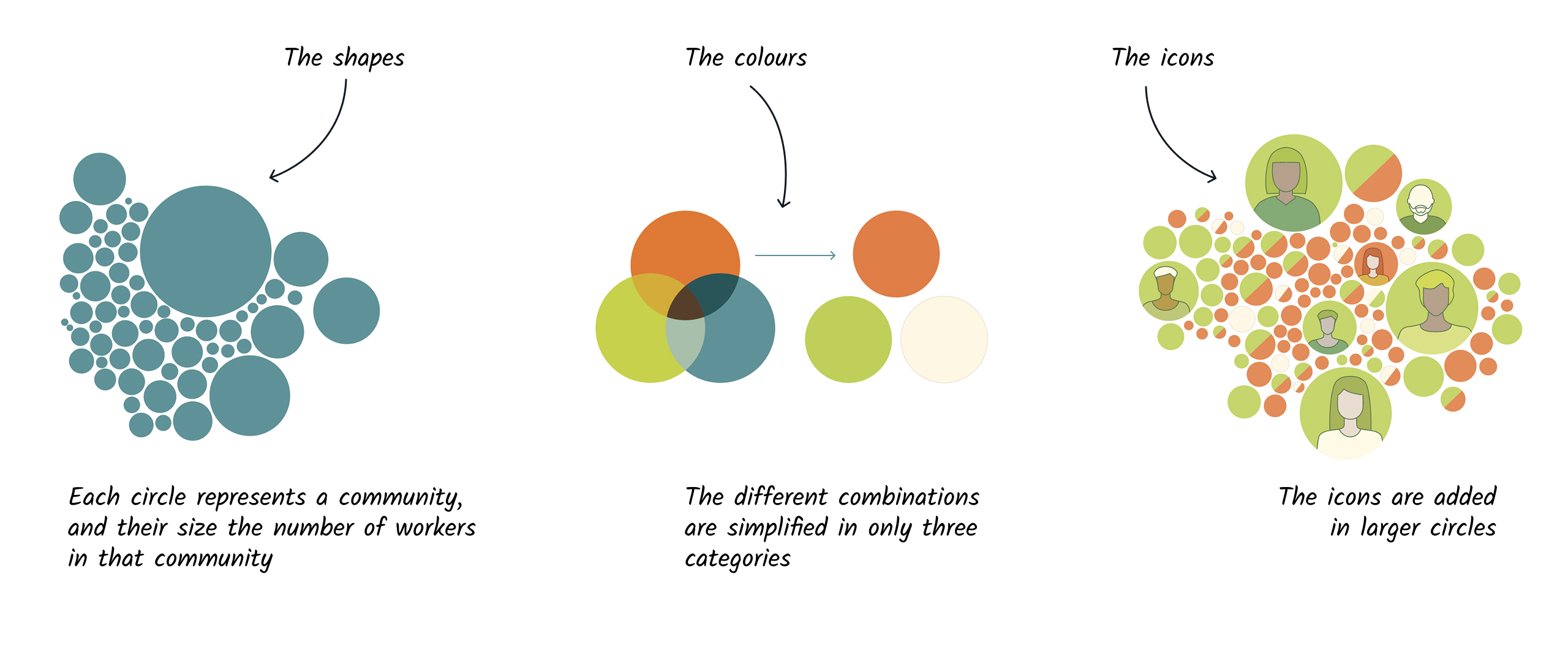
Combine shapes and colours to develop our argument
Concerning the shapes, we chose to work with circles to represent each community and sized them according to population. About colours, the palette includes three colours that represent the three types of susceptibilities for the communities, such as intensity, facility and market susceptibility. Our exploration started with a palette that would provide seven combinations, which proved too many to easily distinguish. Our ultimate solution was to split the circles into as many colours as necessary. Finally, we developed people icons inside larger circles in order to add a human touch to the infographic.
Develop the reading path
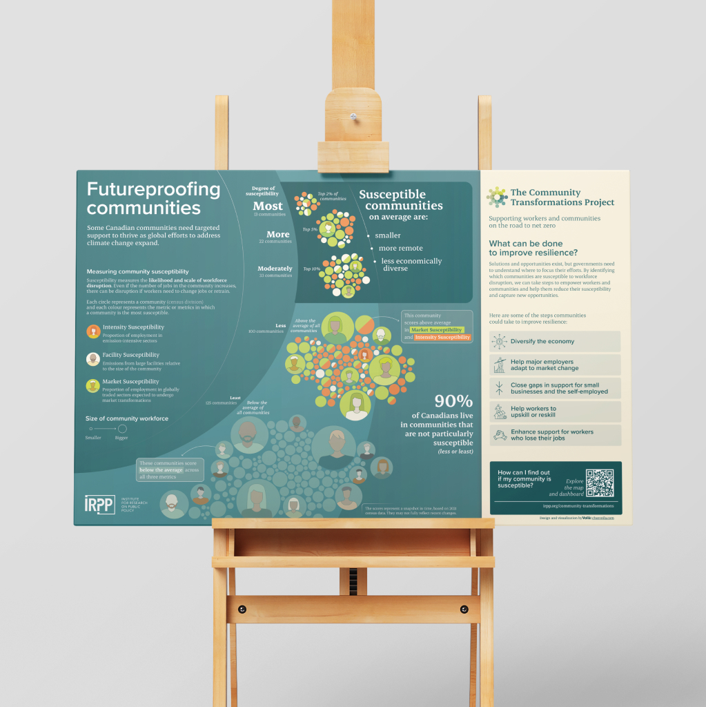
Organizing information is essential to making it clearer. We decided to separate the infographic into two parts: on the left, the explanation of the measures and their levels of susceptibility, and on the right, more information about the context. Concerning the communities, we highlighted the most vulnerable communities at the top and followed a drawn path downward to illustrate the communities less and less vulnerable. We also wanted to emphasize the finding that 90% are not particularly susceptible.
The final result
Here is the final result, which can be viewed in a larger format. For more information about this project and to continue exploring, click here.