After years of evaluating the work of the Global Environmental Facility (GEF), the Independent Evaluation Office (IEO) wanted to improve the presentation of its semi-annual evaluation report to the GEF Council, a crucial moment for their senior management to communicate with the entity that oversees their work and that of the GEF.
We first discussed with the IEO of what they saw as the shortcomings of their current presentation, a necessary step to verify assumptions before making suggestions. Then we discussed the narrative structure and finally came up with a design.
Narrative structure
With the semi-annual report as raw material, we first discussed what the IEO would choose to present from it during their two hours. Thanks to this initial discussion of our objectives, audience and context, we made a few counterintuitive decisions:
The sections would be presented in a different order from the report, to better set up the conversation with the Council.
Not all the recommendations are written on the slides: only the most important or those that call for the attention of the Council.
There are two speakers. Rather than having dedicated sections for each, the speaker most comfortable with the topic at hand takes the mic, which means sharing slides at times.
We created a storyboard with the messages and visuals for each slide, allowing us to brainstorm and make changes at little cost.
Design
Constraints
Our constraints included the use of the green and blue of the IEO logo, recently redesigned. We chose green as our primary colour because it is more closely related to the environmental topic.
Other than for the title slide, we were free to forfeit the corporate slide background, which would give us space and flexibility. We chose a default black background because of the presentation settings.
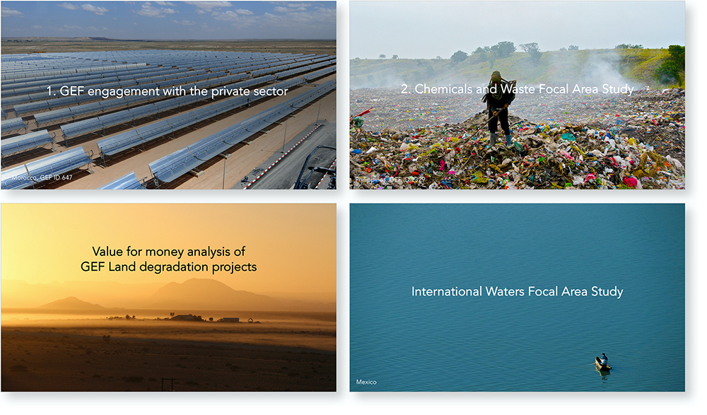
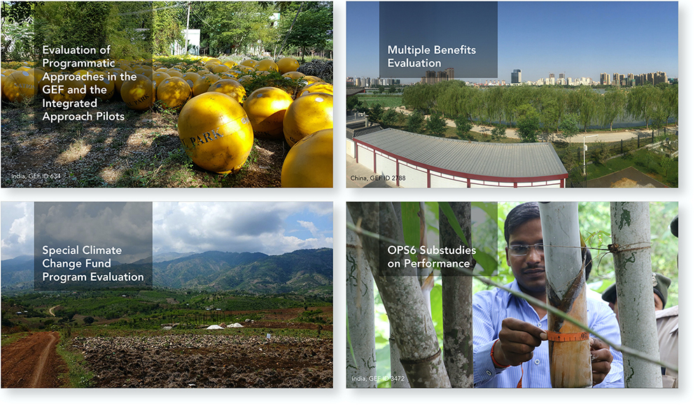
Pictures
We made the most out of the treasure trove of environmental pictures from the GEF. We conducted extensive research, sometimes consulting staff, to find pictures relevant to the content wherever possible. In many cases, the background pictures are from projects discussed in the slide. Where it applies, we provide the country name and project number at the bottom of the slide, emphasizing this relevance.
In the section below about ongoing evaluations, we also use full screen pictures with titles overlay. Note how only the titles are written: the speakers are communicating the details verbally. The goal is to keep the focus on the speaker and not to interfere or compete by having text-heavy slides.
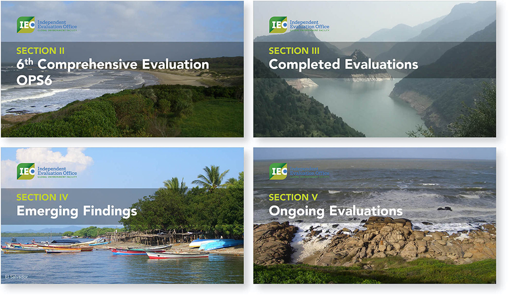
Section title slides
We chose to have a consistent title slide to mark the beginning of a new section. On each of them, we indicate the section number from the report, to guide the audience who might want to refer to it. We include no other text, so as to convey the simple message that the speakers are moving to a different section.
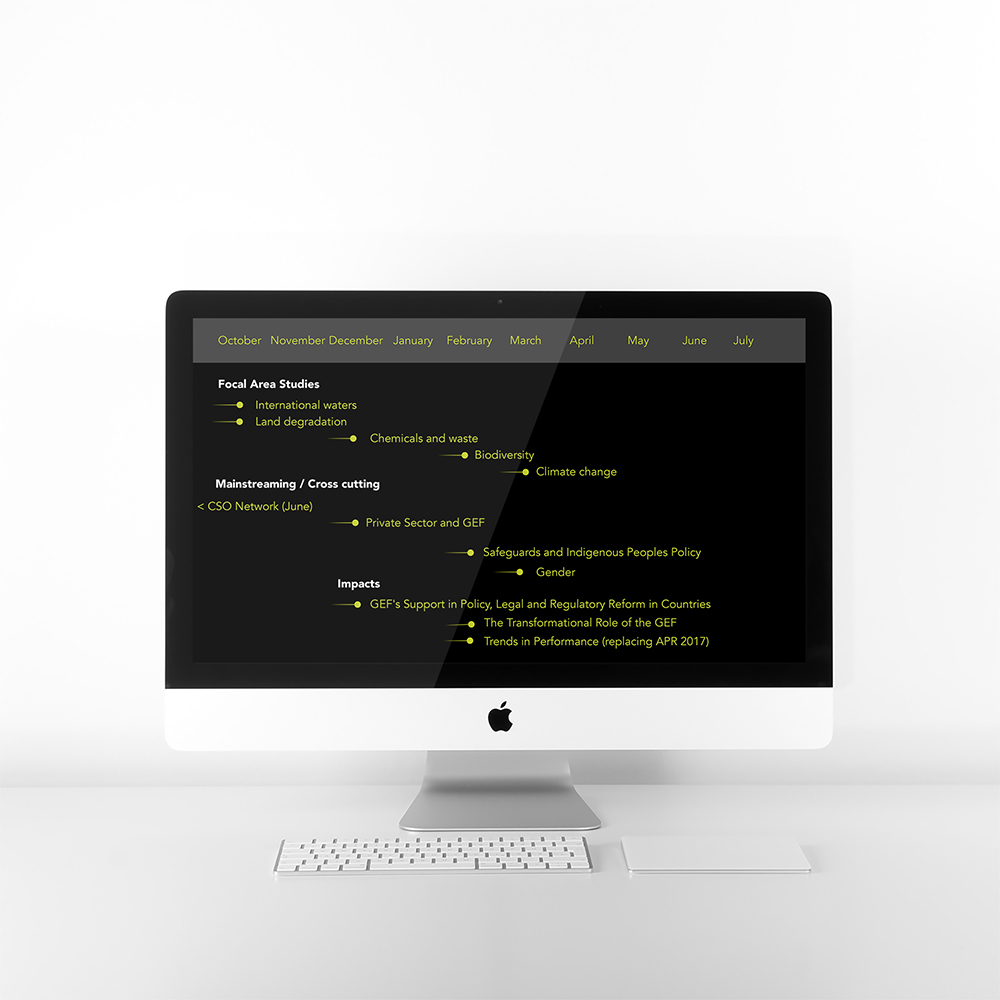
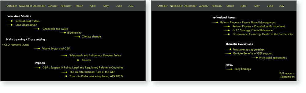
Timeline
An important purpose of the presentation is to update the Council on the status and anticipated completion date of a number of evaluations carried by the IEO. This timeline is already in the report in the form of a table, with groupings by themes.
This provides a good opportunity to use a visual timeline that would help the Council understand the sequence of the evaluations across themes. If needed, they can find the exact dates in the report. We fit it on two slides because of the need to keep the text large enough for the audience to see. The fade-in bullets help to convey the idea of a process preceding this step.
With this design, it becomes clear for instance that the evaluations about institutional issues and the thematic evaluations will be delivered towards the end of the period, almost all at the same time.
Before
Below is an example where we include only the headlines of a more detailed timeline. Again, the audience has the report in their hands and the speaker is free to focus on what is relevant in context.
Before
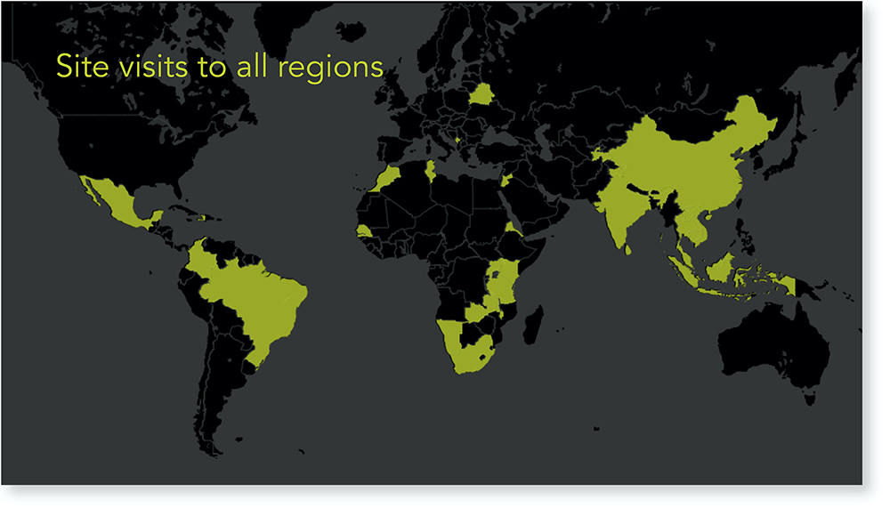
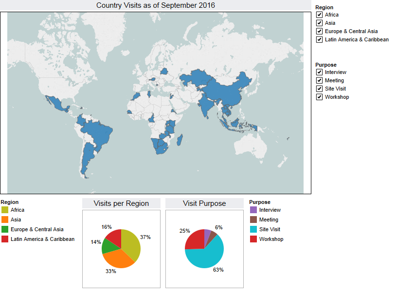
Maps
We use a few maps from the semi-annual report and relevant technical papers because they provide a good visual support to our main messages. The first map illustrates the numerous field visits conducted by the IEO staff for the present evaluation.
Notice the exclusion of all text apart from a title.
Before
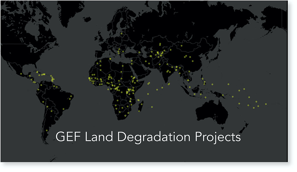
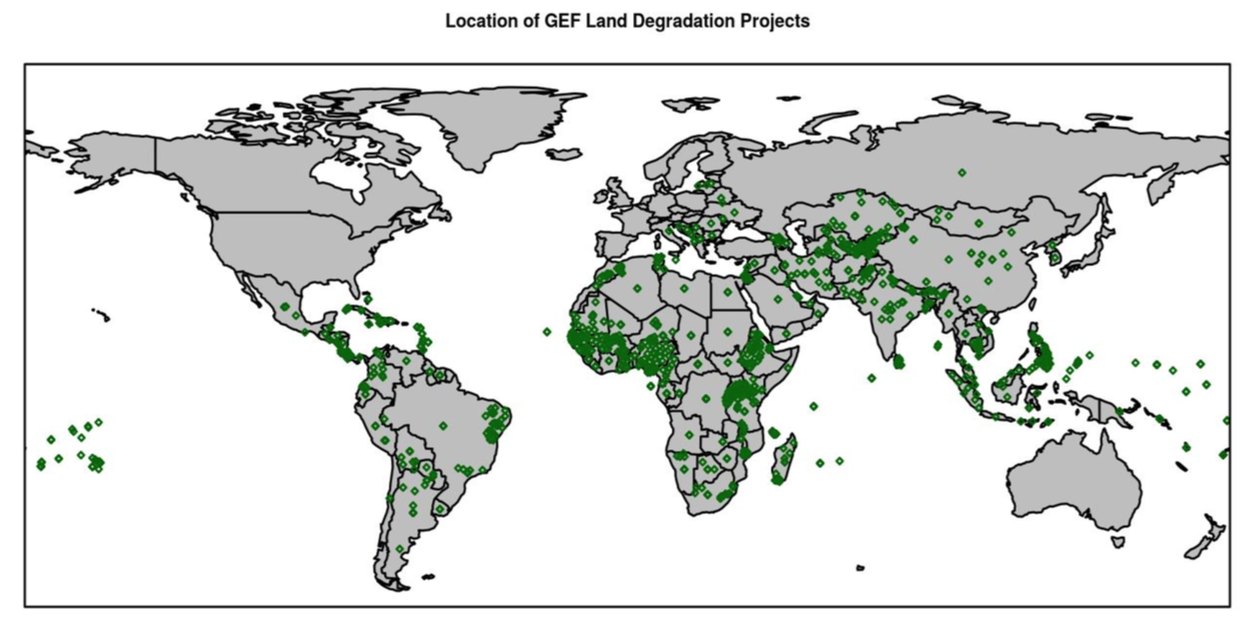
The second map, taken from part of an evaluation, shows the location of the land degradation projects.
The solid markers on the original map obscured the multiplication of projects in a given space. In the redesign, we use transparency to convey the concentration and overlap of projects. We also harmonize it with the dark theme of the presentation.
Before
Sparklines and pie charts
Sparklines are usually found where space is at a premium as is the case in a presentation. We use them on a single slide to convey recent trends.
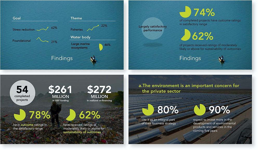
Pie charts are good at communicating a single number and that’s how we use them on a number of slides, to present survey results or portfolio numbers.
Illustrations
After agreeing on the key concepts to represent, we created custom icons and illustrations to represent them, rather than using plain bullet points.
Animations
Subtle animations are present throughout the presentation, such as fades between the slides or the automatic appearance of elements. They blend in without distracting the audience.
The opening sequence was meant to appear before the presentation, while the speakers were finishing their set up and the audience was coming back from a coffee break. We experimented with a sequence of several images and messages, but settled on a single slide given the context and time constraints.
Several slides gave control to the speakers to display the talking points at their own pace. Here they are presented as one sequence.
Other slides were entirely animated without requiring the intervention of the speakers, to allow them to focus on their talk. This specific slide provides a humorous illustration of the problem at hand.
How to show the complex results of a study showing that women do not have the same level of access to financial services as men in Tanzania and Mozambique?
Client: Consultative Group to Assist the Poor (CGAP)