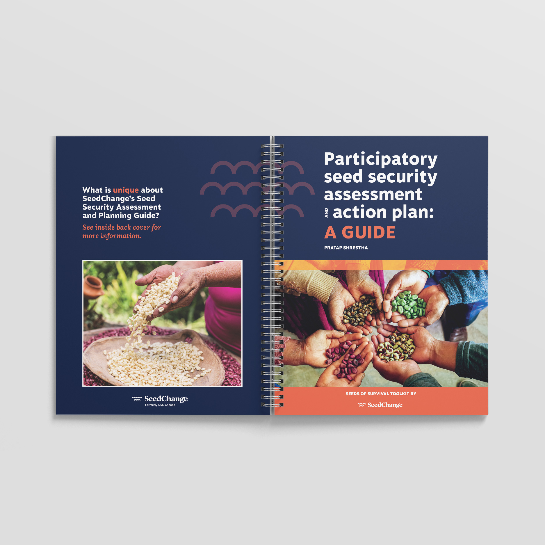
SeedChange is a non-profit organization whose mission is working with farmers to grow healthy food using good seeds and sustainable practices. Out of their collaboration with Dr Pratap Shrestha came a practical tool. This tool would guide the user in the collection and analysis of field data with the goal of establishing an action plan that will ensure seed security.
This is not an ordinary report: it is a practical tool that presents a complex and long process. So, SeedChange turned to Voilà: to transform their raw content into a practical and well structured guide. It needed to be possible to print the guide locally and it was designed with a spiral binding for easy manipulation in the field.
We designed some structured visual solutions to facilitate usability.
Finding your way around
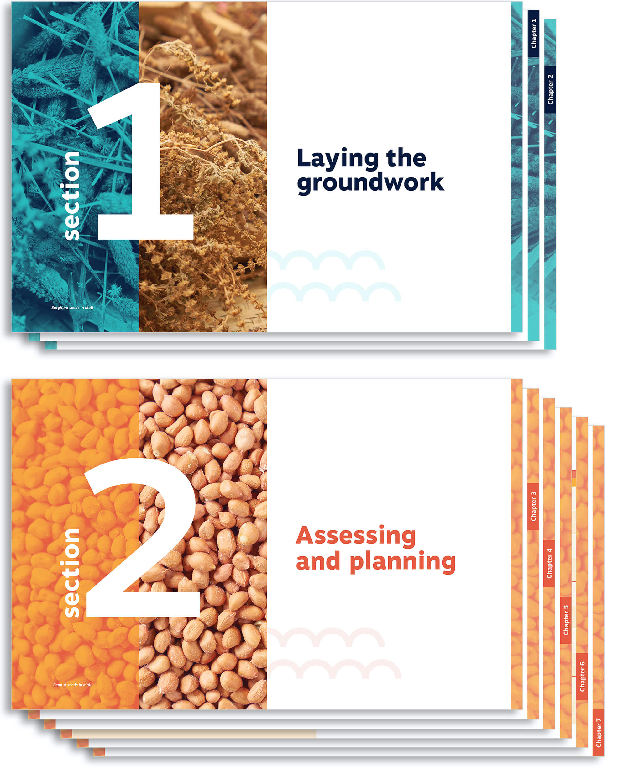
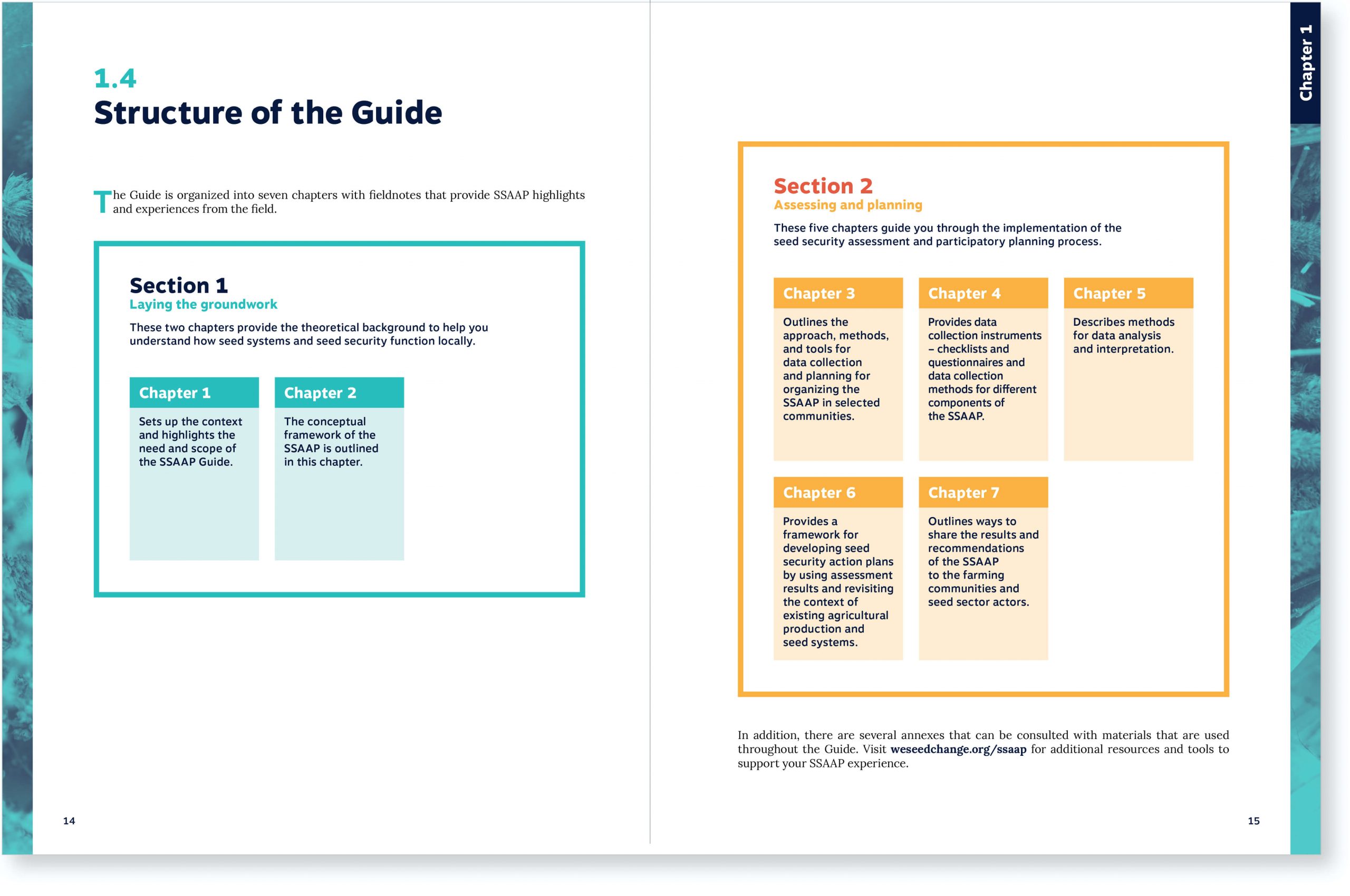
The guide is divided into seven chapters and accompanied by appendices. To create an explicit hierarchy, we first suggested dividing the guide into two large sections with distinct colors to separate the theoretical background from the implementation of the project.
In addition, we added the chapter number in all the margins of the document, allowing the user to quickly navigate from one chapter to another.
Each section has been fully developed using tones of the color associated with it.
Section 1 is in blue, a cold and neutral color for text that introduces theory and the overall context of the project. Orange and red, warm colors, are used in section 2 because it takes place in the field, in direct contact with people, soil, and seeds.
Initially summarized in the form of a short written paragraph, the structure of the guide has been redesigned to become a visual and colorful tool for understanding the guide.
Before
A human touch
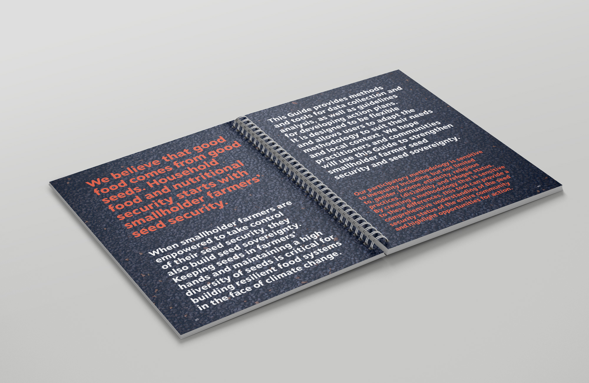
The guide covers specialized concepts, so it is possible that the reader would want to understand its raison d’être right from the start. We suggested adding two pages which would explain this in simple terms. The text, written in large letters and superimposed on a background image, is inviting and attracts the attention of readers.
SeedChange offer their technical assistance to those who would like to implement the methodology. With this in mind, we invited them to add a page in the first section to inform the user and promote their services that complement this tool.
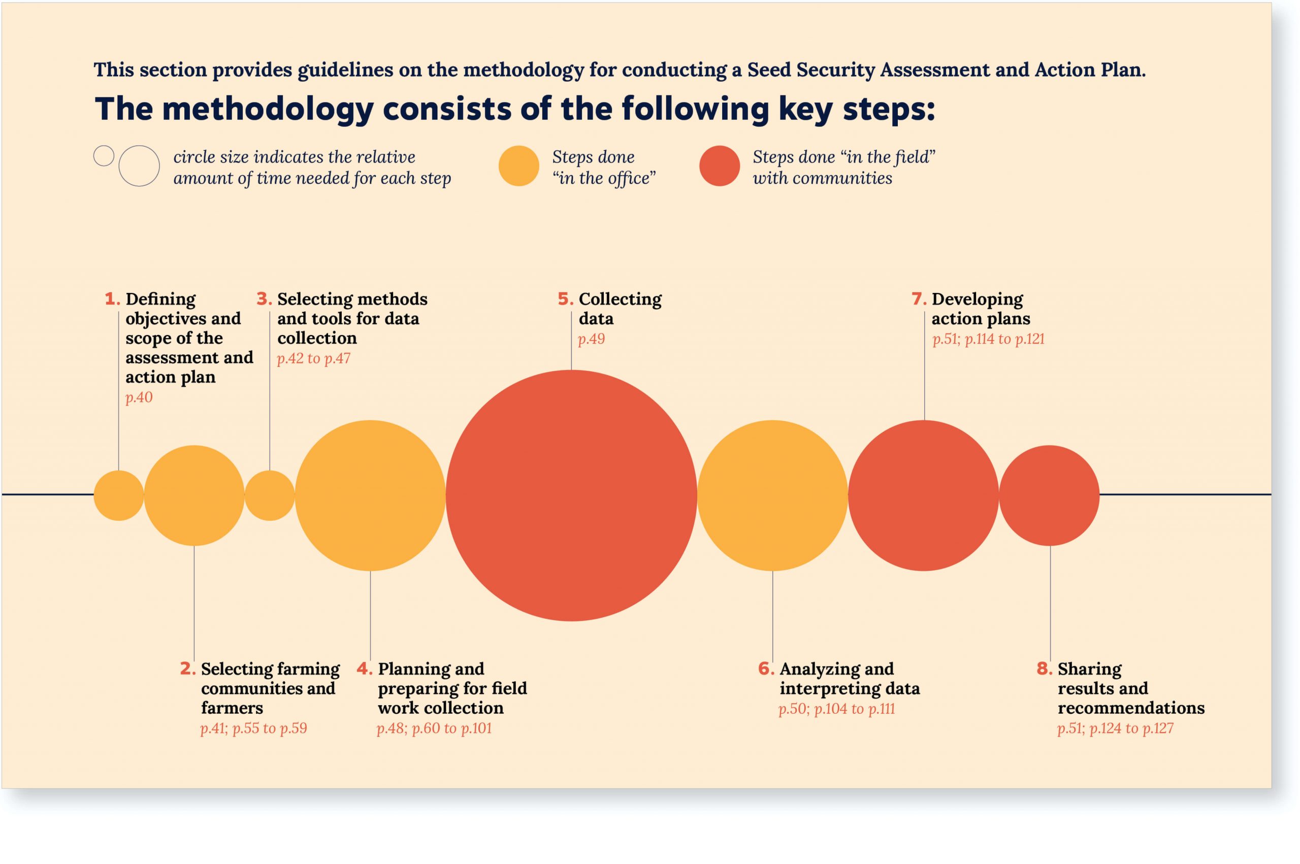
Structuring the steps over time
To understand the extent of each work step and the context in which it takes place (in the field? at the office?), we created a timeline with approximate time references.
Each stage is represented by a circle whose area expresses an approximation of the time and the work necessary for its completion. The sum of all stages equals 100% of the work accomplished.
This timeline allows the user to get a sense of what the whole process will be like and to prepare for what to expect at each stage.
It is also repeated several times in the guide to give a sense of the progress that has been made.
Declinations
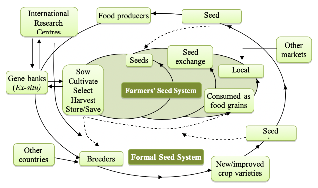
Visualising a complex system
This first diagram needed to clearly show the structural differences between two systems as well as emphasize how they influence each other.
Blue and orange coloured backgrounds clearly distinguish the two systems, quickly providing a general structural understanding of the diagram.
System actors are arranged in a more structured way which makes the graph feel simple despite the complexity it communicates.
The farmer is clearly identified as the main actor in this context.
Orange arrows are used to emphasize exchanges between the two systems.
Before
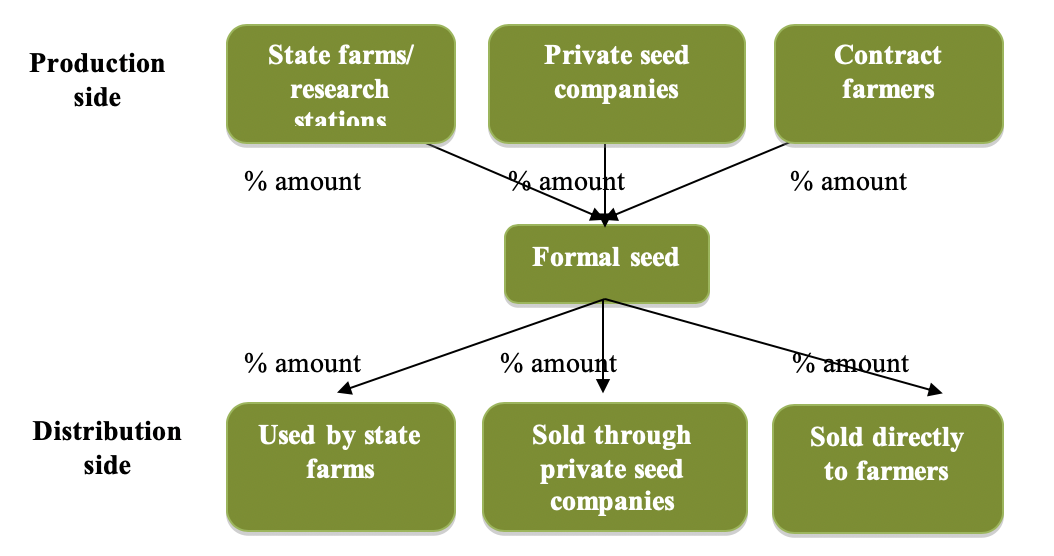
Facilitating system analysis
In order to understand the characteristics of the system supplying their seeds, participants use this diagram to record the proportion of contribution of the different seed producers and distributors. The diagram had to be easily reproduced using basic shapes available in word processing software.
The diagram now flows from left to right to represent an advancing process.
The red and orange arrows are not horizontally aligned because they are not related.
A lighter shade is used on the “Others” arrows because they are optional
“Farmers” were added on the right to contextualize the diagram
Before
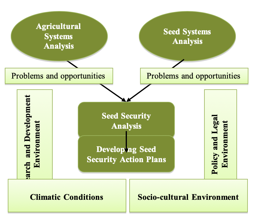
A process for taking action
The goal of this diagram was to visualize the four stages of the assessment process and how they related to each other. We wanted the visual to feel elegant and dynamic.
The stages of the process are emphasized using dark blue.
The 3 analysis phases are arranged like stairs and are an increasingly dark colour. This implies that each phase builds on the last, constructing a more complete picture.
Visualising the action plan phase as an arrow shows that it has an impact on the future
In the corners, are the factors that influence the process. They are in low contrast with the background so that they are perceived as part of the environment
Before
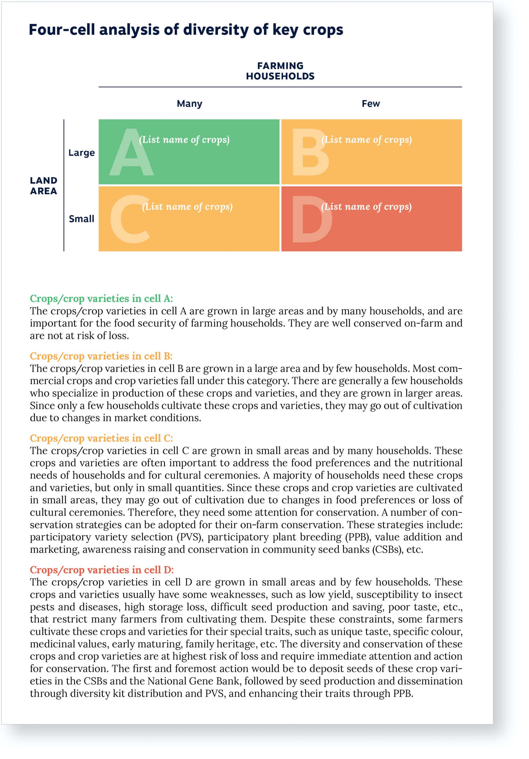
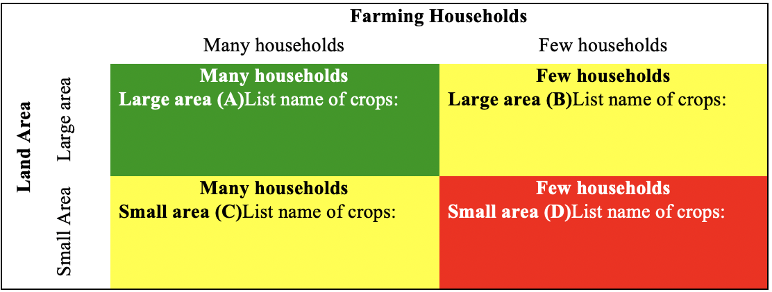
Four-cell analysis
This diagram appears several times in the guide to allow the user to assess the diversity of key cultures. It is divided into four cells each of which is associated with a color that communicates whether the situation is positive or negative.
We redesigned this diagram using the colors from SeedChange’s brand guidelines.
Previously, the title of each of axis was repeated inside the cells. We removed them and left only the instructions.
The letters, which correspond to the sections of explanatory text below, have been enlarged to better guide the user. Likewise, the titles of the user manual have been changed to the color of the associated cell.
Before
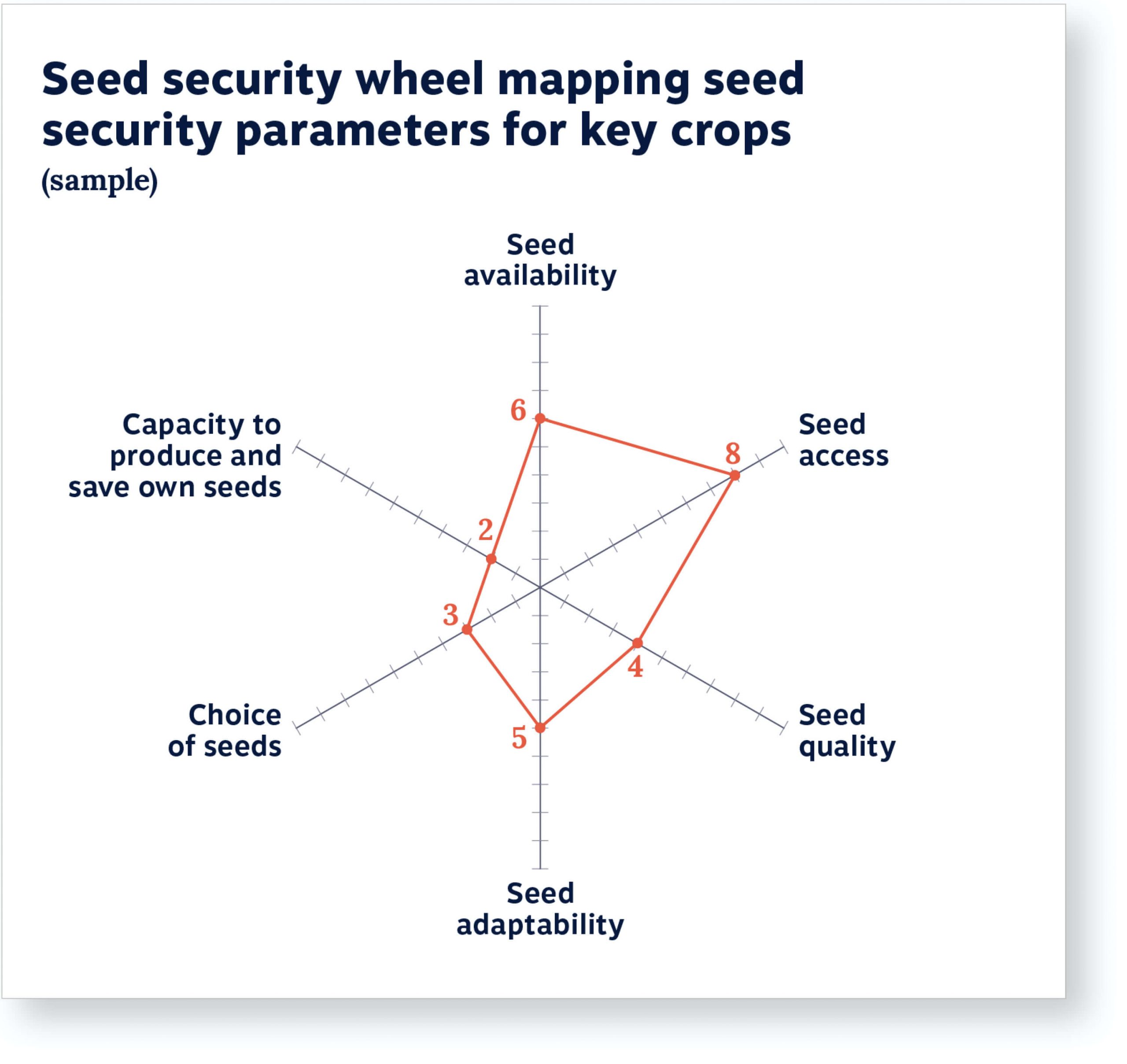
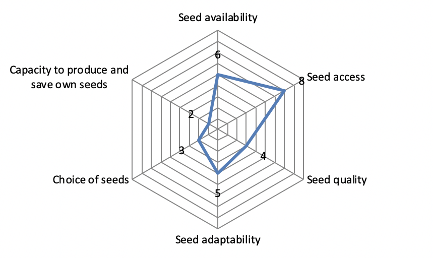
Radar chart
This graph is used to visually assess key parameters of seed security. Originally drawn in the form of a spider web, the diagram encouraged the user who wanted to copy it to draw a large number of lines that were not necessary for the analysis of the data.
We removed the “spiderweb” and kept only tick marks along the main axes.
In the initial graph, the axes originating from the center of the canvas started at 1, which was confusing. In the new graph, the center is 0.
The data labels in the example are now the same colour as the line drawn between them. They are also marked with a dot, for improved readability.
Before
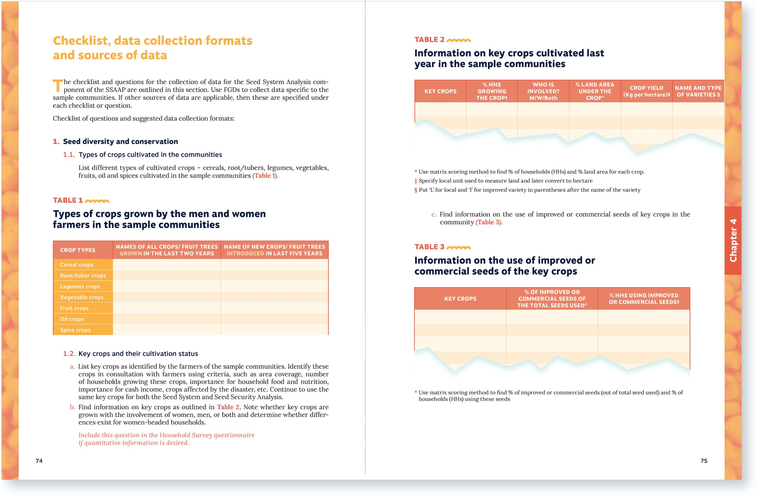
Tables
The guide includes a very wide range of tables that the user can recopy and fill in. Some of these tables must be reproduced as is. Others may have a variable length depending on the user’s situation.
To mark this distinction, we added a torn appearance to the tables of variable length. This gives a sense that only a portion of the table is shown and encourages the user to extend the table freely.
About the guide
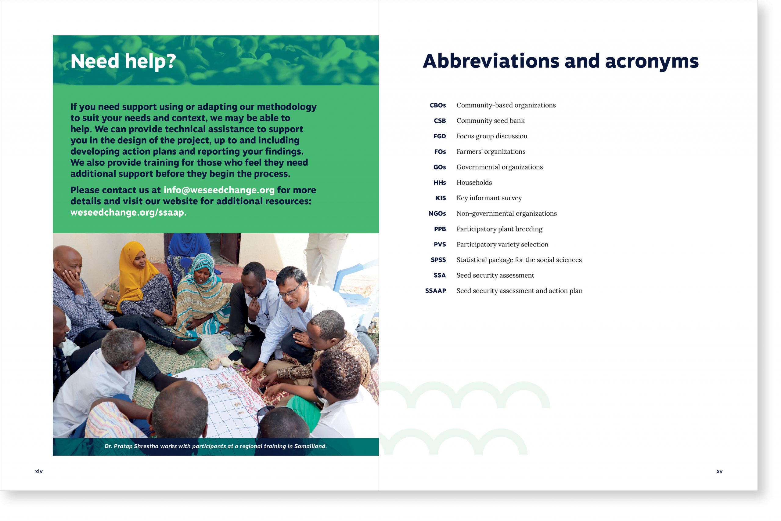
Since the guide’s summary was dense and long, it was not appropriate to put it on the back cover. In order to preserve this content, we invited the reader to open the guide to obtain all the necessary information about its content just inside the back cover.
Client feedback:
“This has been such a huge project for us (and I’ve only been involved for 3 years) and we have really struggled with the presentation of so many complex ideas and instructions in a guide like this. I’m sure we will have comments on the details once we all sit down and go over this, but overall it looks SO GOOD and I am so happy to see all of our hard work finally come to this point! There are so many design elements that really support the reader through their engagement with the text and I can see how this will add tremendous value to the guide.”
Julia Laforge, Knowledge Management Research Fellow at SeedChange