Interpreting the Do No Harm guide through a Canadian context for Truth and Reconciliation

Patricia Angkiriwang
September 30, 2021

How do we approach and present data responsibly, with intention and purpose? The Do No Harm Guide for data visualization, published by Jon Schwabish and Alice Feng (Urban Institute) earlier this year, presented a set of guidelines for visualizing through a lens of equity awareness.

To apply the Do No Harm Guide, Schwabish and Feng emphasize that the guide is not a one-size-fits-all set of rules, but rather should be adapted to particular needs of a project and organisation. 

As September 30th is the National Day for Truth and Reconciliation here in Canada, I was curious to see how this guide can be applied to local contexts of reconciliation, equity, and Indigenous issues. Here, I share five takeaways from the Do No Harm guide and connect them to some reflections, learning resources and examples.

At Voilà:, we hope this is just the beginning of these conversations, and that this will spark more questions, thought, and dialogue.

1. Acknowledge the context and histories that shape the issue you are visualizing. 

It’s important to think critically about not only the data behind the visualizationDo No Harm Guide, Chapter 5, but also the context in which that data exists.

When creating a data visualization around a certain issue, think: what factors have shaped inequities, injustices and disparitiesDo No Harm Guide, Chapter 1 when it comes to this issue? These factors could be policies, institutions, or actors, as well as histories of abuse, racism, discrimination, and others.

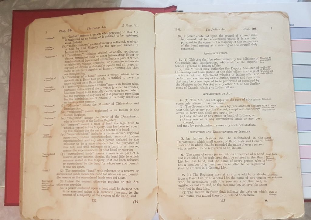
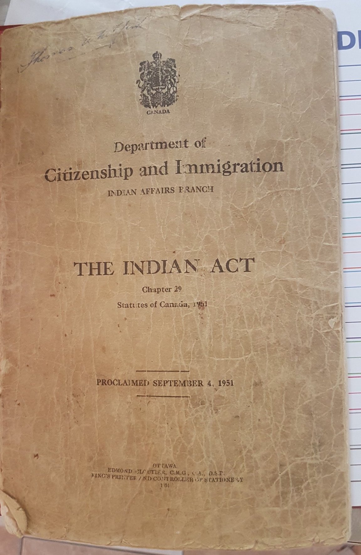
When it comes to reconciliation, the ever-present elephant in the room is the Indian Act of 1876, which included policies on residential schools, reserves, and the many, many legacies that followed. Whether it be issues on housing, food insecurity, languages or education, we’d be hard-pressed to find an issue that isn’t touched by these histories in some way.

Then, acknowledge this history and context in the way you communicate your data. This means incorporating this acknowledgement in your data visualization, infographic, or in the text that accompanies it.

The Do No Harm Guide frames all of this as part of the dataviz process, rather than an extra optional step. So, next time you create a map of levels of education in your province, for example, take a few minutes to do some digging to see how this issue may have been influenced by colonial policies and histories. It isn’t a waste of time, but simply part of the work.

A yellowed copy of The Indian Act. On the cover: "Department of Citizenship and Immigration. Indian Affairs Branch. The Indian Act, Chapter 29." Photograph courtesy of @LawladyINM
Photograph courtesy of @LawladyINM

Here are some resources to get you started (a non-exhaustive list):


Here at Voilà:, we’re taking some time to inform ourselves as well. On our to-watch list this week are: this 45-minute documentary on residential schools by Al Jazeera, and a selection of films on residential schools curated by the National Film Board (NFB).

2. Remember that data reflect the lives and experiences of real people. 

As people who create visualizations of data, it is our responsibility to help our readers understand this.

This can be through reminders of who the data points representDo No Harm Guide, Chapter 2, reintroducing empathy in the data experience through faces and photographs. A piece by CBC news on Missing & Murdered Indigenous Women, for example, displays cases of missing women through both an abstract representation, as well as through profiles and stories.

Or, we can let the readers locate themselves in the data. The popular Native Land app, for example, allows readers to search for where they live. By looking up the land where they are situated, they can find their own connection to the people who have taken care of that land since time immemorial.

Similarly, the First Peoples’ Map of BC connects readers with Indigenous languages, arts, and culture by allowing them to filter and zoom into their geographical areas of interest.

Above all, keep in mind that “Indigenous peoples” is a monolithic term. Inuit, Métis, and First Nations all fall into this umbrella, but comprise a wide diversity of people. Of the large number of First Nations, for instance, the Canadian Encyclopedia states that there are 634 First Nations in Canada, speaking more than 50 distinct languages.

3. Wield your power carefully, and present data with intention

Remember that our framing of a certain issue (what we choose to focus on and what we choose to ignore) can influence the self-perception or treatment of the people represented by the data, as well as bias our reader’s perceptionsDo No Harm Guide, Chapter 3 of the issues we are visualizing. It is imperative that we wield this power carefully.

Sometimes, the topic we are visualizing will require us to embrace complexity. Instead of pretending as if data were neutral or objective, sometimes we will need to weave in context from diverse voices, taking the opportunity to lift upDo No Harm Guide, Chapter 11 people’s voices and lived experiences, to help the reader better understand the topic at hand.

Visuals themselves also hold a great deal of influence. We must also be aware of how anything from colourDo No Harm Guide, Chapter 9 to the ordering of our dataDo No Harm Guide, Chapter 7 can encode meaning, whether or not that meaning was intentional. Be wary of using icons that depict or reinforce stereotypesDo No Harm Guide, Chapter 10, show people as helpless victims, or reinforce power hierarchies.

4. Think about your language

Although we work in the world of data visualizations, visuals are not the only thing we create. Our data are presented with titles, subtitles, labels, captions, alt text, and much more.

It is important that when we refer to people, we identify and use the terminology they preferDo No Harm Guide, Chapter 6. When referring to a specific community, it is best to use the name that community (or First Nation) prefers, or uses publicly.

The tricky thing is that language evolves: what we think is acceptable may no longer be the preferred terminology to use today. There’s no shame in double-checking.

Here are some resources and style guides we found, when talking about Indigenous peoples and groups:


The use of language can also be an opportunity to use traditional place names whenever we create a geographical map. A beautiful example of this is the breathtaking map Coming Home to Indigenous Place Names in Canada by cartographer Margaret Wickens Pearce, which celebrates ancient and recent Indigenous place names through cartography.

Other examples of mapping current traditional place names include the interactive Pan Inuit Trails map, this Place Names program in Nunavut, the ʔəms gɩǰɛ (Our Land) map by Tla’amin Nation, and an Ojibwe perspective of the Great Lakes (Nayanno-nibiimaang Gichigamiin).

The Coming Home map by Margaret Wickens Pearce

5. Whenever appropriate, research and tell stories with communities, not on behalf of them. Don’t assume– ask.

Although this adviceDo No Harm Guide, Chapter 4 seems to be more tailored for research and data collection, I wondered if, and how, we might engage with people in a visualization project.

Just as visualization relies on subject matter expertise, it should also rely on knowledge of the communities whose stories are told through charts.

When visualising a topic centering around a particular group of people or place, it could still be important to build relationships with the communities involved. This allows you to get meaningful feedbackDo No Harm Guide, Chapter 13 (just don’t forget to value, credit, and properly compensate people’s time!).

For this, reciprocity is critical. Be aware of research fatigue, and do your due diligence and educate yourself before you burden others with the responsibility of teaching you.

Here is a list of relevant links to start with, should you decide to collaborate and research with Indigenous communities:

There is much more in the Do No Harm guide that is not covered here, so I hope you’ll take a look and see what parts you can apply to your own contexts and work.

For those of us in Canada, there’s a lot here to be learned about how we can take concrete steps to improve how we visualise data with intention, purpose, truth, reconciliation. Let’s keep the conversation going.

Patricia Angkiriwang

Patricia Angkiriwang

Patricia Angkiriwang is a data visualisation developer and information designer at Voilà:. She is responsible for developing interactive data visualizations and designing visuals for client projects.
Facebook
Twitter
LinkedIn

You might be interested

Do you like to be informed?

Share our discoveries and follow our work by subscribing to our newsletter.

We will be happy to help you reveal your worth. Here is how you can reach us.