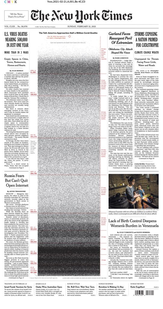
The more I think about today’s front page of the New York Times, the more it is for me another watershed moment for data visualization. But not for good reasons.
This graph is confronting us with the limitations of data visualization to convey tragedies.
Tragedies like COVID-19 deaths happen at the individual level. One death is a person who did their 2nd grade homework, helped their brother out of a ditch, broke up on New Year’s Eve, lied to their kids and then apologized. To their relatives, friends and coworkers, they are a full person. To a chart, they are a dot.
The NY Times introduces the graphic this way:
“It began with one dot. Then it grew to nearly half a million.”
The reality is more that it began with one person and it grew to half a million dots.
When three people are murdered, they each get a profile: name, age, race, job and more. When 500,000 die, they each get a dot.
Turning a person into a dot, which is what data visualization does by nature, is the opposite of conveying the tragedy of death. 500,000 deaths are not made 500,000 times bigger than one, they are made smaller than a single death.
The New York Times explains its graph this way:
“But unlike the previous approaches, Sunday’s graphic depicts all of the fatalities. “I think part of this technique, which is good, is that it overwhelms you — because it should,” Mr. Gamio said.”
But it doesn’t overwhelm. Quite the opposite: it puts it within our grasp. One visual, read in a few seconds. No dwelling on any single one of them. It plays into, in fact it activates the collapse of compassion. The tragedy is now emotionally manageable.
As the camera zooms out, each individual needs to be made smaller and smaller to fit in the frame. And each becomes a mere dot. If the United States reach 600,000 deaths, the tragedy will have grown, but the visualization will remain the same size and every individual will have to partake a smaller share of the space.
Data visualization is good for showing aggregates, for revealing trends that are invisible to individual experiences. But it does not reveal these individual experiences. It loses its power with the accumulation of individual tragedies.
—
There are other issues with this particular visualization.
There is no point of focus, there is no position for the reader. We don’t know if these people resemble us, are close or far from us. There is no grouping that would help us seize the people behind. No age, no level of education or income. Only the time of death, this great equalizer fed through the great equalizer of data visualization. And then we have 500,000 dots.
 The fact that the graphic doesn’t take the full page, as opposed to the thousand names of the May 2020 front page, is yet another unfortunate signal. This time, it shares the front page with tennis news, dog training and online shopping. Giving it less space suggests that even the NY Times team is getting numb to the scale of the tragedy.
Another issue is the focus on deaths to assess the COVID-19 impact. It is so much more than this, even from a strict health perspective. Using the 500,000 numbers is reductionist to convey how many people have been affected by this illness. The long COVID, the weeks or months of suffering and recovery, the near-death experiences, the reduced lung capacity for life, the unknown impact on vital organs, etc. All of this is made invisible by this graph supposed to show the extent of the pandemic in the United States.
—
But more than a critique of the NYT’s front page, this is yet another realization of the limitations of data visualization, of my own craft. This is about the proverbial hammer seeing nails everywhere. What needs to be done may not be a data visualization.
Perhaps a full profile of the 500,000th death. If we want to use the data, perhaps a collection of 50 profiles proportional to the distribution of deaths in the population, by age, by race, by level of income, etc. Something that reveals individuals.
But not 500,000 dots.
Francis Gagnon is an information designer and the founder of Voilà: (2013), a data visualization agency specialized in sustainable development.


