10 things I’ve changed my mind about

[publishpress_authors_box layout="ppma_boxes_13147"]
June 12, 2024

To celebrate 10 years of Voilà:, here are 10 things I’ve changed my mind about since I started out as an information designer.

Original view
1. Beauty isn’t always crucial in data visualizations 

Around 2012, I was working on redesigning management reports for an international organization. A colleague politely asked me, “Could we add a few colors, perhaps?” I told her no, that black and white with a touch of red was enough to communicate all the information. My charts were dense and not very pretty, but everything was legible and clear. I firmly believed that the information they contained was enough to make them attractive.

Today, however, I often repeat that we’re “communicating with humans”, and that humans like what’s beautiful. Beauty attracts and pleases us. It is an asset, even for those who seek only to communicate clearly to a targeted audience. 

Just as a nutritious dish needs to be delicious, an analytical chart needs to be beautiful.

Visualization extracted from a report showing the performance of four indicators, with line and bar graphs. All in black and white.
Like an old black-and-white TV.

Original view
2. Visualization is based on a set of rules

In 2011, armed with basic knowledge of dataviz, I began teaching the immutable rules of visualization, based on the research in visual perception.

Eventually, however, as participants kept asking me good questions, as clients kept showing me that my rule didn’t work for them, and as I kept observing that a cast out practice worked in other contexts, I changed my mind. Visualization is not a set of rules to be followed. It’s a flexible language that allows us to make choices. 

Want to make a pie chart with 24 points to show that these are parts of a whole? Well, go ahead! You’re absolutely right: this will make it very clear that these are parts of a whole. You lose clarity and precision in the presentation of the data, that’s all. It’s up to you to decide what you want to communicate first.

Today, in our training courses, we still present certain “rules” because I also believe in giving simple, concrete tools to neophytes who only have a few hours to devote to this subject. But if they challenge us and explain that they can’t apply this “rule”, we simply explain the trade-offs involved.

A pie chart with 9 different, brightly colored points and a legend that defines these colors. There is no title and the points are in random order.
Go ahead and enjoy!

Original view
3. A good chart should be understood in a few seconds

I’ve seen many examples of complex charts that take some getting used to, but then reveal a finesse of analysis that simple charts can’t provide. 

An obvious example would be Hans Rosling’s animated bubbles. Even in a video lasting just 4 minutes, he takes 50 seconds to explain each component: axes, colors, bubble size, chart zones, etc. The result: you understand things you’ve never understood before.

It can be surprising to see the media publish complex charts. After all, the public must not have the patience to decipher them. And yet, these graphics captivate an audience that enjoys discovering their codes and messages. Their curiosity is stimulated by the elegance of a complex visual that is well worth the effort.

My philosophy now is that every graphic should reward the effort put into it. If it provides little information, then indeed it must be simple and intuitive. But if it can reveal something deep and complex, then it can be as complex as necessary, even if it takes a while to understand how it works.

Extract from Hans Rosling's first TED talk. We see him in the half-light in front of a large screen on which appears a scatter-graph with "1962" written in the middle.
This chart wasn't easy to understand—and that's okay.

Original view
4. Edward Tufte is a prophet/ obsolete

In 2004, I was preparing a course on political economy when, at the end of my rope, I searched the Internet for “powerpoint sucks” or something like that. That’s how I discovered PowerPoint is Evil and, at the same time, Edward Tufte and information design.

It was a revelation for me. I was discovering this combination of analysis and design. I devoured everything I could read on the subject. I was an instant Tufte fan.

It was through studying the field, practicing visualization, and listening to the community that I realized that Tufte represented only one strand of information design. His methods, his convictions, and his teachings are not the whole story.

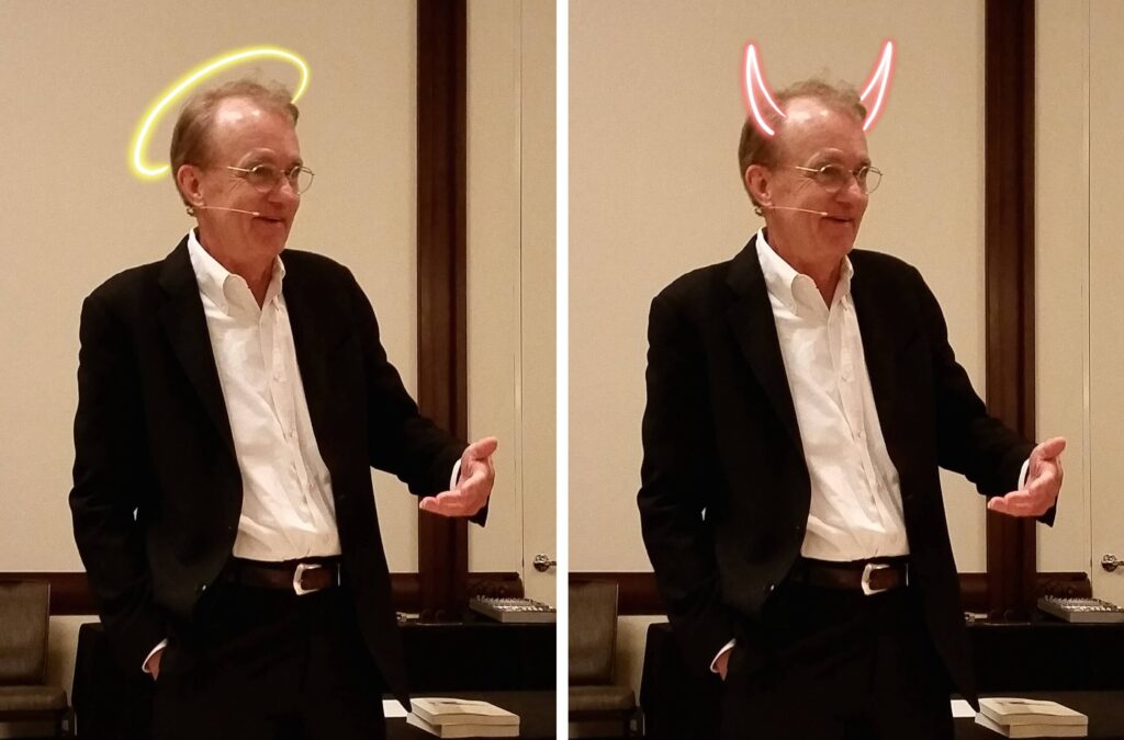
Just as it’s common to fall in love with Tufte’s teachings when discovering information design, it’s quite common afterwards to turn against him and the limitations of his teachings.

No wonder. His approach is dogmatic, unsupported by the evolution of knowledge and at best limited to a narrow context. It’s difficult to take him at his word.

But he remains a thinker and educator in the field who has contributed enormously to its visibility. You’ll find many specialists, from all walks of life and with a wide variety of approaches, who first discovered information design through Tufte.

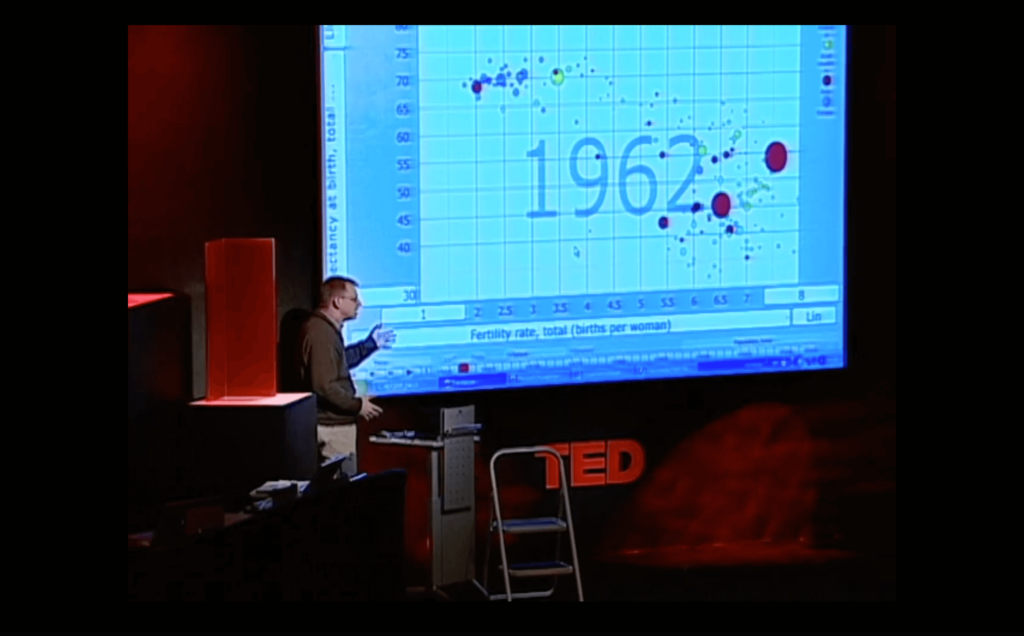
Above all, Tufte articulates very well why he loves information design. His thirst to understand and make others understand. His wonder at the classics of Galileo or Minard is contagious. His desire to make data speak, to discover in it something invisible to the naked eye through visualization, and then the opportunity to communicate it. All of this is still relevant today.

First image: Edward Tufte, standing, talking with a microphone attached to his ear. He has a halo drawn over his head. Second image: Edward Tufte, standing, speaks with a microphone attached to his ear. He has a devil's horn drawn on his head.
None of the above. (Source: Wikimedia)

Original view
5. People are too busy to read complex content

This is undoubtedly one of the subjects where I stand most at odds with popular opinion.  All I read is that we have to be shorter, simpler, to the point because people just don’t have time anymore™.

But it’s not true. Information workers read all day long: e-mails, reports, newspapers and so on. Dozens of hours a week reading.

The real problem is the quantity of information that is presented to us. Our attention is a hot commodity. The challenge for content producers is not brevity, it’s relevance and quality.

If you’re interesting, if you’re relevant, if you’re funny, if you’re good, you’ll be read. The bar is higher than it used to be, but people have just as much if not more time to read as ever. Don’t make it shorter — make it better.

A man sitting on a wooden park bench, hiding behind the newspaper he's reading.
Too busy to read. (Source: Unsplash)

Original view
6. The product speaks for itself

When I first started in the business, I’d receive my clients’ material by email, then do my work, which I’d email back to them: the design, the layout, the graphics. I’d wait a few days for their reactions. Very often, too often, their feedback reflected a lack of understanding of my approach.

It was only after 7 years of practice that I started organizing meetings to present the first version of our work. This allows us to explain ourselves directly and, above all, to answer clients’ immediate questions before they get too deep into their perceptions.

If you’re interested in this approach, I’ve written down a few tricks we use today to convince our customers.

Cover page of the World Bank report "The Economic Case for Nature".
To convince, aim for Inbox Zero.

Original view
7. Training courses help you become an information designer

I started giving visualization training courses with the idea that participants would apply the practical principles communicated.

I changed my mind once I started working with former participants as new clients. I was surprised to find that many of the basic principles, although clearly demonstrated, discussed, and applied in exercises, were apparently forgotten a few months later.

So what’s the point of training courses?

It’s to introduce a few people to the field, who will then be inspired by what they learn. To identify the people in a group who have a sense of information design and who are going to want to delve deeper into this subject that seems so interesting, so obvious even. Organizations need to capitalize on these people to become internal resources, rather than expecting everyone to become an information designer.

Another benefit of training for organizations is to create an openness to change in the corporate culture. Participants may not actively remember everything, but they now have a passive knowledge that the usual ways of doing things are worth revisiting. That there are gains to be made by changing visualization methods. That’s why I firmly believe that managers in particular need to attend these training courses.

Francis Gagnon giving a training session to half a dozen people. Everyone is seated two by two at tables, and Francis listens to them while standing in front of a whiteboard with a drawing of a chart.
Looking for information designers.

Original view
8. To be an information designer, you need to master several skills

Data collection, management and analysis, design, writing, programming, aesthetics, typography, colors and the list goes on. Information design is at the confluence of multiple fields.

For a while I thought, and I still often read, that you have to master them all to be an information designer.

It’s true that some stars in the field combine these talents. I’m thinking of Moritz Stefaner, Shirley Wu, John Burn-Murdoch, Gregor Aisch and many others. We call them unicorns.

But there are also many stars with very specific skills. Giorgia Lupi and Stephanie Posavec don’t program to my knowledge. Mike Bostock is known for creating the D3 programming language. Cole Nussbaumer Knaflic focuses on teaching. Alberto Cairo plays a leading role as a thinker and community connector.

The important thing is to find your place, your strength. Look for what excites you and avoid what bores you. Be the best or simply very good at what you do, and your market will find you in your zone of genius.

You don't have to do this. (Source: Wikimedia)

Original view
9. In a chart, words are less important than the visual

The visual is what jumps out at you when you see a graphic. That’s what contains the encoding. It’s normal to have the impression that it’s the most important. That’s what I thought at first too.

But to understand this visual, you have to read the text. It’s this text that gives meaning to the shapes, which in turn are often already seen—a pie with many points, a trend line pointing upwards, a histogram of normal distribution.

I’ve seen incomprehensible three-column graphs. On the other hand, I’ve seen connected scatterplots illuminated by a few annotations. 

At Voilà:, sometimes the text takes us longer to develop than the visuals. How should the title be formulated? Scale? The unit? The caption? In some projects, this was the main challenge.

Shapes communicate data, but text communicates meaning.

This chart by Georgina Sturge shows the number of grants of asylum or other forms of humanitarian protection, by refugees' country of origin, in each year since 1989. The height of each 'stream' represents the number of grants of asylum to that nationality in a given year. In each year, the streams are ranked from top to bottom, by number of grants. Not all nationalities are shown. The data show a high level of activity in the early 2000s and now in the early 2020s.
Some charts live and die by the word. (Source: House of Commons Library)

Original view
10. Information design is growing by leaps and bounds

When you enter a new field, it’s hard to know whether it’s growing rapidly, or whether you’re just discovering it as you go.

Information design makes so much sense to me, its value so clear, that I initially anticipated exponential growth in a very short amount of time.

Well, yes, information design is growing, but it’s more gradual than I expected. More linear, let’s say. For example, I wouldn’t have imagined that Canadian media would evolve so little in 10 years. I also imagined that more technical reports with good information design would soon be the norm, not the exception.

Today, information design is still a little-known niche, so much so that at Voilà: we now mostly use “data visualization” to refer to our work.

This service will continue to grow, its value undeniable. I simply expect that it will continue to evolve at this steady pace, and that it will take a long time to reach all those who could benefit from it.

Line graph from 2013 to 2024, then to the infinite future. An exponential growth line is labeled "Prediction 2013" e. And goes out of frame before 2024. Another is labeled "Perception 2024" and shows linear growth to 2024, then becomes a dotted line with the same linear growth rate labeled "Prediction 2024".
Does one bad prediction lead to another?

Have you changed your mind too? About what and how? Let’s discuss.

Francis Gagnon is an information designer and the founder of Voilà: (2013), a data visualization agency specialized in sustainable development.

[publishpress_authors_box layout="ppma_boxes_13235"]
Facebook
Twitter
LinkedIn

Discover our most recent thoughts​

Do you like to be informed?

Share our discoveries and follow our work by subscribing to our newsletter.

We will be happy to help you reveal your worth. Here is how you can reach us.