One of our objectives at Voilà: is to promote information design, especially in Montreal. When data viz Prof Thomas Hurtut from Polytechnique Montréal offered us the opportunity to advise a group of students during their semester project, our answer was an enthusiastic “Yes!”
For our contribution, we offered a list of potential topics related to sustainable development, and two consultations: one at the concept phase and one at the polishing stage.
What to visualize?
Amongst our suggestions, the students chose to create a series of visuals related to the environmental impact of the food industry. A great choice!
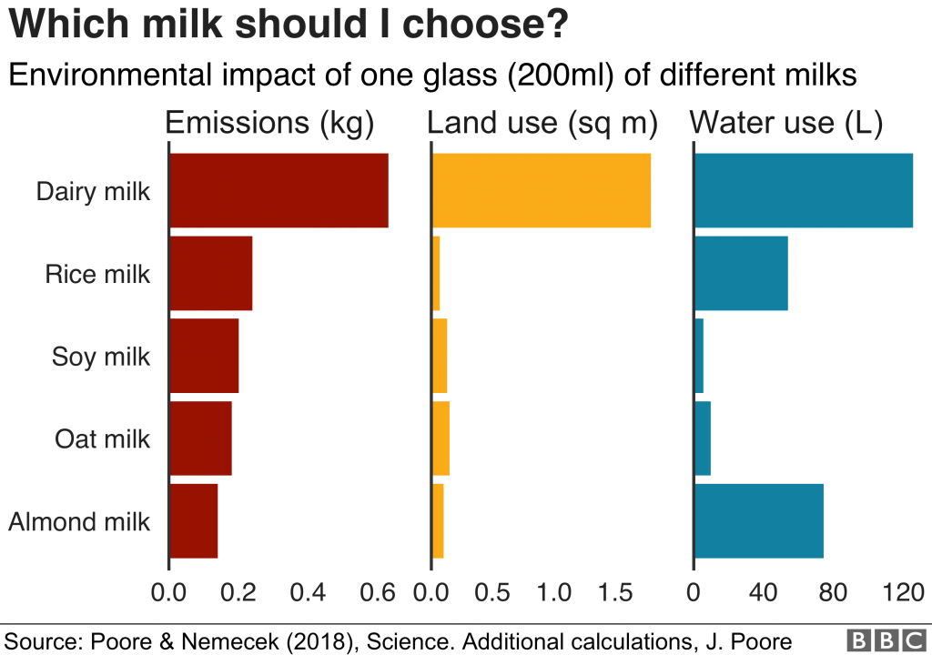
At this point, most are aware that eating animal products has a larger impact than eating plant-based, but what’s cool about this topic—well, not so cool—is that many don’t realize how MUCH higher. As a quick example, below is an impact comparison of dairy with a couple of plant-based milks:
(Give oat-based chocolate milk a try!) In light of this, the students’ goal was to raise awareness about how food choices we make affect our climate using data mainly from Our World in Data, based out of Oxford University.
Initial ideas and introducing interactivity
We were excited for our first meeting where we would see their initial visualisation ideas! This was the point in the design process where there was the most flexibility, so we could be the most creative.
Interactivity was a requirement for the project, but all the same we encouraged the students to use this power wisely. Since there was a lot of food emissions data to explore, we suggested they could use interactive features to give the audience a way to see themselves in the data, thus creating engagement. In the final design, the students created a section for users to pick a meal they could have for supper. This choice then affects which ingredients are emphasized in the food emissions data.
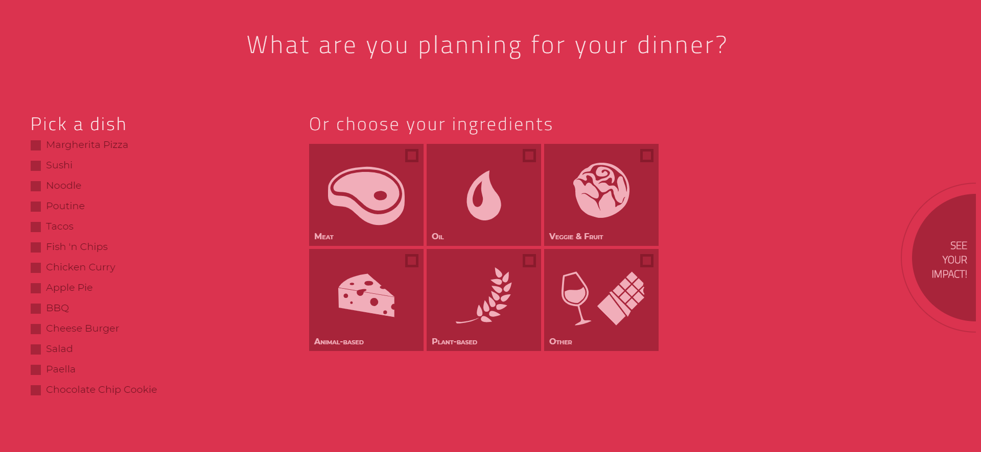
Discussing interactive designs was especially fun. Most of the visuals we produce for clients are static, so through this collaboration we got a chance to stretch some rarely used design muscles.
Polishing and wrapping up
Once the project was almost complete, we held another virtual meeting with the students to see if we could help them resolve some of the last issues. There was less opportunity to make changes, but it also meant that we could see how the student’s vision would pan out. The narrative flow, the general design choices and most of the interactivity of the final version were already in place.
Once the project was completed and marked (they got a good mark!), we worked with the students to implement a few of Prof Hurtut’s recommendations and our own so as to share it here with you.
The final food adventure!
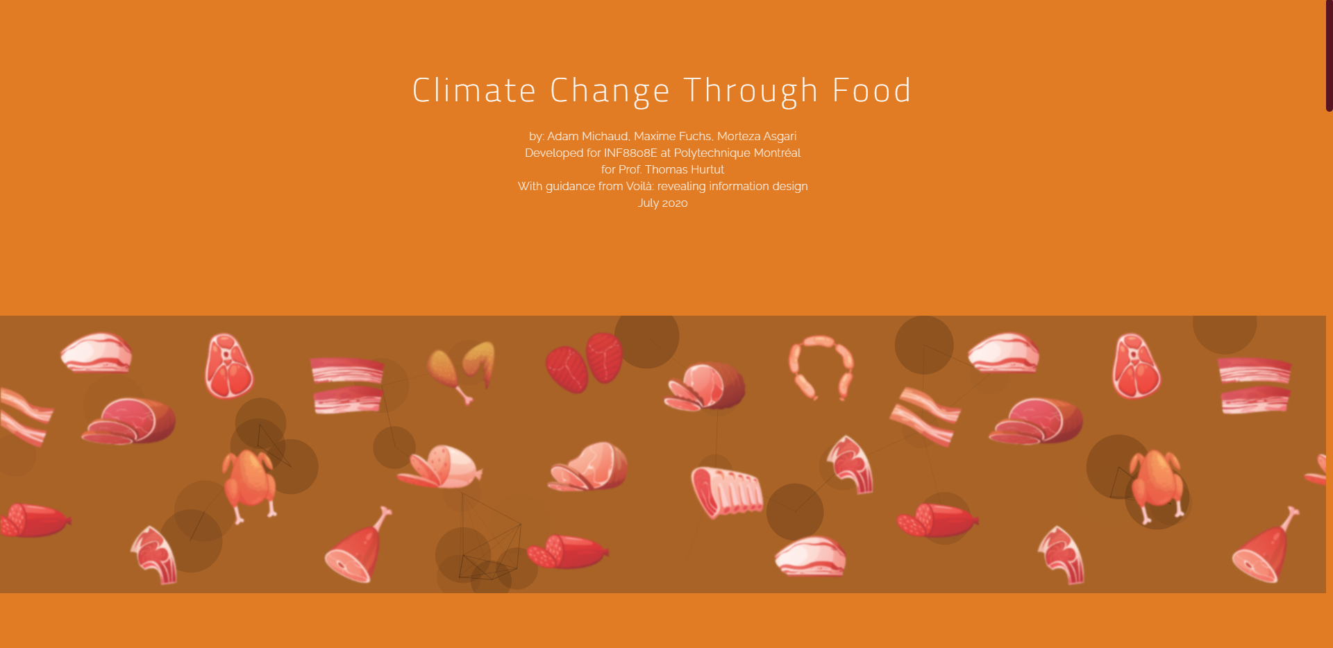
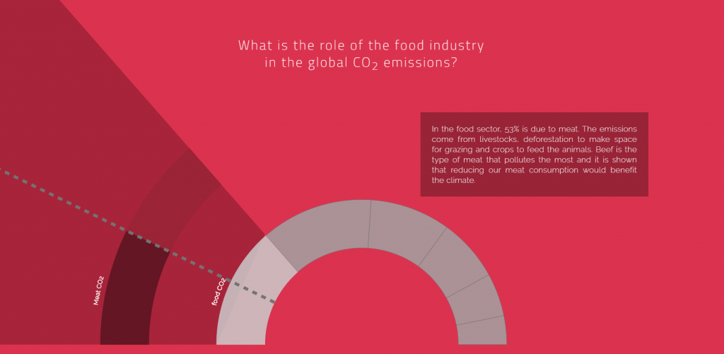
The students have worked hard over the past weeks and we’re happy to be able to share their final product with you: A colourful interactive scrollytelling experience illustrating the impact of food choices on climate change. If, like us, you’re curious about how your eating habits score, you can check out the full visualisation.Congratulations Morteza, Adam, and Maxime!
Technical tidbits
The visualisations were developed using JavaScript and D3 (a JavaScript visualisation library). You can find a copy of this project’s code on GitHub.
Erica designs and develops visualisations and proposes improvements for existing ones. She also researches and writes about information design, along with helping to organize activities and formalize processes at Voilà.
