A page, an illustration, a few paragraphs. The result appears straightforward, but it is only the final step in a long process full of detours and dead ends. Here we share the decisions we took while developing a recent illustration (in a more or less chronological order) including what we would do differently next time.
To demonstrate a new weapon in our arsenal, we decided to design our first scientific illustration project related to the main topic that motivates us: sustainable development. We started by exploring current events: scientific magazines, press kits, articles published recently … Until we agreed on the subject and the format: a poster about the precious and fragile bees whose high mortality rate has been a problem for several decades.
Choose an angle, choose a target
Based on our understanding that the bee population is in decline, we decided the poster would list the causes. Influenced by the numerous articles on the subject, we had chosen our angle before even starting research on the project (Our first mistake! As we will see later). Our target audience was adults who enjoy reading popular science magazines.
Collect, sort, analyse
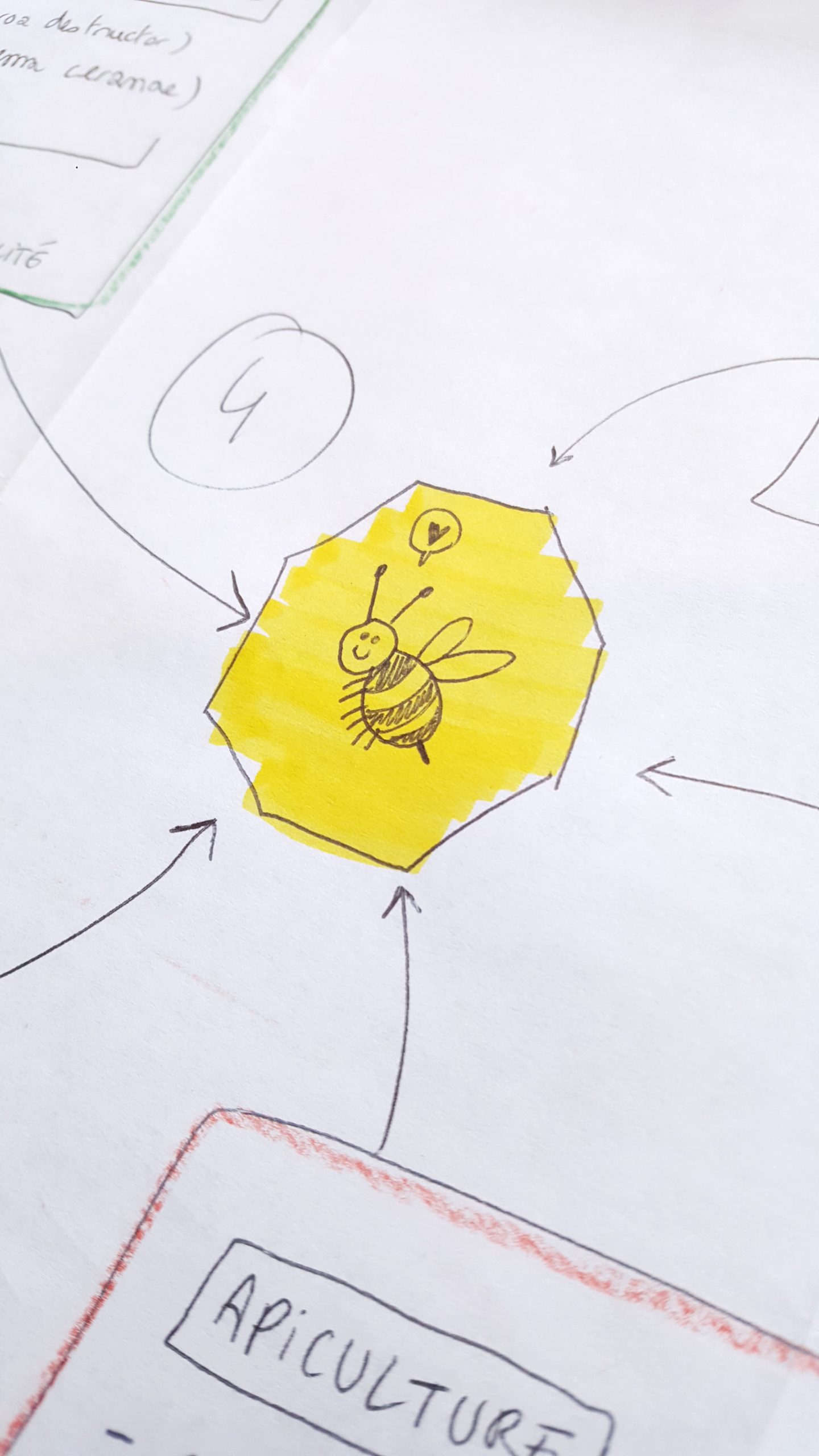
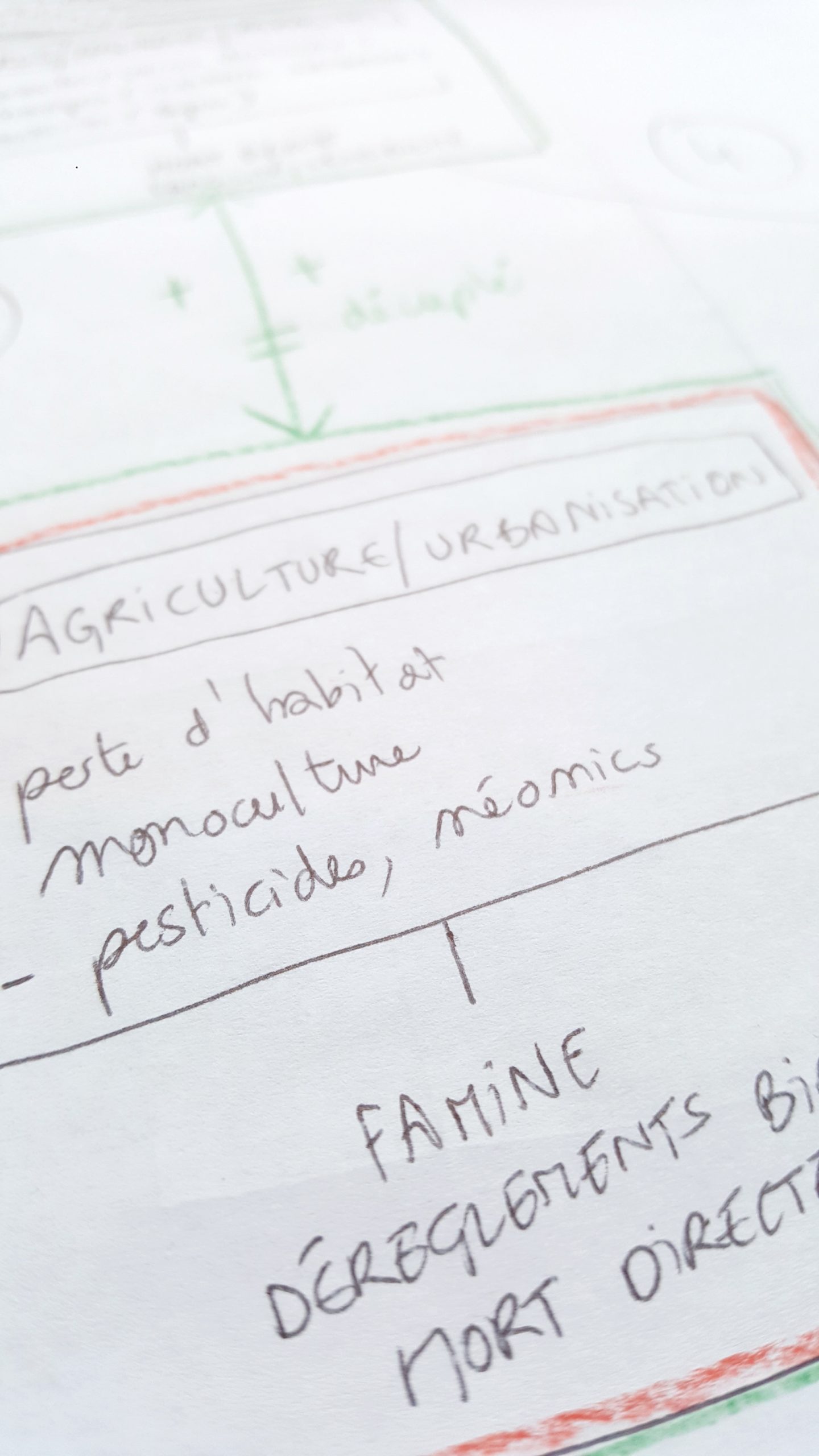
To get a good overview of the subject, we gathered a large collection of articles from the press, social networks, associations, and scientific institutions. This first quick scan of existing texts allowed us to start sketching a basic outline for the poster. It also allowed us to clarify our focus: Would we cover domesticated honey bees, or wild bees? We chose to speak about the decline of domestic bees because there was more information about them. We then left the tertiary sources aside to focus on more reliable texts such as scientific articles, studies, and press files published by institutions. All publications that were outdated or imprecise were discarded. After establishing our first detailed plan of the topics we wanted to cover, we wrote a first draft to make sure we were able to explain the topics clearly and precisely. As expected, this step revealed ambiguity and certain questions that, despite our research, remained unanswered.
We need an expert …
Who better to answer our questions and review our text than an expert on the subject? Through personal contacts in beekeeping, we found Martine Bernier, project manager in beekeeping at the Centre de recherche en sciences animales de Deschambault (CRSAD), who filled in the missing information in our first drafts by providing us with additional scientific resources.
… To avoid making mistakes!
When we asked “Are honey bees in decline?”, the expert replied: “No. They are domesticated. Wild bees are in decline. ”
By “domestication”, Mrs. Bernier means that the bee population is under control: if a colony dies, the beekeeper replaces it, thus maintaining the survival of the species. Domesticated honey bees therefore cannot be in decline.
Panic at the office: our angle was wrong! It was the first lesson we learned from the project; considering the complexity of the topic, we should not have chosen the angle by ourselves, but discussed it with an expert before getting started, to be sure we were building on a solid foundation.
Getting back on track
In response, we quickly formed a (two person) crisis unit to redefine our objectives and adjust our approach. In the end, we weren’t completely off the mark: although protected from decline, domesticated honey bees are not protected from humans. Both wild bees and domesticated honey bees bear the brunt of pesticides and disease. Once the content corrections were made, we reduced the length of our texts to make sure the poster would have a good text/image balance.
Tell a story
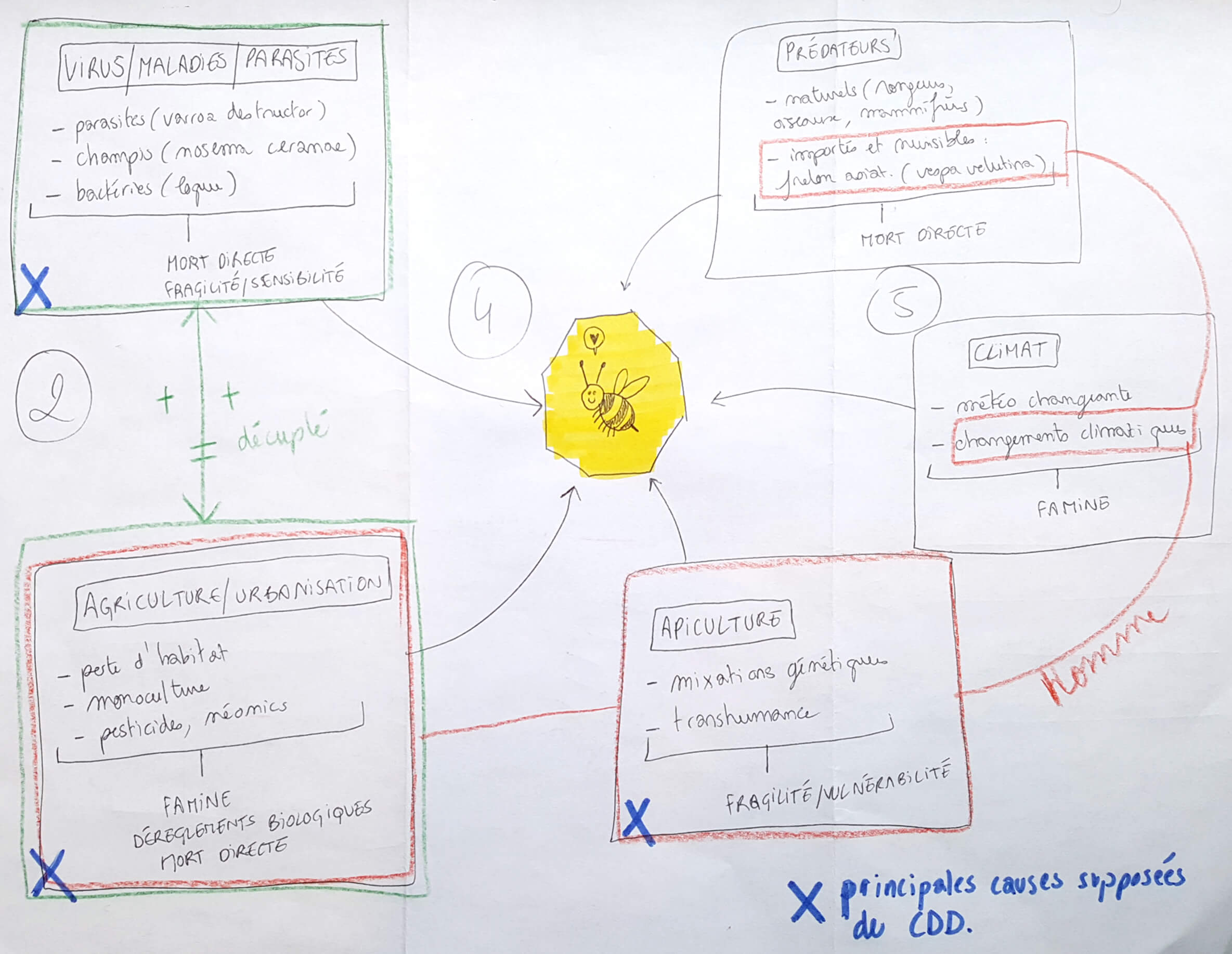
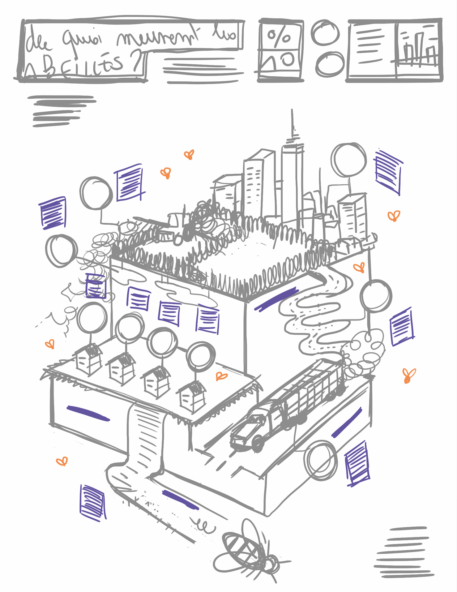
Bees are at the center of all the threats (diseases, parasites, predators, pesticides, transhumance, etc.), but how to illustrate all these causes without falling into the classic octopus layout?
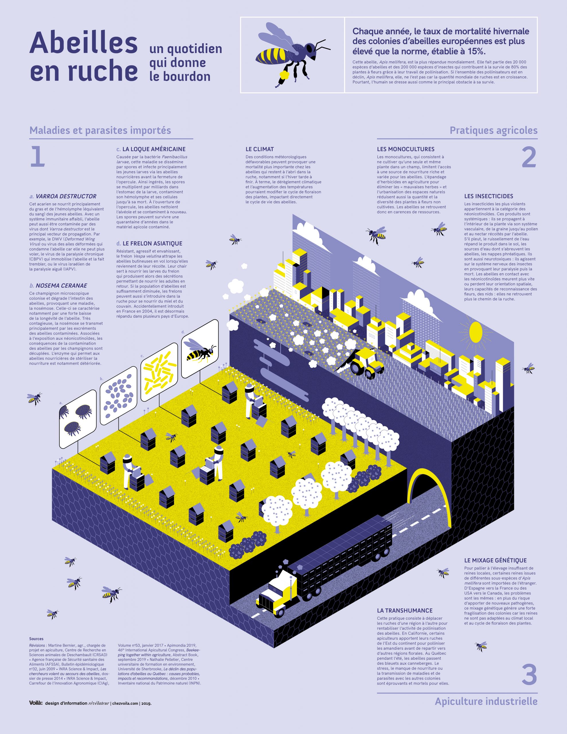
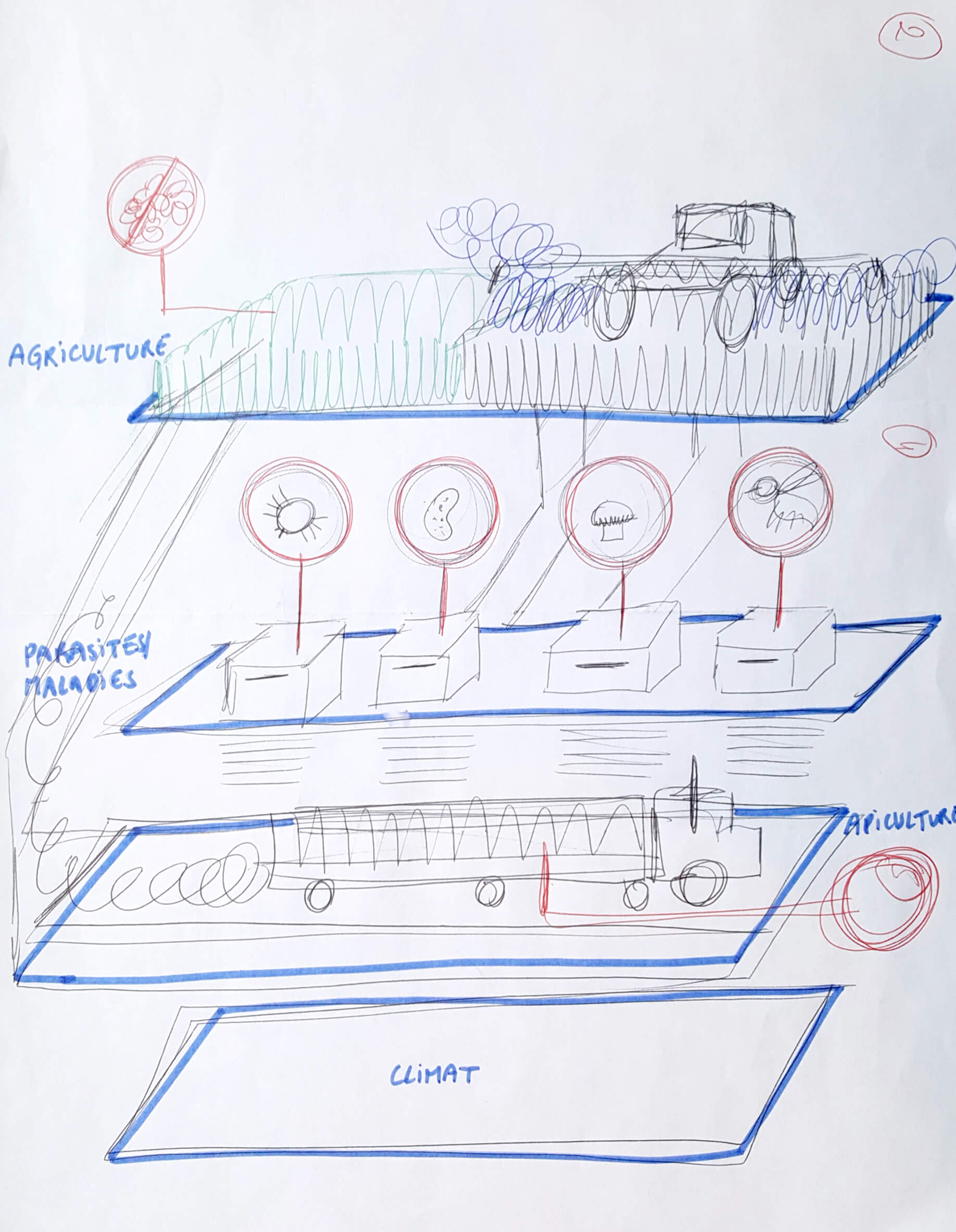
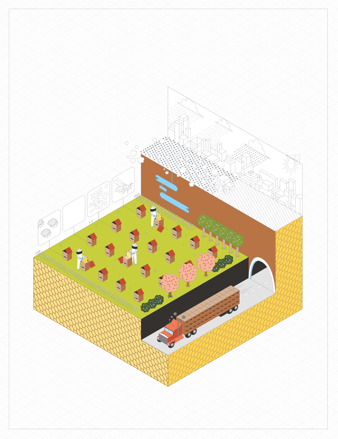
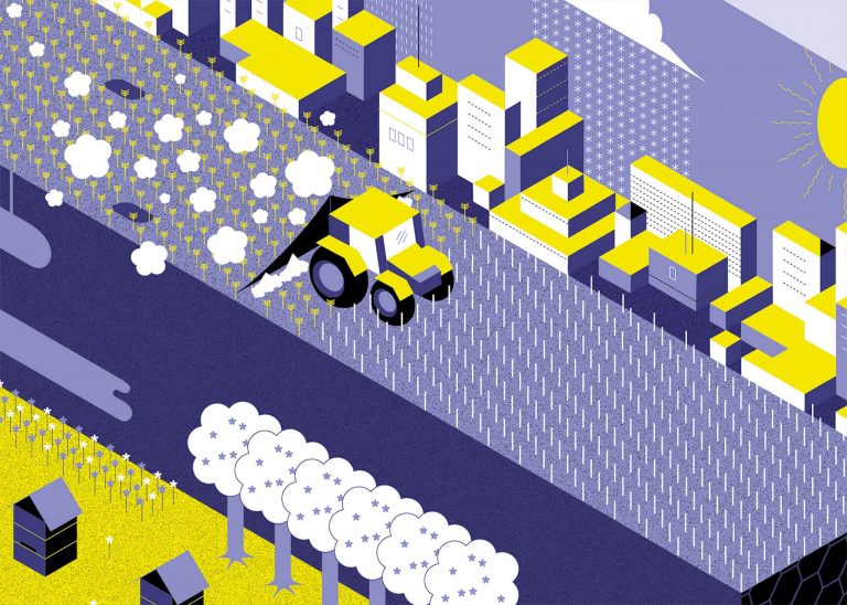
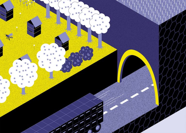
We wanted to explore a style of illustration that is neither too realistic nor too abstract which would reinforce the main message: bees have to constantly deal with multiple simultaneous threats. For example, while some colonies are devastated by varroa destructor mites, others are attacked by Asian hornets. Meanwhile, a tractor spreads pesticides on fields where only one species of plant is cultivated and a truck moves beehives to the other side of the country… Basically, we wanted to tell a story.
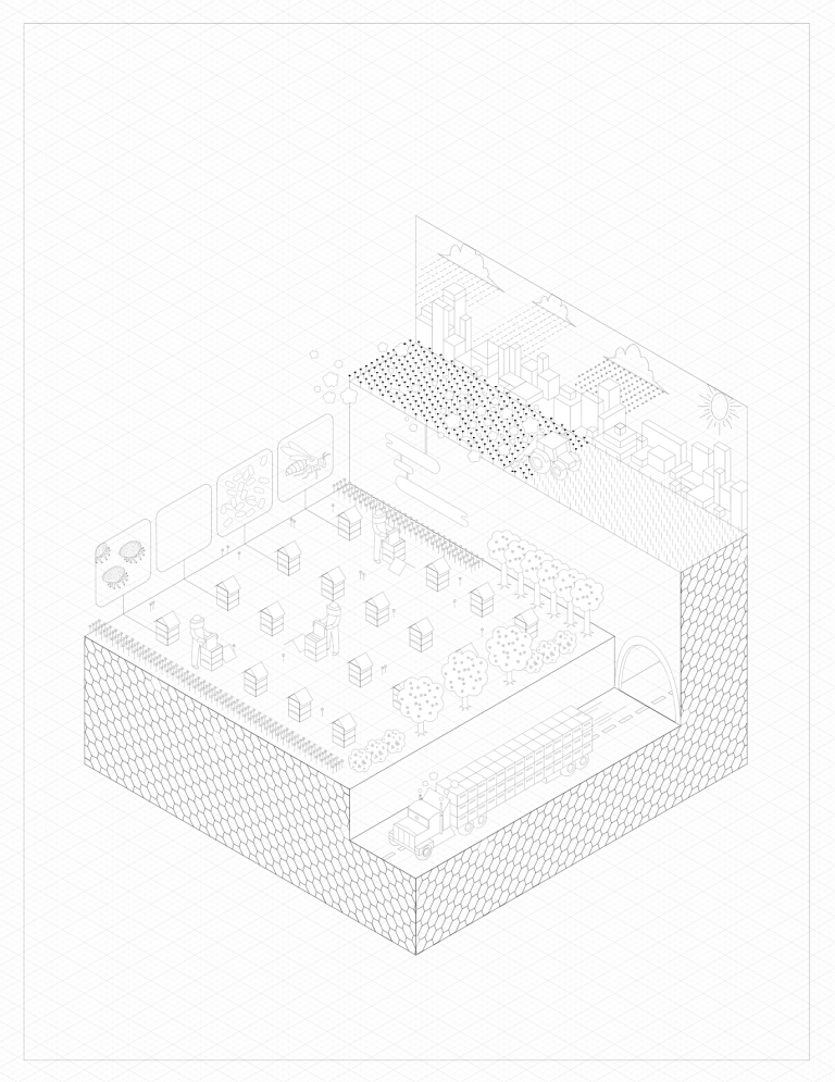
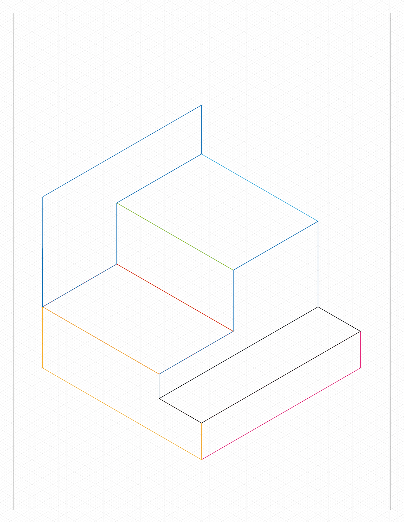
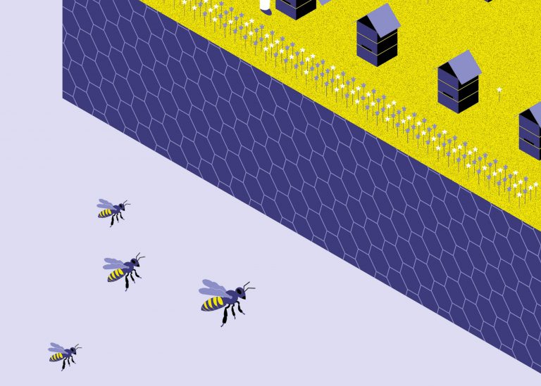
The challenge was representing all these scenes without weighing down the poster while also leaving enough room for the written text. For this, we turned to an isometric representation which would allow us to structure the drawing like a stack of legos. Each major cause of death would be ranked according to their degree of impact and placed on a “podium” whose cubic shape could resemble that of a beehive.
Draw
After building our isometric perspective grid, we asked Ms. Bernier to classify these major groups of causes on a 100% scale. We then noted that our initial draft was inaccurate and that the blocks had to be redesigned, even though this risked disturbing the design’s visual dynamism.
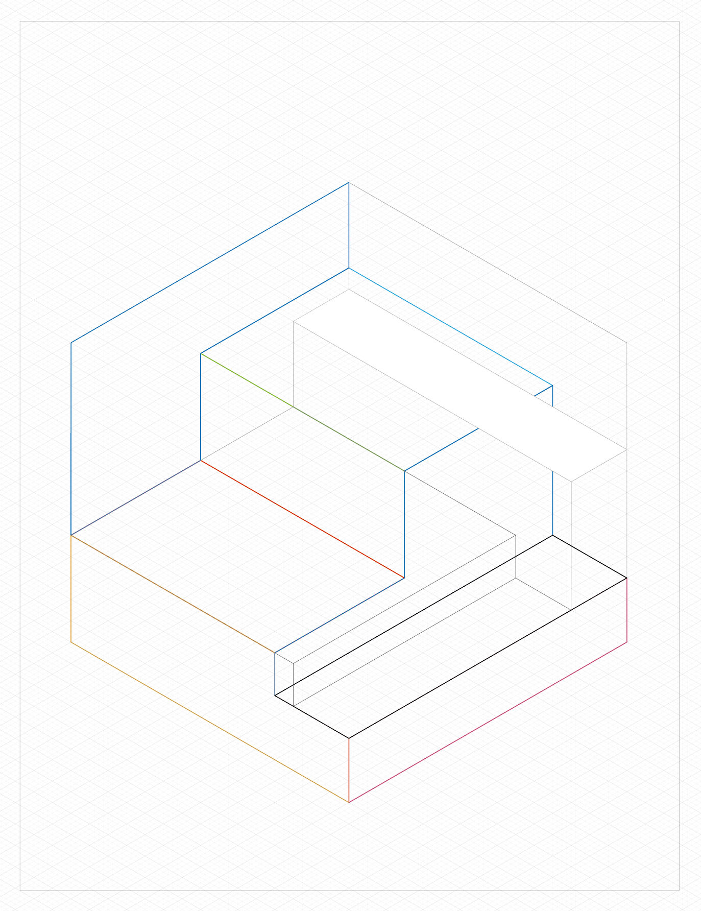
Once everything was to scale, the long process of detailing began: drawing trees, beehives, fields, the city, beekeepers… Just with lines at this point without worrying about color.
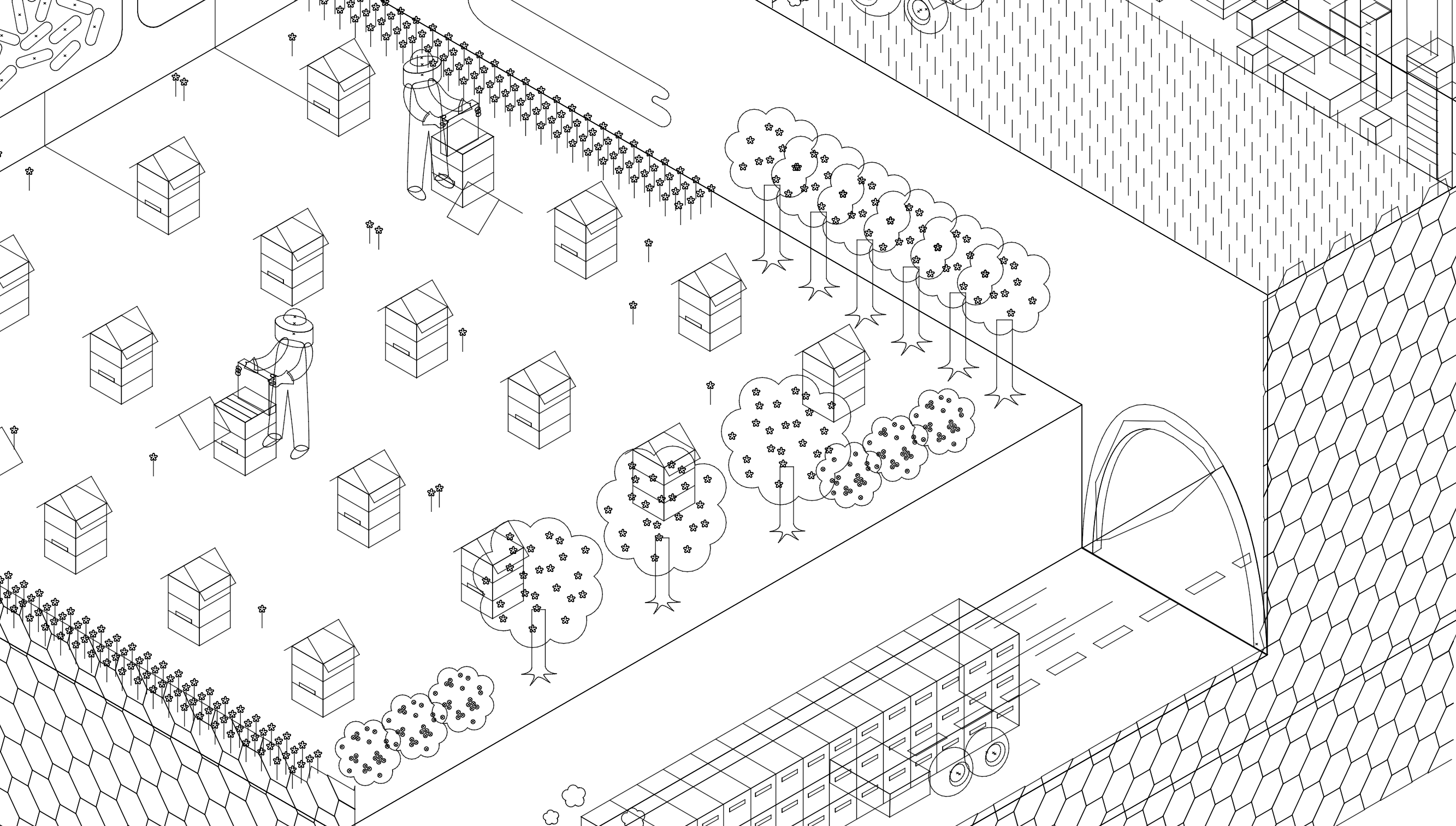
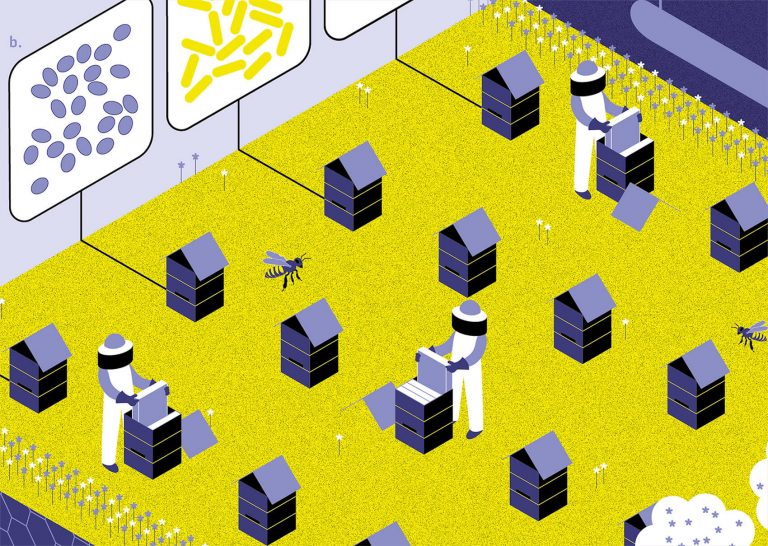
In order not to “humanize” the humans and so that the eye would not be attracted to the characters, we did not show faces and kept the silhouettes simple.
Adding Color
The detailed outlines were complete but the hardest part remained: choosing the right colors. As a reflex, we initially chose a realistic color palette — blue for the water, green for the grass, pink for the flowers and brown for the earth. But the feedback was unanimous, the illustration seemed like it had come straight out of a children’s textbook. How could we make the image more appealing to adults? How could it pack more of a punch?
We had to steer away from reality and be more adventurous with our color choice. Next we first tested a high contrast palette made up of mostly dark colors: black, dark blue and lighter blue-gray, accompanied by white and an acid yellow to brighten the image.
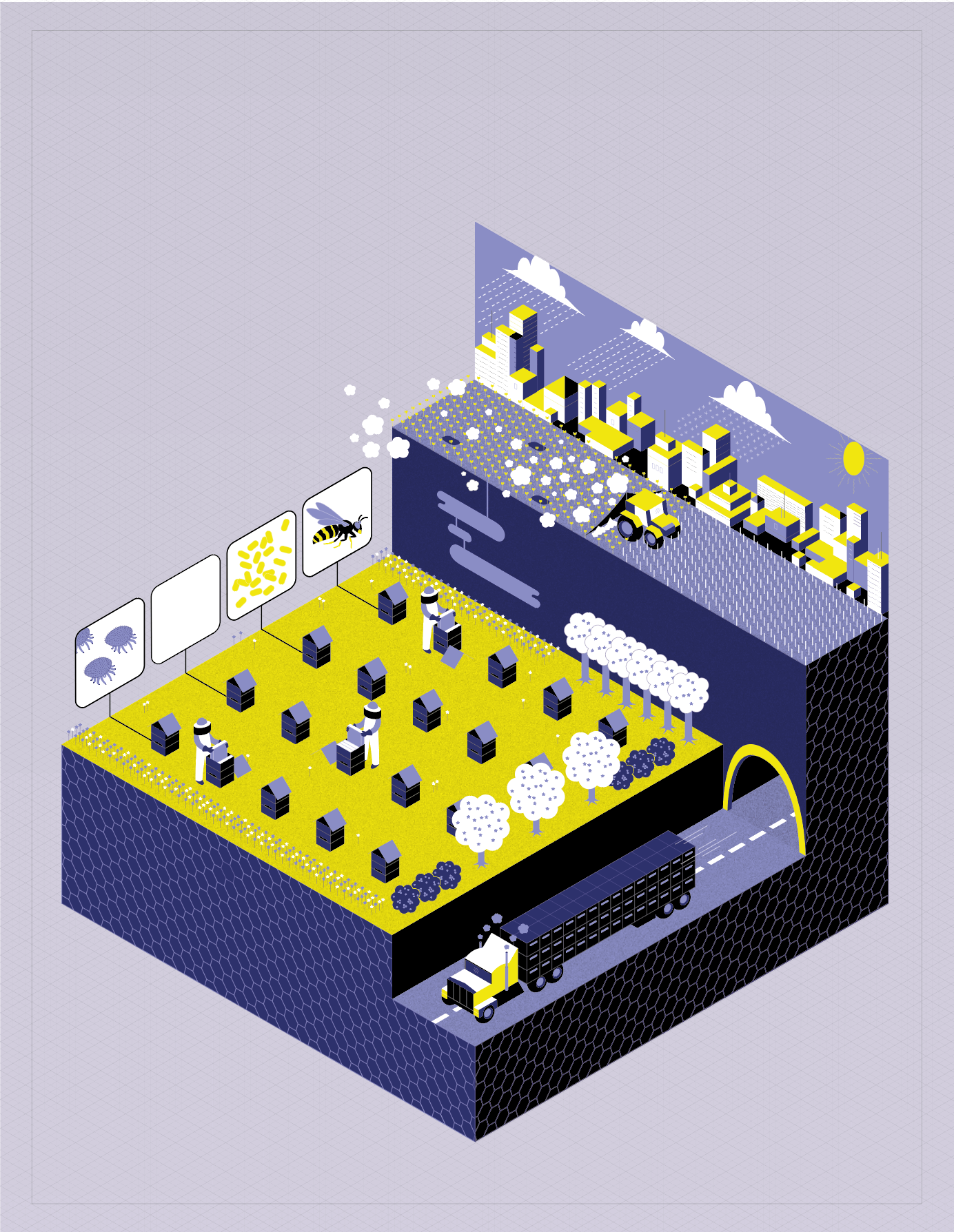
Add the text and correct
After choosing our colored background, all that remained was to place the text, which we also wanted to place in the same isometric perspective. But the paragraphs were too long and once placed on the isometric grid, they were completely illegible. In retrospect, the isometric grid should have been created based on how the text would look when placed on it. In the end, we returned to a more classic layout, with texts placed around the image and organized in three numbered groups to give the poster a hierarchy.
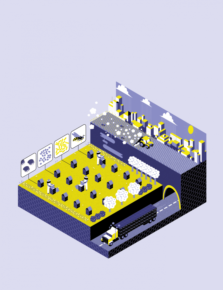
The illustration was still too imposing, so we removed the extra volume from the base of the “podium”. This also gave us more flexibility when it came to placing the text. We corrected the bacteria illustration and added one for fungi. We changed the city section of the illustration to give it more space in the image because the original drawing did not work.
We need a title!
It would appear that finding a title for a project is as difficult as doing the project itself as it took several days to make a decision. How to sum it all up in a few words while piquing the reader’s curiosity ? How to express the difficult daily life of a bee without putting all humans in the same basket? In the end, a French pun was up to the task.
Looking back
The first lesson we learned from this project is to think about the poster as a whole from the start. By designing the visual one step at a time (what to write, what to draw, how to color, where to place the text), we often found ourselves blocked by our own choices and had to compromise.
The second: let time help us take a step back! Five months after the creation of the poster and following the rebranding of Voilà:, we started a new set of adjustment for the poster:
- Colors replaced by those from our palette
- Grid readjusted to our standards, slightly enlarged text to improve readability at all
- Simplifying the city illustration, less intense contrasts for a less aggressive feel
- Zooming in on the insects and bacteria to improve clarity
- Subtle honeycomb pattern in the background and light gradation to gain depth in the image
- Bees, bees, and more bees!
Making this poster was a great exercise because it took us out of our comfort zone. This encourages us to explore new graphical representations to continue to diversify Voilà:’s service offer.
Estelle Villemin is a graphic designer and a scientific illustrator. Her role is to provide clear and aesthetic visual solutions that are tailored to the customer’s needs.
