Tracking Canada's progress toward Net Zero emissions
Is Canada on track to meet its 2030 emission reduction goals, and how far might it be from a path toward Net Zero? The Canadian Climate Institute conducted an independent assessment of Canada’s emissions reduction plan and came to us to showcase the results.
Clarifying the structure
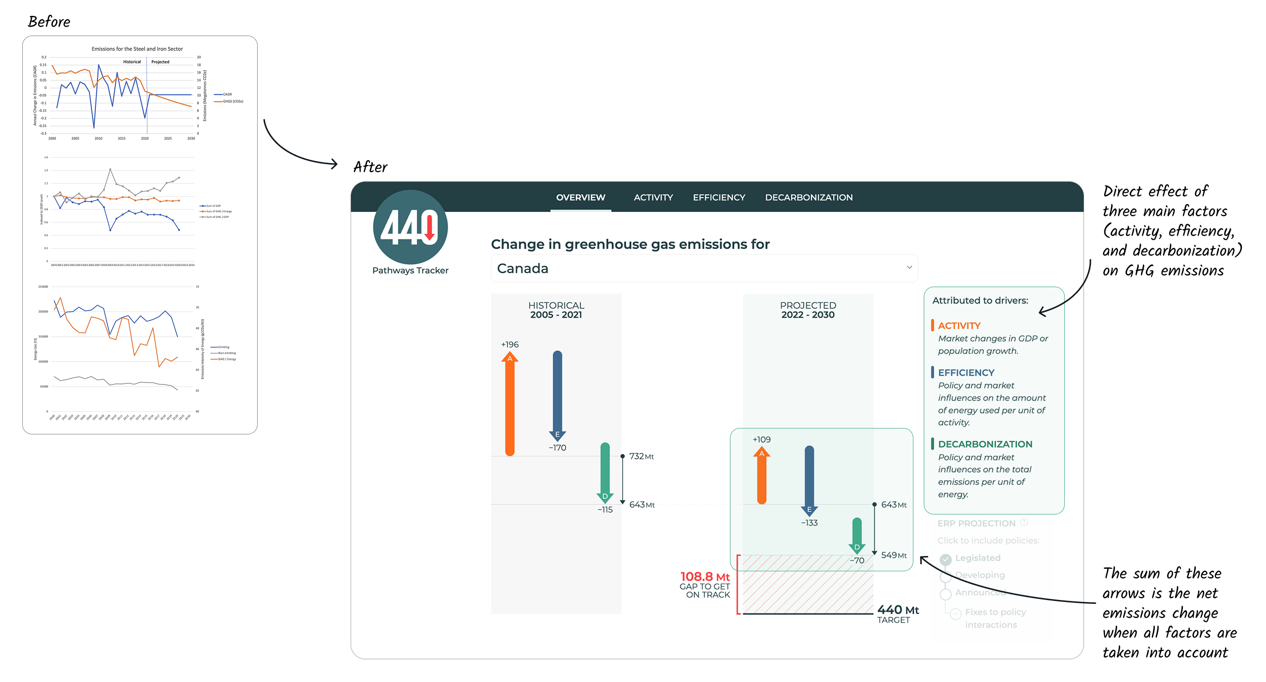
Before even drawing the dashboard, our first task was to make sense of the data prepared by the client. We proposed a reorganization based the Kaya equation by which we can calculate the emissions:
Activity: the amount of output
Efficiency: how much energy is needed per output
Decarbonization: the reduction in emissions per output
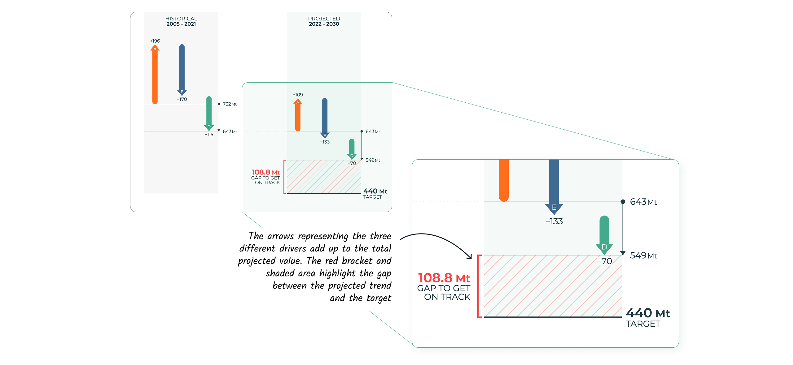
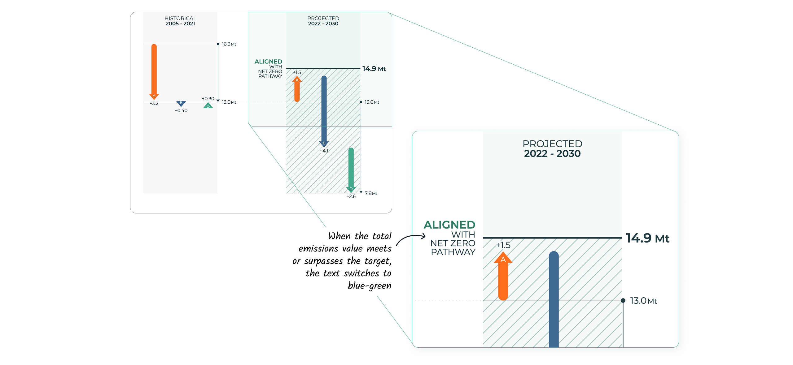
These factors are summarized in a custom arrow chart on the main page. The arrows show the cumulative impact that these changing individual factors have on greenhouse gas emissions both in the past, and in the future. Double-clicking on an arrow takes us to the corresponding page that presents the trends driving each factor.
Then the whole tool follows this structure, with charts visualising the data on activity, efficiency and decarbonization.
Annotations bring life to simple charts
A unique feature of the otherwise conventional charts in this dashboard is the use of custom annotations.
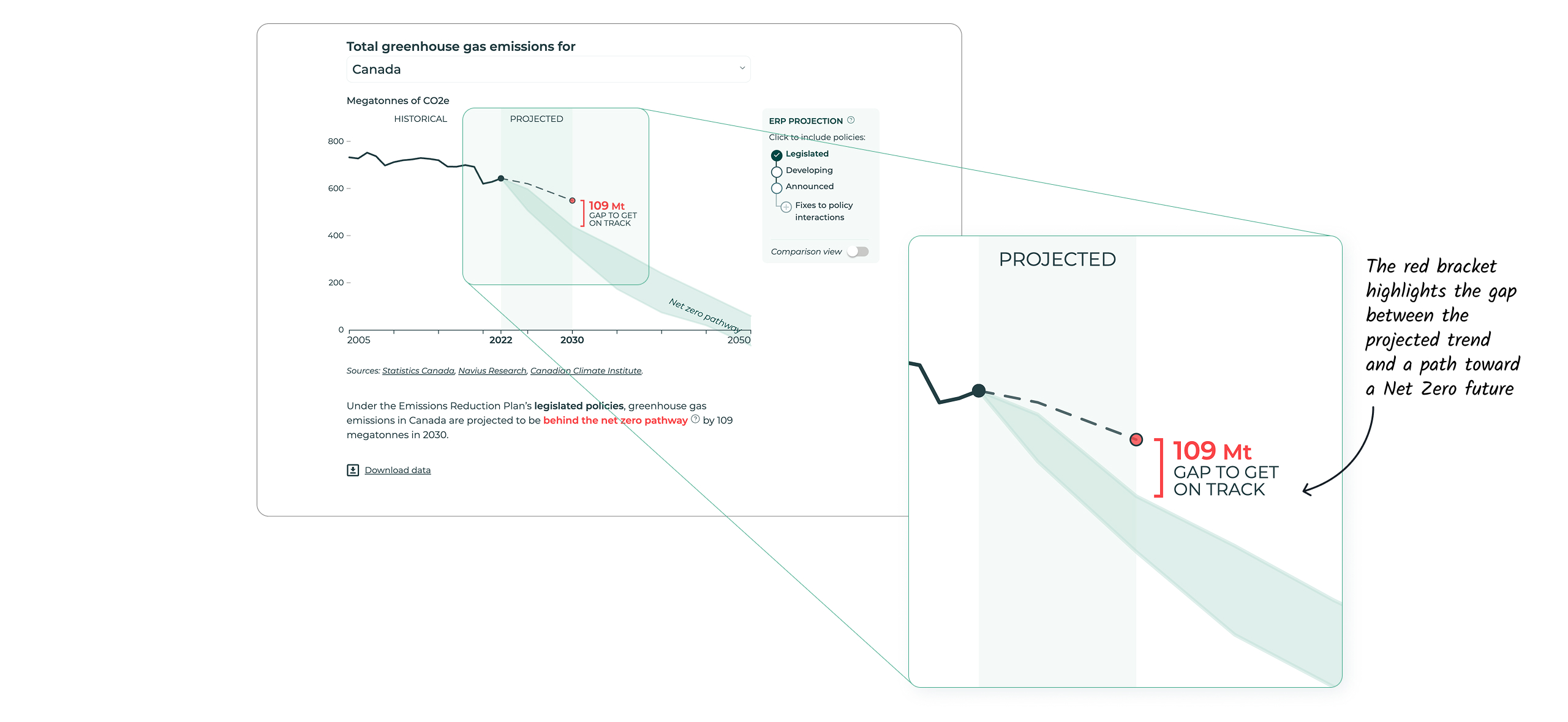
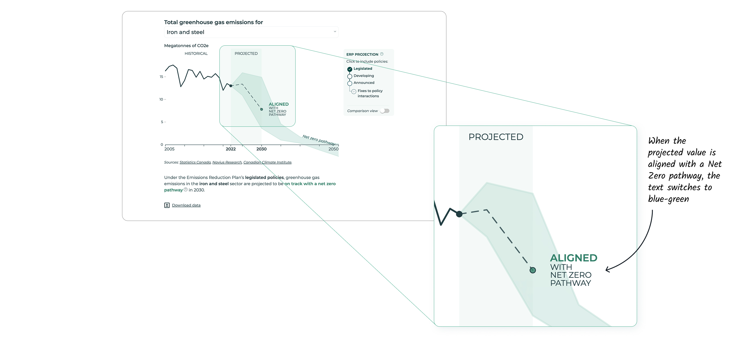
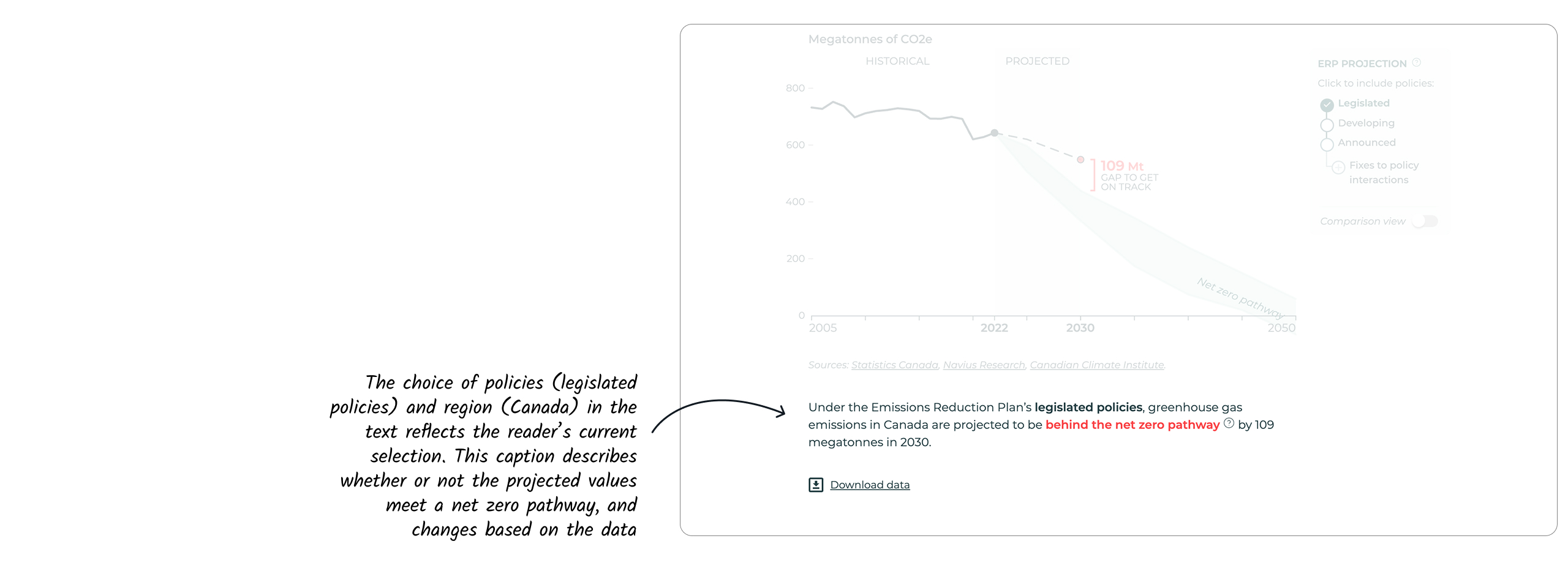
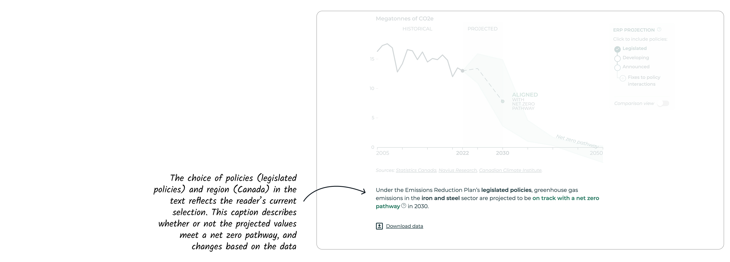
For instance, an annotation highlights the gap between the projected trend and a path toward a Net Zero future. This annotation switches from red to blue-green when the projected value is aligned with a Net Zero pathway, and the text changes accordingly.
The use of brackets, whose lengths dynamically change with each dataset, adds a sense of playfulness in an otherwise simple chart. This theme is carried throughout all the line charts, as well as the custom arrow chart, to introduce a sense of cohesion and enhance readability.
Dynamic text supports narration
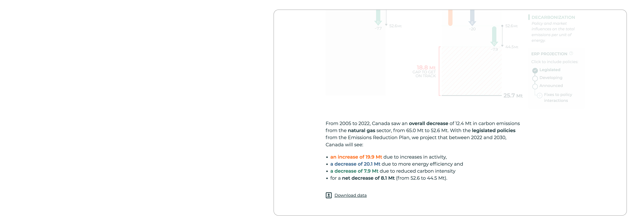
Dashboards often have a vast number of ways to filter, slice, and dice data. Because the data displayed is always changing, this can limit our ability to use declarative titles, custom annotations, and other tools that help us communicate a message in a static visualization. To address this gap, we designed this dashboard to use dynamic text, with paragraph explanations and captions that change along with the data.
By allowing readers to engage with the data through a different modality (the data is explained through a sentence, in addition to a chart), we guide the interpretation of the charts and clarify the reader’s understanding as needed.
Interactivity in the details: Information on hover
Finally, we added some custom interactive details for a special touch.
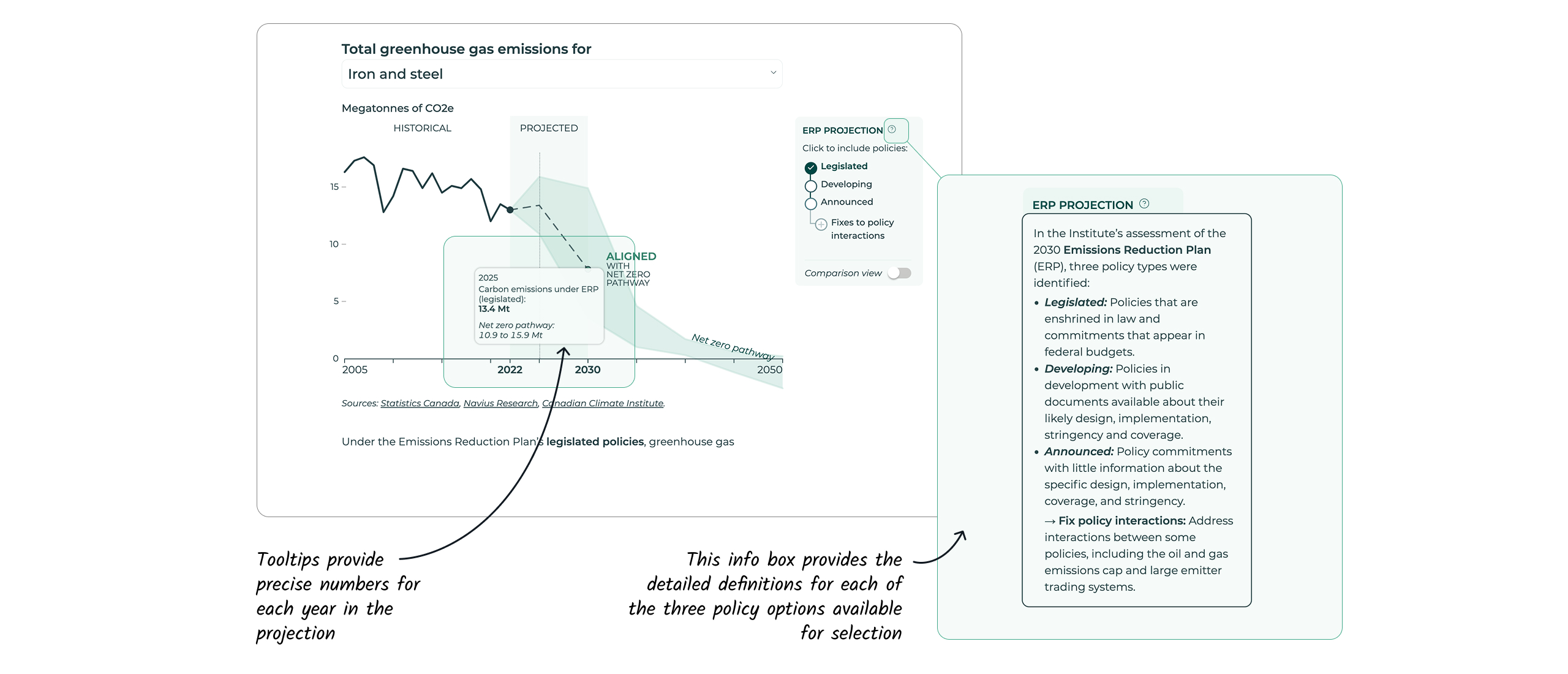
Hovering (or tapping) over any chart reveals tooltips that allow readers to access the precise values of the data points, formatted in a human-readable way.
Help icons, peppered throughout dashboard elements and captions, reveal text boxes that provide additional context or definitions for the reader.
Bespoke interface elements
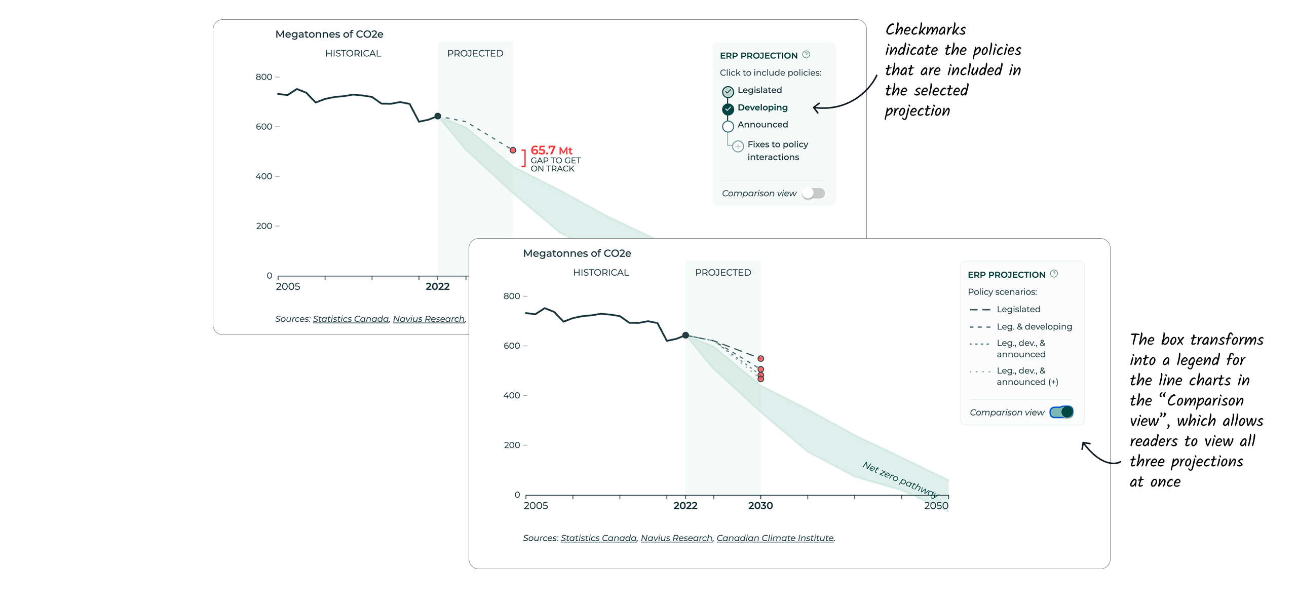
The custom selector element that allows readers to choose which Emissions Reduction Plan (ERP) policies to include in the display is an unconventional design choice, halfway between checkboxes and radio buttons, and reflects the nuances and complexities present in the Institute’s dataset. Through a bit of information design, we were able to use this selector element to hint that the projection displayed on screen when the “Developing” option is selected includes the effects of both Legislated and Developing policies.
Through this simple yet comprehensive dashboard, readers can explore overall greenhouse gas emissions over time, across a variety of different sectors in Canada, and for a number of different policy scenarios, as well as the trends behind the factors that influence the trajectory of these emissions.
You want your data to speak to a large audience? Contact us.