Earlier this year I visited my hometown, Cali, Colombia and some friends recommended that I visit the La Tertulia museum, to see “Huellas de desaparición” (Traces of disappearance), an exhibition that would surely catch my eye. And they were right.
This exhibition was created by Colombia’s Truth Commission alongside the Forensic Architecture agency. Their research centers around three sensible topics in Colombian history:
- The enforced disappearances after the Palace of Justice siege in 1985.
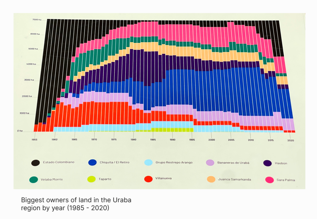
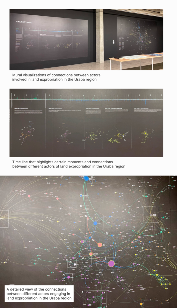
- The land expropriation in the Uraba region by banana enclaves.
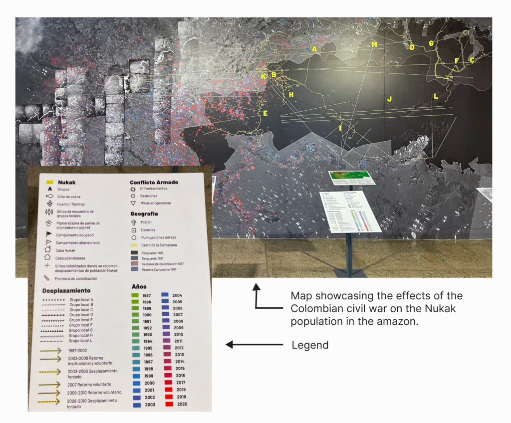
- The disappearance of the ecosystems in the Amazon and its consequences for the communities there.
This exhibition contained insights that delve into the details behind the events. These insights were the result of geospatial, data, aerial, and satellite image analysis.
The expertise, craft, and time invested in this exhibition is staggering. The amount of data being processed is gigantic:
Tens of hours of video that had to be watched and analyzed, reading hundreds of documents and parsing data sets from them, and identifying elements and patterns in hundreds of images. A lot of the insights were presented as data visualizations.
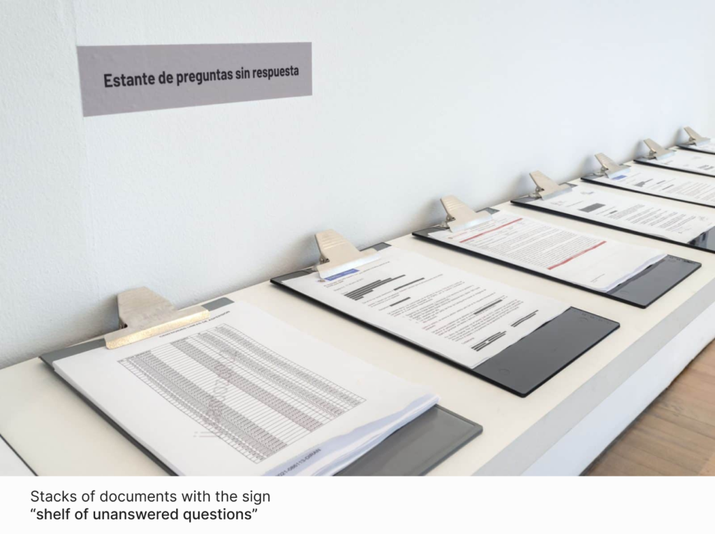
Here are some data visualizations that were part of the exhibition:
Negative Evidence
During my visit, there was one data visualization that caught my attention more than the others.
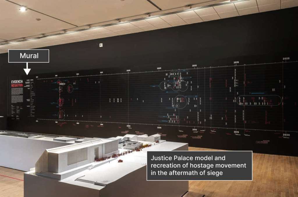
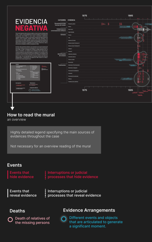
“Evidencia Negativa” (Negative Evidence) is a mural that details the search for answers for the victims of forced disappearance in the aftermath of the Palace of Justice siege.
This mural/data visualization records all the major events, all the victories and blockages, that the people searching for answers faced since 1985.
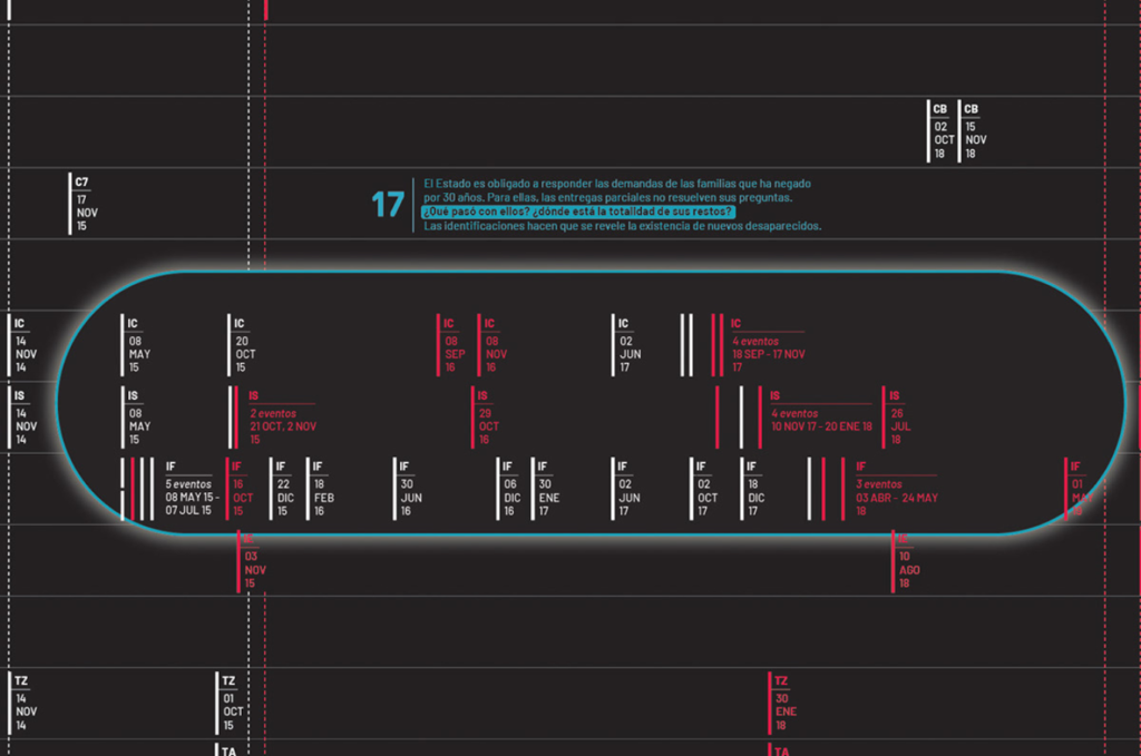
This project allows the reader to understand how information and inquiries were blocked in the years after the event and how with the passing of several years those blockages turned into answers as several overlapping events allowed the families and friends of the victims to have a better understanding of the events that happened that day.
Let’s learn how to read it:
The project conveys information effectively but what caught my eye was how it conveyed the emotional weight of the topic:
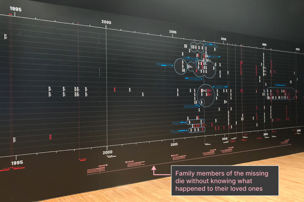
- The size of the mural helps the reader be more aware of the passing of time. Since you have to walk through the years to read the mural you get a bigger feeling of “These were 20 years without answers”, you feel the gap more clearly. I think you wouldn’t have that reaction without this play on scale.
- The project brings back the human element and the cost of the constant blocking of information by adding the date of the passing of several family members of the victims at the bottom of the mural. Which have passed without ever knowing what happened to their loved ones.
- The annotations that accompany the significant moments throughout the visualization are written in a respectful but direct way that help communicate these key moments in history.
This project gave me a new understanding, I knew about the Palace of Justice siege and the story surrounding it. I have also heard about the forced disappearances in the aftermath. It wasn’t until this mural, this exhibition, that I became aware of how long it has been without answers, not as a number or a fact but as a feeling, and of the incredible amount of obstacles people searching for the true confronted.
You can explore the Negative Evidence visualization in-depth here.
A lot of the data visualizations in the exhibition were not the easiest reads, but like good works of art the more you stayed with them, the more you saw, the more you understood and finally the more you felt the weight of the things it conveyed.
Data visualization is a great tool to share information but it can also be a way to tug heartstrings. When data visualization is used this way it generates an impact on the reader that they will remember for longer in comparison to a standard graph.
If you are near a museum that is holding this exhibition I would recommend you give it a visit. It is currently at La Tertulia Museum in Cali, Colombia until May 31st, 2024. It is not only a great reminder of the power of data visualization but also of journalism, of searching for the truth and holding people and institutions accountable for their actions.
Julian Hernández is an information designer at Voilà:. He is responsible for creating engaging and insightful data visualizations that help viewers see the data from a different angle and consider new possibilities.

