This ambitious project aimed to equip the whole Québec.ca’s website with a common visualization language. The result of that? Greater clarity and accessibility of the information shared with the general public
Created to be useful
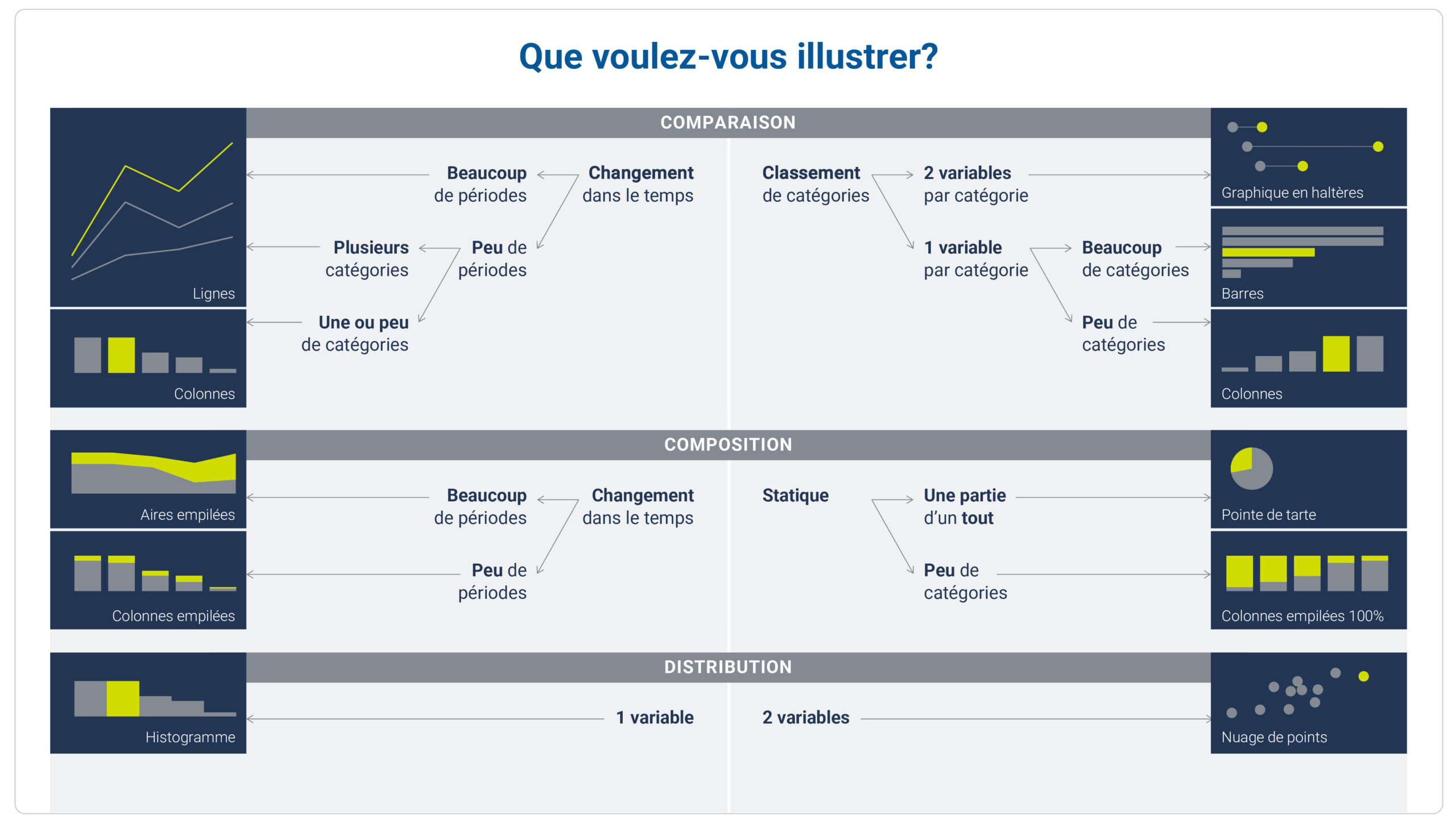
The style guide is structured by function and includes a decision tree that links all of them with their preferred types of graphics.
Users can then explore sections dedicated to each type of chart, where they can find best practices, examples, and more.
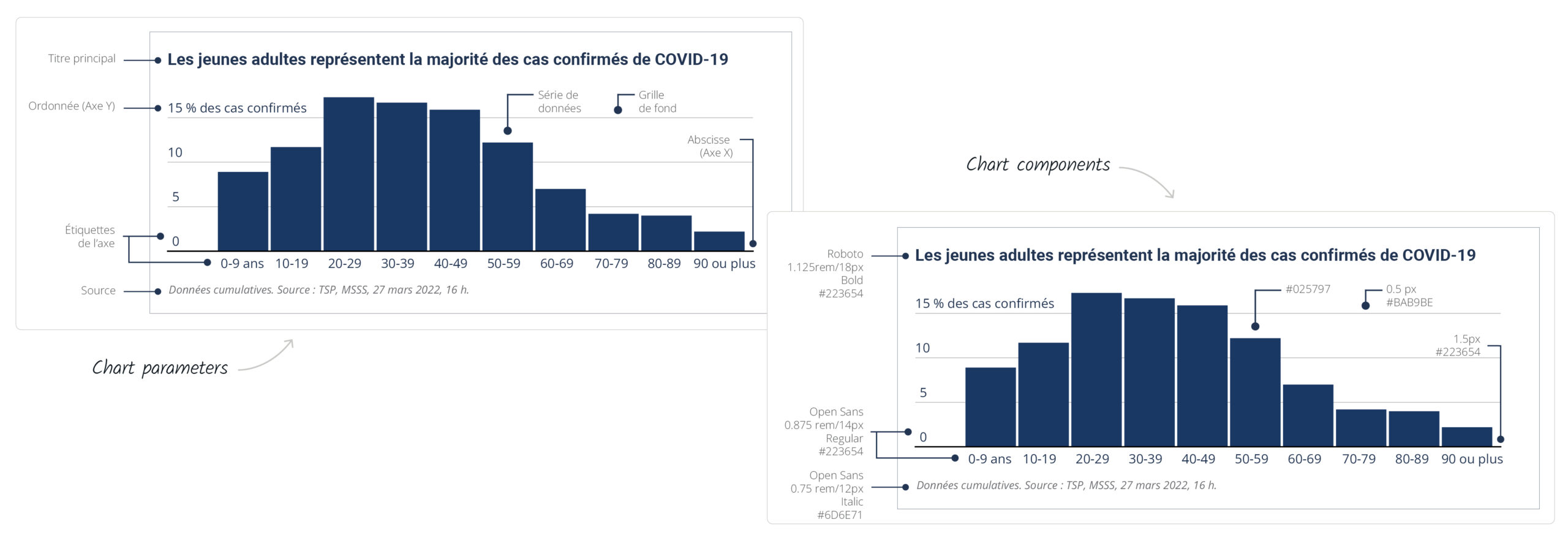
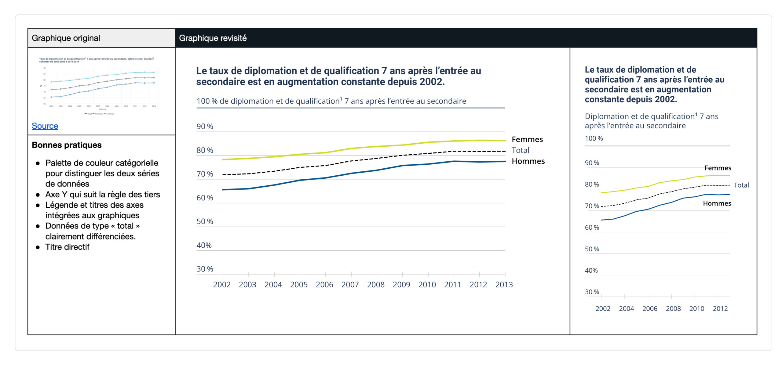
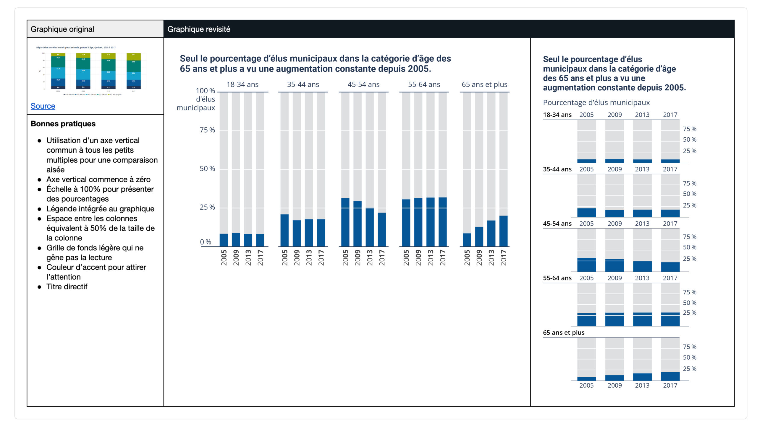
The part about good practices is rooted with a model chart that is “deconstructed”. We go over the essential components of a graphic, as well as its visual appearance.
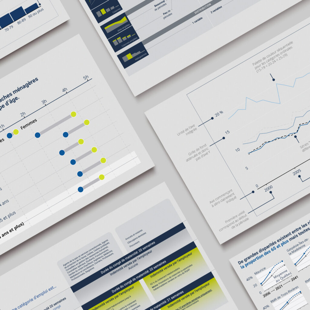
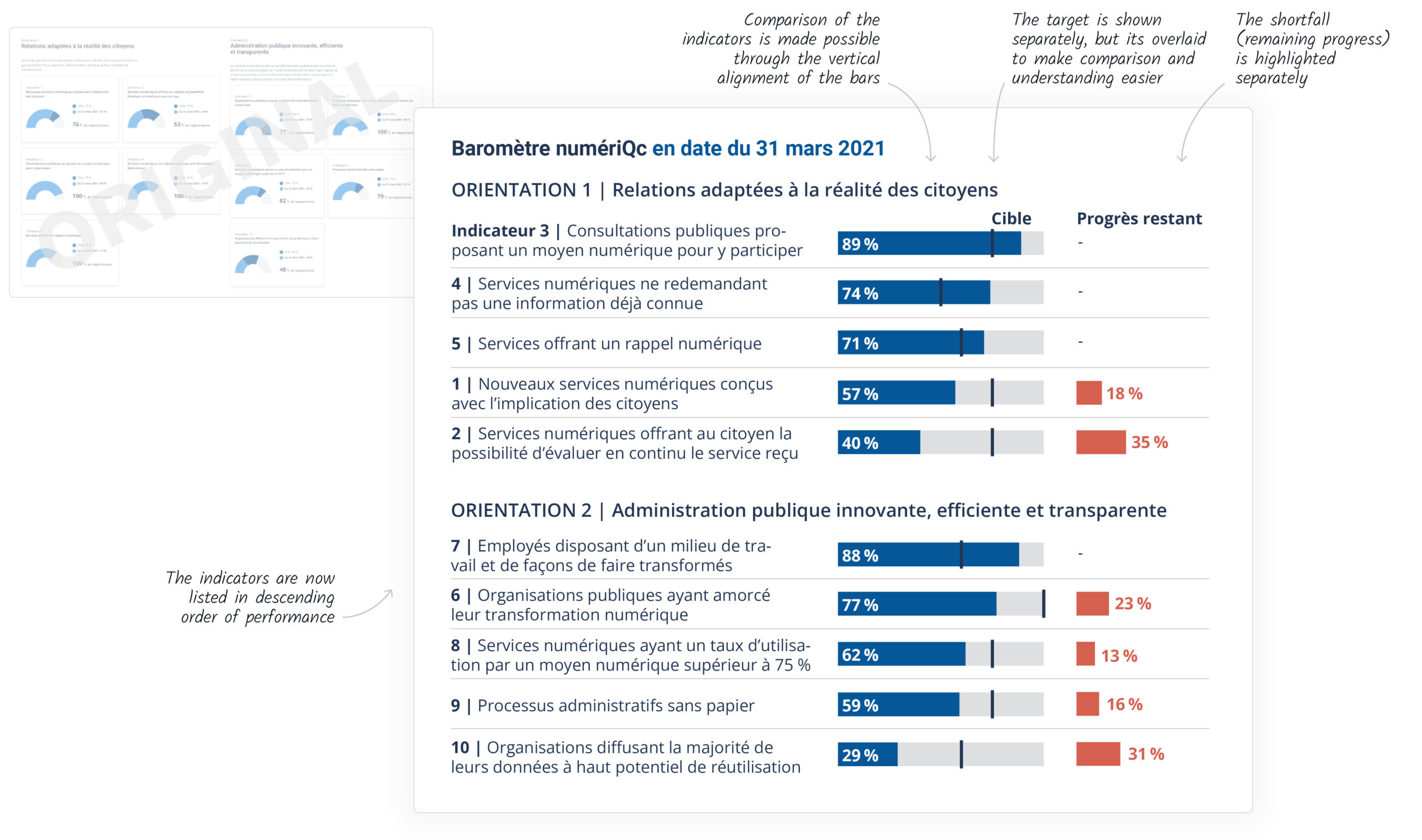
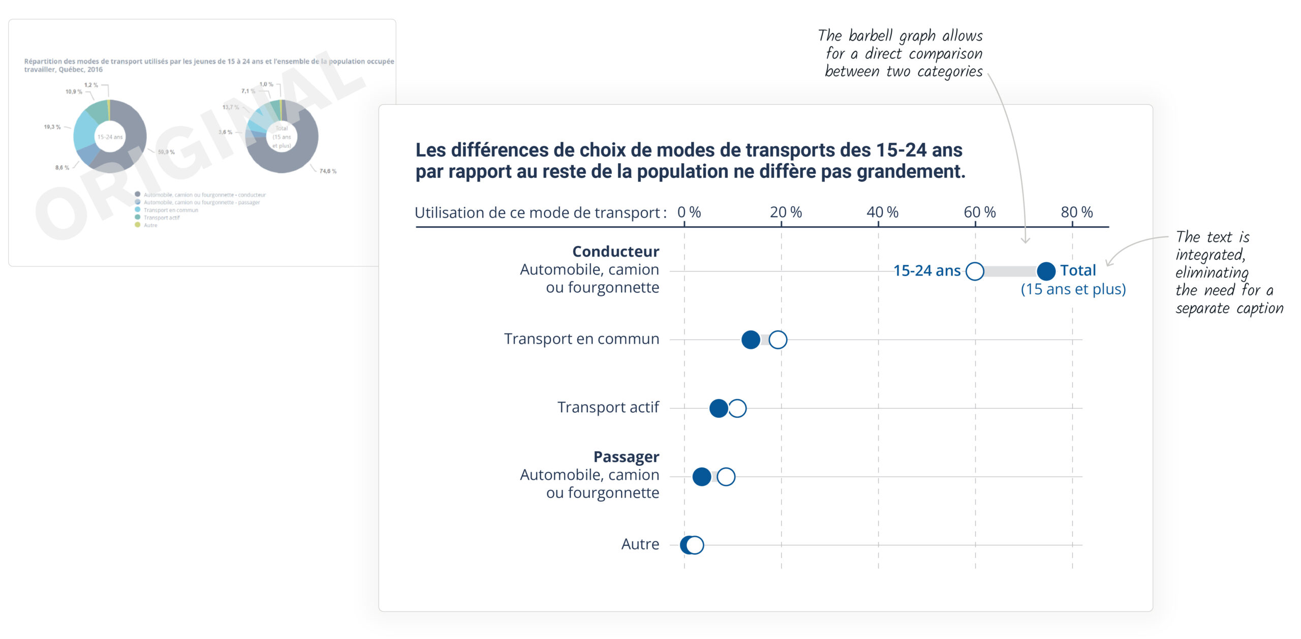
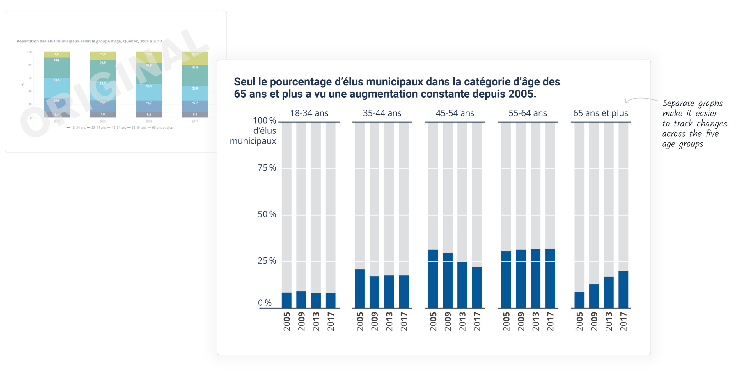
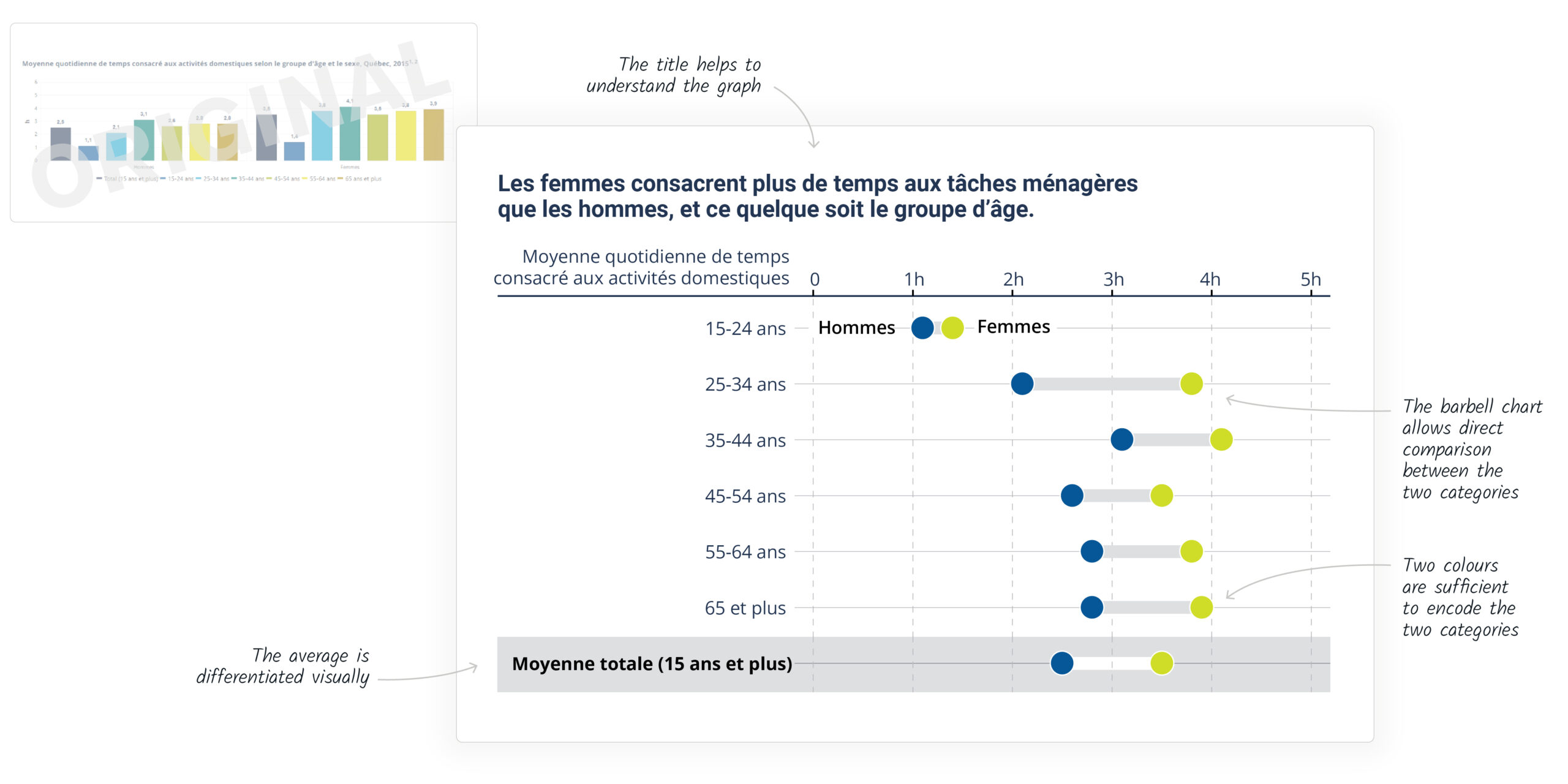
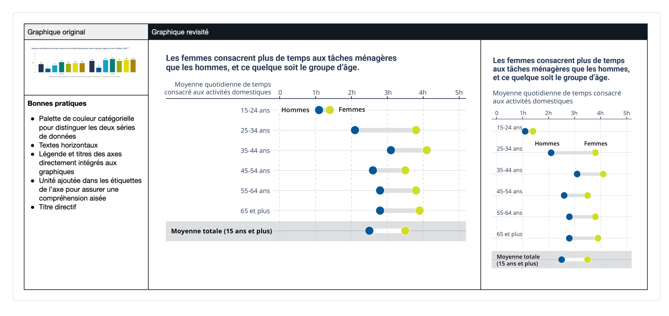
Finally, for each chart type, we reworked original visuals by applying the best practices described in the guide. The goal is to demonstrate that these best practices are realistic and achievable within their intended context.
Created to be complete
We have provided each example in landscape format (for desktop display) and portrait format (for mobile display). We have also included a series of recommendations for adapting charts from one format to another.
The guide also contains recommendations in the form of “cards” for the creation and layout of dashboards, the integration of interactive functions into graphics, and best practices for the layout of tables.
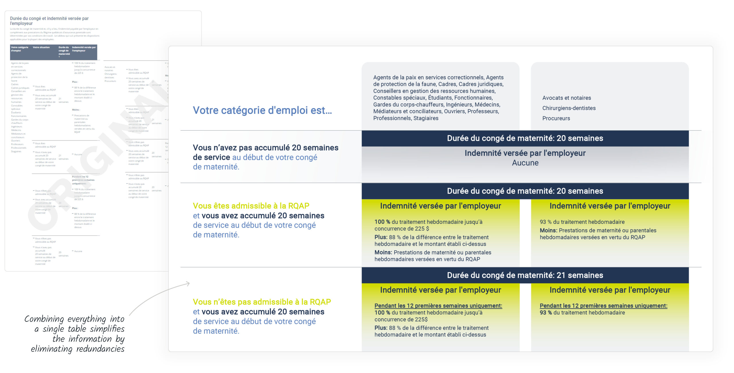
Here is an example of best practices “cards”.
Here is an example of content about table layout.
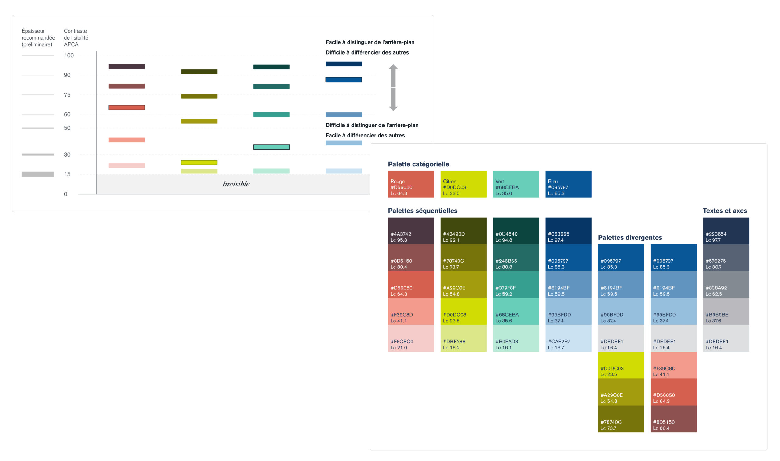
We reworked the website’s color palette to improve contrast and accessibility. We developed a series of sequential and divergent variations and added recommendations based on different contexts of use.
Finally, we included recommendations for creating visualizations that are suitable for neurodivergent individuals, as well as guidance on the importance of, and how to write, alternative text (the text read by screen readers when an image is included on a web page).
Conclusion
Developing a standards guide for the Quebec public service required a special approach.
We aimed both to equip users with concrete examples and to provide change to managers with recommendations and best practices to share internally.
We also wanted to create a guide that not only conveys knowledge related to the “production” of charts (“how to make a chart”) but also to the “conceptualization” (“when to make a chart” and “how to choose the right chart”).
The gradual rollout of the standards by the Government of Quebec is available on their website.
Does your organization manage a large amount of data and seek more structure in how it's presented?
Do you want your charts to align with your visual identity?
Would you like to integrate data visualization best practices into your workflows?
A standard style guide might be the solution for you.
Get in touch with us!.
How to meet the higher standards that the audience demands when it comes to digital and in-print data visualization? All while balancing the need for nuances and impact when it comes to climate data?