Same charts, different designers: learning from an experience

[publishpress_authors_box layout="ppma_boxes_13147"]
September 8, 2024

What happens when two information designers who work in the same agency challenge themselves to rethink a set of charts they found on the Internet? That’s what we’ll explore in this article.

But first, let us introduce ourselves.

My name is Timour, and I’ve been an information designer for ten years, at Voilà: for three. I’m a sociologist by training, and I like the idea of using information design to give greater visibility to information of public interest.

As for me, Patricia, I’ve been a programmer and information designer at Voilà: for three years. My background is in science, and I’ve always been interested in communicating ideas in a clear and nuanced way. I use information design to facilitate decision-making using visual tools.

Challenge accepted!

As is so often the case, the idea came about during coffee break.

We had found an article by the Canadian Centre for Policy Alternatives that presented their favorite graphs of 2023, something that aligned with both of our interests. As we reviewed them, we wondered what changes we would make. And there, rather spontaneously, the challenge was born. The rules were simple:

1/ Rethink the charts and sketch out a redesign
2/ Work on the same charts, but separately. (No peeking!)
3/ Come back together and discuss the results.

We put the charts together in a separate document with relevant context and duplicated the document so we could work on it separately.

And we didn’t set a minimum or maximum time for each graphic, but our workload served as a natural limit.

Here are the takeaways from our resulting discussion.

Disclaimer: this post is not intended to present polished redesigns for each of the Canadian Centre for Policy Alternatives charts. Not only has no one really asked us for our opinion on the subject, but these are also fairly specialized topics, and we always prefer to talk to a person or persons with a good knowledge of the subject matter before embarking on a complete redesign. We’ve included some preliminary drafts of concepts that are to be taken with a grain of salt.

A screenshot from a PowerPoint file that contains different sections for each redesigned chart. The first slide is always the original with some context and the second and third are Timour and Patricia’s notes.
[Click to zoom in]

Instincts in action

The first thing that stood out to us after reviewing each other’s redesigns was the different mindsets we had when we approached the task.

Where Patricia meticulously captured her observations, analysis and thoughts, Timour quickly threw himself into producing drafts and preferred to succinctly document the reasons that led to his choices.

This observation made us smile, as it perfectly represented the way we naturally work, without even realizing it.

Thoughts from Patricia:
“We didn’t discuss much before this activity at all, so I blindly assumed that our main point of compare and contrast would be comparing our design processes. So I made sure to document my thought process as much as possible. Also, maybe I’m a natural “gatherer” – my process is to gather all the information before starting. It makes me realize that this initial recording process is what I need to overcome task paralysis, where I get “stuck” before even starting at all.

An image of the original chart and the two sketched concepts created by Timour and Patricia. Timour’s doesn’t include much notes and focuses instead on the end result whereas Patricia’s gives more space to her observations and analysis before getting into a concept. Nevertheless, both have converted a line graph into several smaller graphs.
[Click to zoom in]

That’s not the only thing we noticed. On closer inspection, we also found that our attention was focused on two contrasting dimensions: content and form.

Patricia’s notes show a particular focus on the content of the redesigns, with questions such as “Is 2% a lot?”.

Timour’s notes focus more on the form these recasts can take and how the container can enhance the content, with comments such as “I like the combination of a slope graph with a line graph and an area graph”.

Thoughts from Timour:
“This exercise has important implications for my work. It’s a good reminder that I can bring a good dose of determination and high decision-making ability, coupled with an enthusiasm for the “packaging”. However, this shouldn’t blind me to the fact that I’m not always naturally inclined to document my analysis and creation process, which can make life difficult for my colleagues since collaborative work relies on good communication. And that my attention quickly turns to the shape and form, sometimes to the detriment of the content, which can also lead me to move too quickly in the wrong direction.”

Above all, clarity

Beyond the differences in our approach, the appearance of the redesigns themselves intrigued us .

Here’s a series of screenshots of the kind of “results” we brought to our discussion. What do you notice?

Series of sketches for chart redesigns. The sketches are simple, use shades of gray, with a focus on annotations and labeling.
[Click to zoom in]

For us, it was the priority given to “clarity” (at least, visual clarity) that jumped out at us. Clear lines, annotations in the graphs, titles that make sense, the use of small “details” that highlight the data. On the other hand, there was little in the way of visual metaphors, scenery or emotion.

Admittedly, the format of the exercise (rethinking a series of 10 graphics in a condensed amount of time) had an influence on the outcome. After all, creativity is, by its very nature, inefficient, and our goal, however unconscious, was to maximize the use of our time. Now, that’s not to say it’s a bad thing either!

Thoughts from Patricia
“I didn’t spend more than 10 minutes per chart on average, so I never let myself be bored enough to be creative— I just moved onto the next one!”

Under the influence

Our final conversation focused on the influences that led us to create the graphics we did. We were able to pinpoint elements in specific charts to external influences that had made an impression on us, influencing our personal “style”.

Patricia recognised the use of shaded bars to show proportion as a direct influence from colleagues Timour and Francis, while Timour noted that the bold line chart segment he used in one of his charts was influenced by an example he saw in the Data Vis Dispatch newsletter earlier that week.

Thoughts from Timour:
“In my case, I notice that my charts are heavily influenced by designers who were recommended to me early in my career. Stéphanie Evergreen, Andy Kirk, Cole Nussbaumer, and major media like Financial Time, the Guardian. What’s more, my background in the corporate world and large consulting firms made me aware of a minimalist, “impersonal” aesthetic. I don’t think I ever realized just how deeply these influences were rooted in me. And while I’m attached to them and recognize their value, it also makes me aware of my desire to expand my personal palette and give my visuals more emotion and personality. The work of Gabrielle Mérite and Shirley Wu in particular appeals to me.”

A sketched redesign accompanied by two examples from Cole’s “Storytelling with data” book showing the inspirations for the concept.
[Click to zoom in]

Lessons learned

So, what lessons have we learned from this adventure?

Firstly, we found that the “secret ingredient” behind our work lies more in mixing and balancing than in any one element. It’s in coming to terms with our instincts and influences, balancing our strengths and weaknesses, that we deliver our best work.

Which brings us to the second point: the importance of introspection and examining one’s own mental patterns. This introspective exercise allowed us to get to know ourselves better and continue to grow in an intentional way. Getting to know ourselves also enables us to collaborate better with the rest of the team, because it makes us aware of our own blind spots.

We hope you enjoyed the exercise, and if you’ve done your own redesigns, please feel free to share them with us on Bluesky or Instagram!

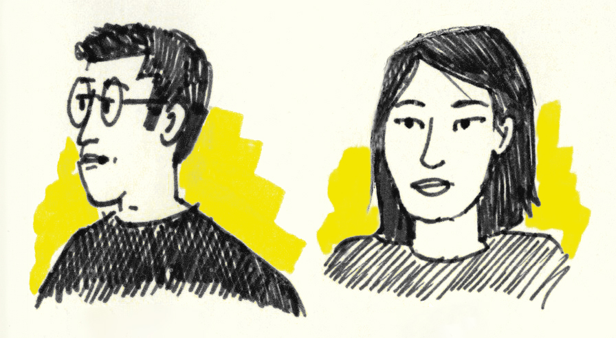
Patricia Angkiriwang was a data visualization developer and information designer at Voilà:. She was responsible for developing interactive data visualizations and designing visuals for client projects.
Today, she works as a front end developer for the clean electricity transition.

Timour is an information designer at Voilà:. He sees information design as a way to simplify the tensions experienced by societies, organizations and individuals.

[publishpress_authors_box layout="ppma_boxes_13235"]
Facebook
Twitter
LinkedIn

Discover our most recent thoughts​

Do you like to be informed?

Share our discoveries and follow our work by subscribing to our newsletter.

We will be happy to help you reveal your worth. Here is how you can reach us.