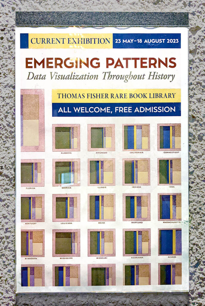
This month, I visited the Emerging Patterns exhibition at the Thomas Fisher Rare Book Library in Toronto, where curators Aurora Mendelsohn, Anthony Gray and Kelly Schultz had hand-picked books from the library’s unique collection to showcase examples of data visualization throughout history. It was a unique opportunity to see these examples in their original publications, intact, and in some cases, hundreds of years old.
The exhibition featured a diverse range of visuals organized into sections, such as thematic cartography and time-series maps, network diagrams, and timelines. It also delved into a section the curators called “The Golden Age,” before concluding with examples that leveraged the power of data visualization in a section aptly named “Making People See.”
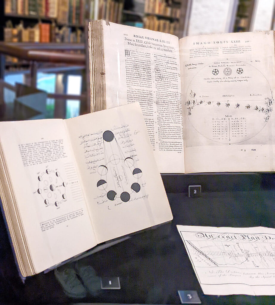
The journey began with a visualization that was nearly one thousand years old, a diagram of moon phases drawn by scholar al-Biruni. These illustrations were significant in how they represented the passage of time, that is, using abstraction and space. In reality, we would never see two moons side by side in the sky – but these diagrams displayed multiple points in time on a single page, showing several moons arranged in a circle to illustrate the relationship between their phases and the angle of the sun.
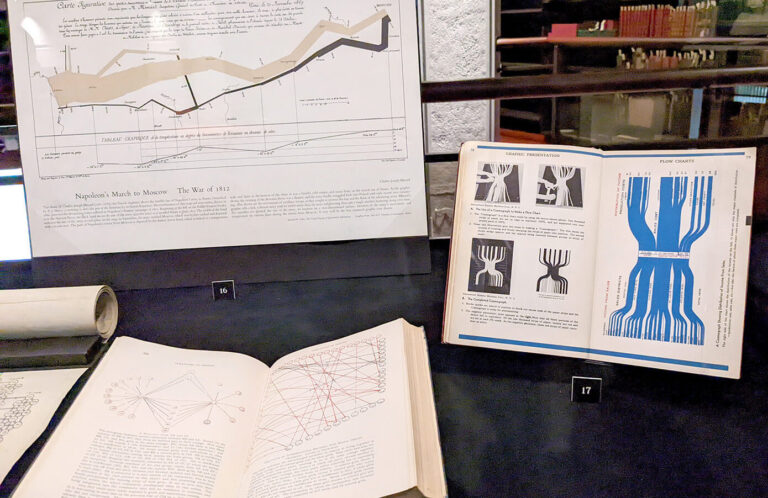
I then made my way through other maps, diagrams, and other early examples of data visualization, encountering prominent figures like Descartes, Darwin, Venn, and Minard.
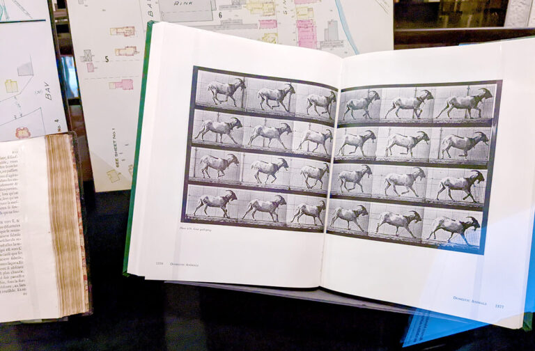
Among others, the curators featured Edward Muybridge’s iconic photographs of animal locomotion, recognizing them as a direct descendent of time-series maps. These photographs were a series of snapshots that capture different moments in time of an animal’s gait– here, in lieu of the famous horse, a goat.
(An aside: While perusing the photographs, it occurred to me that any photograph, essentially a grid of captured pixels of light, could be considered a visualization of data…!)
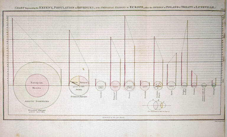
Other highlights included a hand-constructed Sankey flow diagram, then called a “cosmograph”, where a thousand strips of paper were pinned, photographed, and printed, as well as a misleading and nonsensical – but innovative – circle and slope chart by William Playfair.
True to its name, the exhibit allowed me to see patterns emerging throughout the different visualizations. Some visualizations placed the highest value on the information being presented, prioritizing accuracy and the analytical value of the visualization.
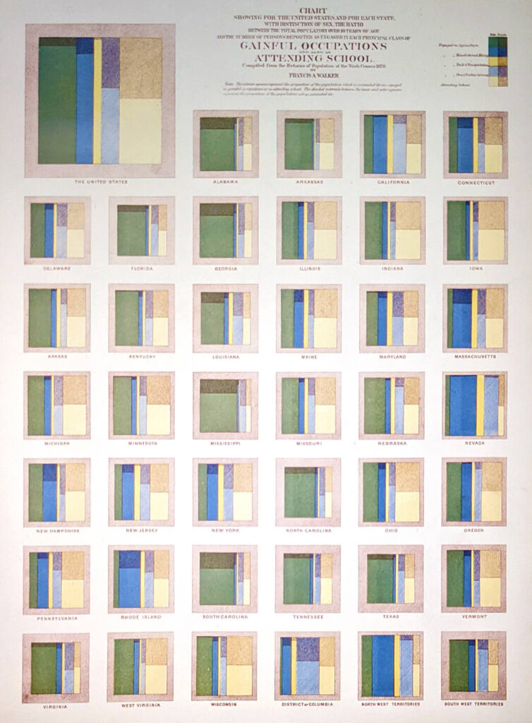
The First Statistical Atlas of the United States in 1874, compiled by the secretary of the Smithsonian, Francis Walker, was a prime example of this. It visually presented the results of the census, conveying the information in all its nuances, with thoughtfully crafted legends and minimal clutter. The page on exhibit featured a set of squares (mosaic plots) that illustrated the breakdown of occupations (mining, trade, professional services) in each state, for both men and women. The data was boldly placed front and centre, and was allowed to shine without much embellishment.
On the other hand, other examples valued aesthetics over function.
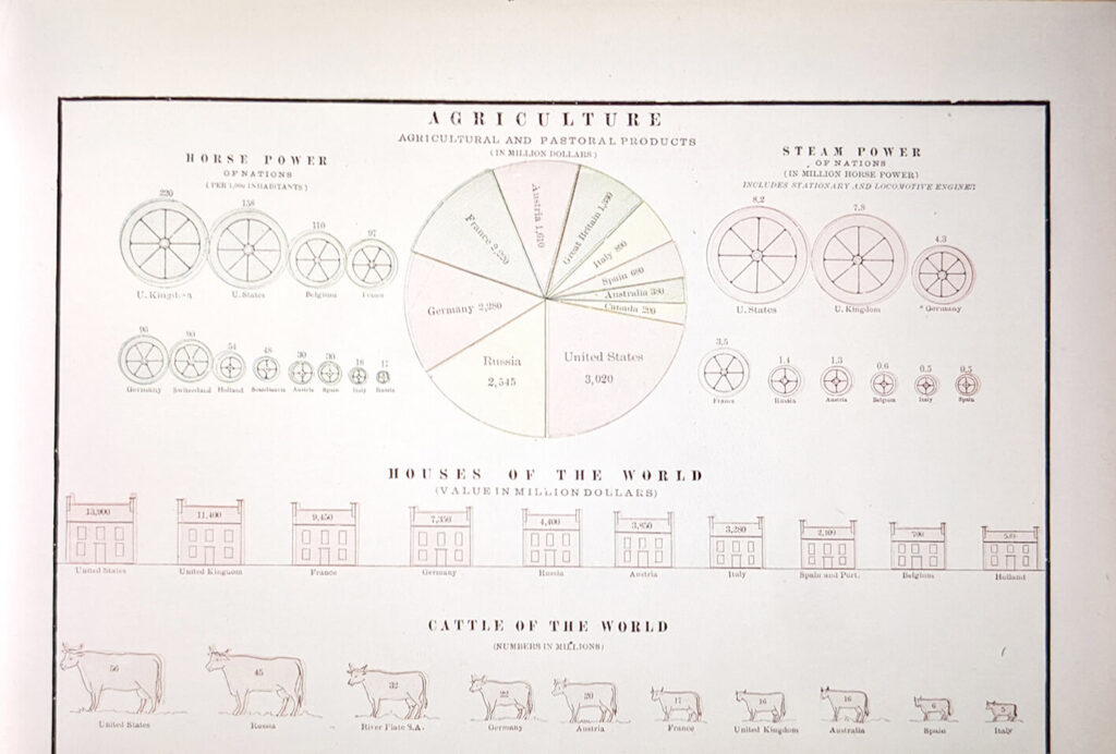
A poster in the exhibition, showing the amount of various metrics across different countries, used the size of pictograms to approximate the value represented, with the number written within each icon. The number of cattle in the world was shown in this way, with mini cows representing each country. The size of the cows, which was approximative and not always scaled correctly to the number of cattle, seemed first and foremost decorative, and did not aid the readability of the data.
Then toward the end of the exhibition, I saw, more strongly, examples that valued visualization for the power it wielded.
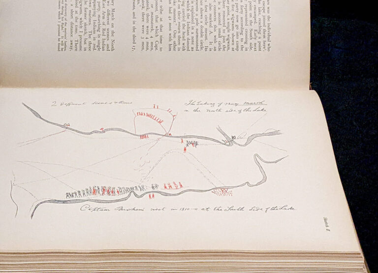
The image below shows a map of battle drawn by Shanawdithit, who drew Beothuk history, culture, and territory in what is now Newfoundland. She drew impressively detailed maps and diagrams from a birds-eye view, harnessing the power of visualization to record and communicate her observations, and anchor her people’s information in history.
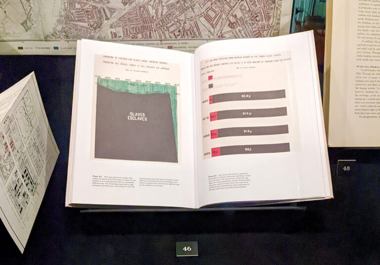
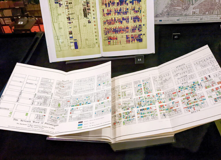
The exhibit also featured the work of W.E.B. Du Bois, with a chart that showed the extent of slavery in the United States across time, as well as a map of the income levels of Black Americans in a neighbourhood in Philadelphia that aimed to dispel the prevailing perceptions at the time. Another set of maps documenting the poor social conditions in the Hull-House settlement in Chicago, created by Florence Kelly, Jane Addams, and residents of the settlement themselves, garnered support for funding and social services there.
I highly encourage all who are able to stop by this unique exhibition to go and take a look for yourself.
After a tour of data visualization and its evolution through history, see what patterns you see in these examples, and then reflect: where are we in our journey today?
The exhibition Emerging Patterns: Data Visualization Throughout History takes place at the Thomas Fisher Rare Book Library (120 St. George St., Toronto) until August 18, 2023, with free admission and public tours.
Patricia Angkiriwang was a data visualization developer and information designer at Voilà:. She was responsible for developing interactive data visualizations and designing visuals for client projects.
Today, she works as a front end developer for the clean electricity transition.
