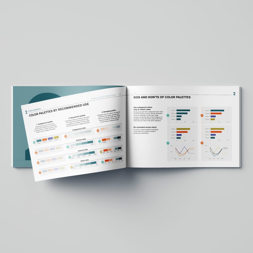
The Canadian Climate Institute approached Voilà: for a data visualization style guide with two broad objectives in mind.
Firstly, ensuring that, externally, all communication materials are clear and effective. Secondly, raising awareness, internally, around data viz best practices and spreading this knowledge among internal stakeholders.
As a result, we produced 30 pages of detailed information on color palettes, chart anatomy, best practices and real-life examples of their application.

This guide is structured in 4 parts:
As a start, we dedicated the first two sections on making sure that all the charts created by the Institute share a similar branding and structure.
Secondly, the third section focuses on data visualization principles.
Our goal was to meet our client’s immediate need and not to give them a whole book to read. Thus, we started from the work that we had already done for them on prior projects.
Actually, we based the charts on climate data familiar to them and on messages from them. We then picked these charts apart and annotated how they follow good data design principles.
Finally, the fourth section is dedicated to a deep dive in certain chart types.
Therefore we organized it in a Q&A format: for each chart we identified the main questions or obstacles that users experience with them, we formulated an answer and created an illustrated example.
The purpose of this guide is to empower the Institute with the necessary knowledge the high expectations of the public. As a result, we created everything in Excel, using features accessible to all users and techniques that are easy to replicate.
We then provided a version of our master file, with every chart that appears in the report, as well as the dataset that was used so that their team could explore how it was made and reverse-engineer it.
A data visualization style guide is therefore a set of guidelines that defines standards and best practices for creating consistent, aesthetically pleasing and effective visualizations. It includes recommendations on the use of colours, fonts, graphic types, sizes, legends, scales and general layout.
Overall, it’s an opportunity to ensure that all communications are understandable and effective, while maintaining consistency in graphic presentations across an organization or project.